HTC One Mini Review

Key Features
- 4.3in screen (720 x 1280; 342ppi)
- 16GB storage
- Android 4.2.2
- UltraPixel Camera
- HTC Sense 5 with BlinkFeed
- Price: From £379
Introduction
First things first. Calling a phone with a screen which is larger than the biggest iPhone 'mini' is just stupid. But, like Samsung, HTC has gone down the route of producing a slightly smaller version of its flagship device and rather than coming up with a new name, has just gone for "mini."
Luckily, that pretty much sums up my negative thoughts on HTC's mid-tier smartphone which is almost as desirable as the HTC One and costing up to £100 less, for some people it will be even more desirable.
Design and feel
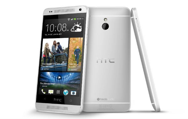
One of the principal appeals of the HTC One over the number one Android phone on the market - the Samsung Galaxy S4 - in my eyes at least, was the premium construction and design. It just looked and felt great when you picked it up. And thankfully HTC has changed little with the mini.
At just 122g and 9.3mm thick, the phone fits perfectly in your hand and having retained the curved back of the larger version, it is comfortable to hold for long periods of time.
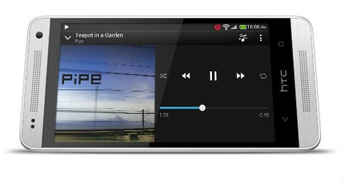
HTC has also retained the micro-drilled holes hiding the BoomSound speakers above and below the screen which - though not as powerful as the full-sized phone - are still much better than the vast majority of smartphone speakers.

While the HTC One was pretty much all aluminium, the mini does make some concessions to its lower price using a glossy plastic frame where the larger version used matte white plastic, and a lot less of it. However there is no flex and the white band compliments the rest of the phone's design perfectly.
The volume rocker has now been split into two buttons rather than a single rocker on the larger device, but being metal, it's perfectly acceptable.
The LED notification light integrated underneath the upper speaker holes can be annoying, but with the right settings works perfectly, letting you know when you have a missed call or wilting battery.
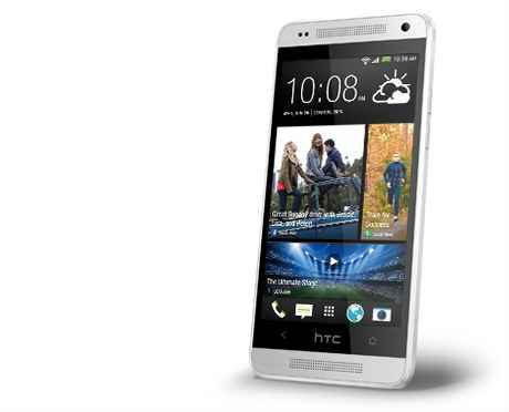
HTC has gone for a non-standard (if there is such a thing) Android button layout, with just two capacitive buttons (Back and Home) either side of the HTC logo, which is not a button at all. It takes some getting used to but once you do get used to it, it works well, letting you easily access features like Google Now and viewing all open apps.
All-in-all the One mini is a superbly designed phone and thanks to its smaller size is much easier to fit in your hand, pocket or purse and easier to use single-handed too.
Display
That is thanks to the screen being 4.3in in size rather than 4.7in but although the physical size may have shrunk, the quality has not.

The screen has a resolution of 720 x 1080 pixels giving it a pixel density of 342 pixels per inch, and while this is a significant drop in resolution from the HTC One, because of the screen size reduction, the screen appeared as good to my eyes as the larger phone.
Using LCD2 means the screen's colour reproduction is accurate and not over-saturated and unreal as can be seen with AMOLED screens as used on Samsung's Galaxy S range. Viewing angles are good and light leakage is minimal, though the panel is pretty reflective which is a problem for most phones these days.
Performance
In terms of performance, the phone is powered by a dual-core Qualcomm processor (Snapdragon 400) which ticks along at 1.4GHz. This is paired with 1GB of RAM and the partnership sees everything fly along.
Streaming video, 3D graphics and multitasking are all handled without a problem. The one drawback in terms of performance came with the battery life which would eek out a single day's use only if you nursed the phone through by turning off Wi-Fi, GPS etc.
Yes, the phone has a smaller 1,800mAh battery compared to its larger brother but with a smaller screen and lower resolution we expected more. It's a pity and for power phone users could be a significant deciding factor.
Camera

As well as keeping the design features of the HTC One, the mini also inherits the Ultrapixel camera technology. The four megapixel camera sensor is dubbed Ultrapixel as a result of the use of a physically larger sensor combined with big pixels which are supposed to be able to soak up more light and therefore improve low light performance.
The physically bigger sensors are aided by a 28mm f/2.0 AF lens, an LED flash and a new image signal processor but unfortunately unlike the HTC One, you don't get optical image stabilisation.
You get both pre and post shutter image capture, allowing you to pick the best from a series of images, similar to the Time Shift feature we saw on BlackBerry's Z10.
The camera app is excellent, offering so many settings it would take you days to go through them all, but everything from manual control of settings such as white balance and ISO are there, as well as the usual plethora of filters.
The app also allows for some impressive post-capture editing, aided by that Qualcomm chip.
In terms of performance, the One mini's low-light performance was superb, picking up light our own eyes could not discern - but the results were just a notch below those from the Nokia Lumia 920.
General performance was also good, though the lower resolution did mean that detail in images when zoomed in was lacking.
Zoe and Blinkfeed
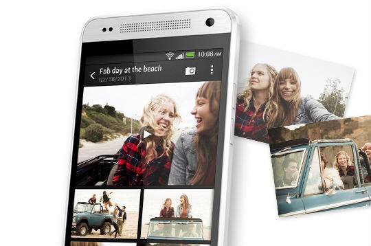
HTC has also developed a new camera feature called Zoe. Essentially it allows you to capture four or five full resolution still images per second while recording three seconds of 1080p video. The result is a short video file which is reminiscent of the moving images seen hanging in Hogwarths.

While it seemed like a bit of a gimmick initially, the ability to share these, put them together effortlessly with unique filters and music is superb and HTC should be congratulated for trying something a bit different.
Another thing that is different but less successful is Blinkfeed, the company's attempt to replace your homescreen with a constantly updated visual news feed.
At first the implementation is jarring and confusing. The system works by pulling in disparate new feeds from sources like the Guardian, Reuters, TechCrunch and others. It will also draw in updates from Twitter, Facebook and Zoe.
The result is a Flipboard-like feed of stories and social network updates that can seem overwhelming. That is until you refine the feed somewhat. Removing Twitter and Facebook helps, but even at that, if you include everything you are interested in, the feed just becomes cluttered and confused.
BlinkFeed is best used for just one or two subjects (football, movies, science etc) rather than as a general news feed.
In its current format BlinkFeed still feels unfinished. The fact you can't import your own feeds means the system is fairly limited, but I assume HTC will work on improving this, and when it does, BlinkFeed could actually become something useful rather than a tacked-on addition to Android as it feels now.
Verdict
The HTC One is not on sale in the UK yet, but when it does go on sale in the coming weeks it will cost you between £380 and £430 to buy outright which is certainly not cheap. Indeed you can pick up a HTC One for not much more money.
If however you are willing to pay that much money, you will get a great phone, which is beautifully designed and built. Add in a great screen and a great camera and you get pretty much the full HTC One experience in a much more compact and pocket-friendly unit.
HTC is undoubtedly making the best Android smartphones on the market, but priced at this level it is hard to see the company overturning recent poor financial results and capturing a larger share of the market.
Scores
- Overall 9/10
- Design 10/10
- Performance 9/10
- Screen 9/10
- Battery 8/10
- Value 7/10
The Good
- Superb build-quality and design
- Excellent screen
- Great camera
The Bad
- Expensive
- BlinkFeed still unfinished
© Copyright IBTimes 2025. All rights reserved.


