Apple MacBook Pro review: Is this a future we are ready for?
We review the new 13in MacBook Pro, a laptop which has caused controversy due to a pack of connections.
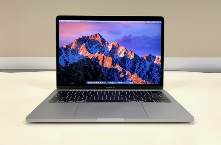
Apple is earning itself a fair bit of controversy these days, isn't it? First we saw the iPhone 7 arrive with a two-year-old design and, the horror, no headphone jack. Then along came the new MacBook Pro, a laptop which starts at £1,449 and mercifully has a headphone jack – but only one other type of connection for everything else.
These two products arrived within weeks of each other and brought with them a whole heap of controversy; critics cried that Apple had lost its way. For the MacBook Pro reviewed here consumers will need to quickly learn all about USB Type-C and accept that, for now at least, dongles and adapters are a part of Apple life.
Make no mistake; this is going to be a difficult transition and it will be costly, fiddly and downright annoying in the short term. But bear with us because Apple's arrogance/courage will eventually make sense.
The new MacBook Pro is split into three key segments. At the top is the 15in model which comes with Apple's new Touch Bar, then there is a 13in Pro with the Touch Bar and an entry-level option which has a 13in screen but no Touch Bar. This laptop, reviewed here, also has just two ports compared with the rest of the Pro range which have four. (We will be reviewing the Touch Bar model soon).
In other words, this is the base MacBook Pro and, even at £1,449, the cheapest. Below it sits the 13in MacBook Air (from £949) and the 12in MacBook (from £1,249).
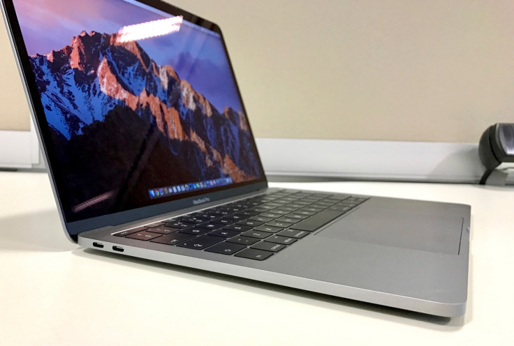
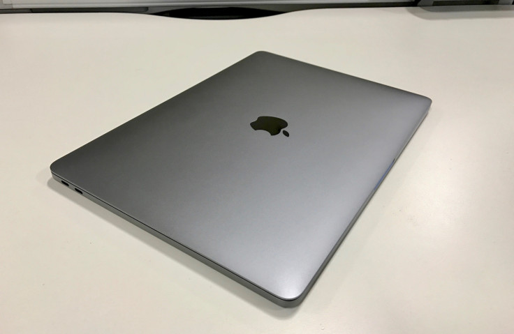
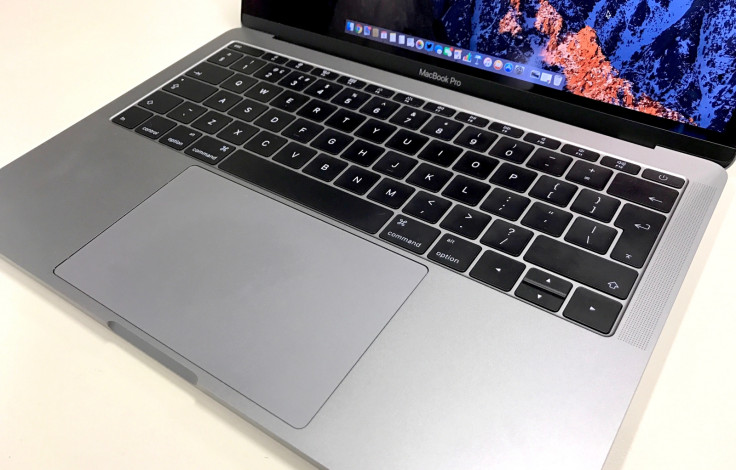
The 2016 Pro takes a lot of its design from the MacBook. It is available in silver and space grey (as reviewed), it has a black Apple logo which no longer lights up; it has the same keyboard with larger keys but less vertical movement than the last Pro; it has the same Force Touch trackpad which offers the sensation of clicking without actually moving.

The larger key sizes are welcome, and while they make a satisfying and premium-sounding 'click-clack' noise, their shorter travel makes them less comfortable than before. It is comfier than typing on a glass iPad screen, but not as cushioned as on the Pro we've owned since 2014.
And while the trackpad is insanely clever, the way it makes you think it clicks when it doesn't, its massive size meant we kept resting our hand on it and right-clicking by accident. The click feels less precise than its predecessor, but we feel this is something we will adjust to in time. Navigating across its glass surface is as exquisite as ever and a reminder that Apple really gets this right.
The new MacBook Pro is a beautiful laptop which once again proves Apple's hardware and design divisions are at the very top of their game. Lighter and thinner than before, to look at and hold it is simply stunning. The screen too is beautiful; it has the same Retina resolution as before, but with boosted brightness, contrast and colour gamut.
But there must be much more to a laptop than merely looking good; especially one with Pro in its name. This is where things get complicated, because Apple has made such fundamental changes here that anyone hoping to introduce the new MacBook Pro into their life without stress, confusion and additional costs is in danger of being left frustrated.
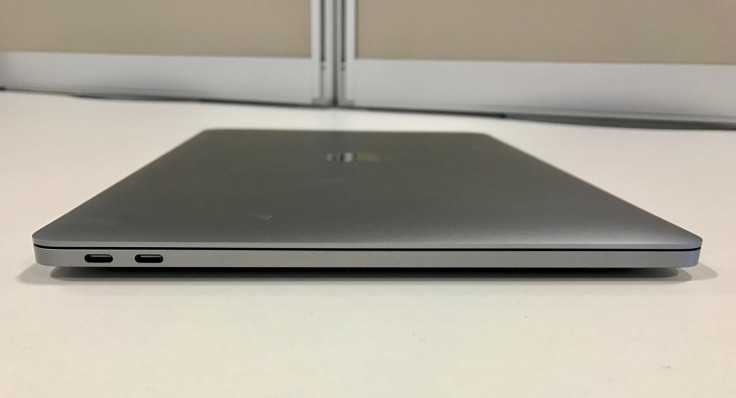
This laptop has just two Thunderbolt 3 ports, which are physically the same as USB-C (as used by several new Android smartphones and will likely soon become a common standard across the technology landscape). Either port can be used to charge the laptop, but doing so leaves you with just one for connecting a screen, portable hard drive, phone, camera or any other accessory. Suddenly using the 2016 MacBook Pro reminds us of the 2008 MacBook Air, which had a single USB port. On second thought, even that had separate ports for charging and connecting to a display.
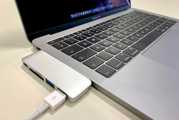
Apple wants the world to go wireless, but this transition via the new Pro is a difficult one to make. No SD card slot means that transferring photos from camera to laptop requires a third-party adapter or a camera with wireless capabilities. Charging the iPhone 7 means buying a new cable. Editing videos with help from a scratch disk also requires an adapter, and so too will most external displays. Consumer backlash has already forced Apple to cut the prices of its adapters in a bid to restore confidence among buyers who suddenly need a bagful of cables to make the new MacBook Pro work with everything they already own. The most common, letting you attach a regular USB device, is £9, down from £15.
This is, of course, the worst-case scenario. Eventually Apple expects USB-C and/or wireless to become the norm and feature on your hard drive, display, camera and everything else. But for now you will want to buy adapters, dongles or a port-filled hub to plug everything in.
Apple is no stranger to forcing the world to ditch old technologies and upgrade; floppy disc, CD, DVD, Firewire, Ethernet, headphone jack, USB, SD cards, MagSafe, HDMI. All gone over the years, diluted down to a single type of port. There is clear logic here, just as there is with making all cars electric, but both transitions will take us down long, winding, expensive and at times uncomfortable roads.
The destination here is computer port euphoria but it is also so far away, behind the dense, low-hanging fog of dongles and adapters, that average consumers might have a hard time seeing it clearly enough to think investing at least £1,449 now is a good idea. The counter argument is that shoppers spending that on a laptop won't mind an extra £50 to £100 on dongles, but then whatever happened to Apple's 'It Just Works' mantra?
The new Pro works by itself just fine and is a brilliant computer in isolation; it has class-leading design, strong (if not spectacular) performance, impressive battery life, a great screen and a good keyboard and trackpad.
But viewed as a whole, when slotted into our existing lives, the MacBook Pro loses some of its shine. This is a beautiful laptop with the same excellent software as ever, but it feels like it has arrived too early and to a difficult crowd.
We spent £30 on a hub from Amazon to send charging, two regular USB ports, SD and microSD slots all to one of the Pro's two Thunderbolt ports. It is a good solution for the average user, who needs to plug in USB sticks, a back-up drive and a SD card. But add a couple of display adapters and things quickly get expensive.
These are early days. Better and cheaper adapters will arrive soon. We will all eventually buy displays and hard drivers with Thunderbolt 3 / USB-C, but that could be several years down the line. How many businesses still use Windows XP? This change will not happen overnight and right now the day you forget your hub is going to be incredibly frustrating.
But, all that being said, we are mostly enjoying the new MacBook Pro. As writers we are not pushing the laptop particularly hard, both in terms of performance and ports. For our use case the Pro gets a lot right; the keyboard gets better and more comfortable the more you use it, and the more your muscle memory adjusts to the shorter key travel. The screen is gorgeous and the battery (just about) lasts a full day in the office, although we felt compelled to carry a charger to be on the safe side.
Apple has again grabbed us by the scruff of the neck, dragged us into the future and left us to fend for ourselves while it waits for everyone else to catch up. As a result the new Pro feels like a step into a future we know is right, but which we aren't quite ready for.
© Copyright IBTimes 2025. All rights reserved.


