Apple MacBook Pro Touch Bar review: Form over function – for now
Apple's new Touch Bar replaces the function keys on the latest MacBook Pro.
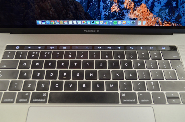
It is easy to forgot how much using a computer is down to muscle memory. Ask someone to write out the letter order of a keyboard and they'll probably find it difficult, but ask them to type a sentence and they won't make a mistake.
So what happens when you take away an entire row of keys and replace them with a touchscreen which changes based on what app you are using? The result is the Touch Bar of Apple's new MacBook Pro.
This is a thin OLED display which replaces the function keys and can be used to control sound, brightness and media playback, but also adjusts to provide shortcuts, sliders and other digital buttons to help make using apps easier.
At least that's the theory. IBTimes UK has spent two weeks with the new 15in MacBook Pro with Touch Bar to see if the biggest feature of Apple's new laptop is worth its significant price tag.
The 13in MacBook Pro with Touch Bar starts at £1,749, and the 15in is priced from £2,349.
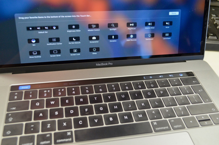
At its core the Touch Bar is made up of three elements. The first is a small strip of semi-permanent icons on the right. Here there is space to add a range of buttons to adjust volume and screen brightness, access Siri, take a screenshot, play and pause media, see your notifications and more.
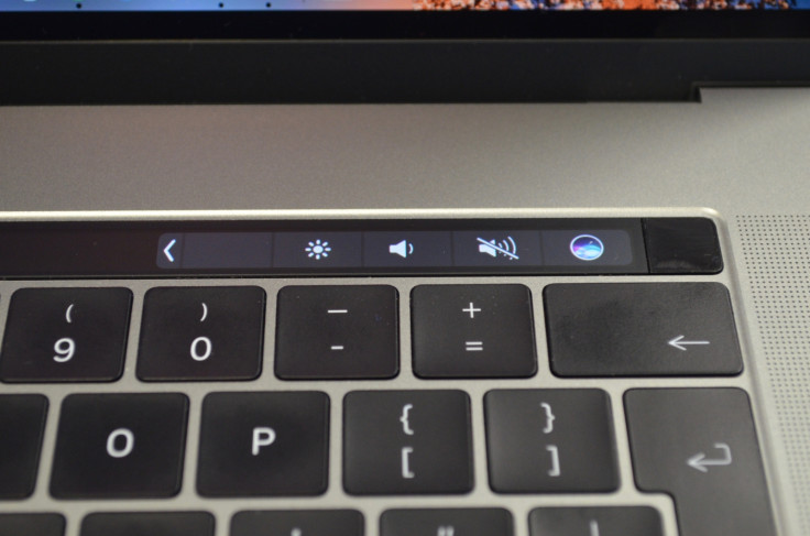
The second element is a fingerprint sensor to the right of this small strip. It works with Touch ID and can be used to unlock your Mac or buy items online through Apple Pay with a press. It also recognises the prints of multiple users, so you can log into your account by just pressing the button.
Finally, the majority of the Touch Bar is a dynamic panel which changes based on what you are doing and which app you are using. In Safari the bar shows open tabs, a new tab button, forward and back controls and a search command. Tap the latter and a colourful row of recent and favourite websites appears; tap one to go to that site - all without touching the trackpad or any physical keys.
It's a nice visual demonstration and switching between open tabs with a tap is useful once you remember the option is there, but it doesn't necessarily make using Safari easier than with a regular keyboard and the trackpad.
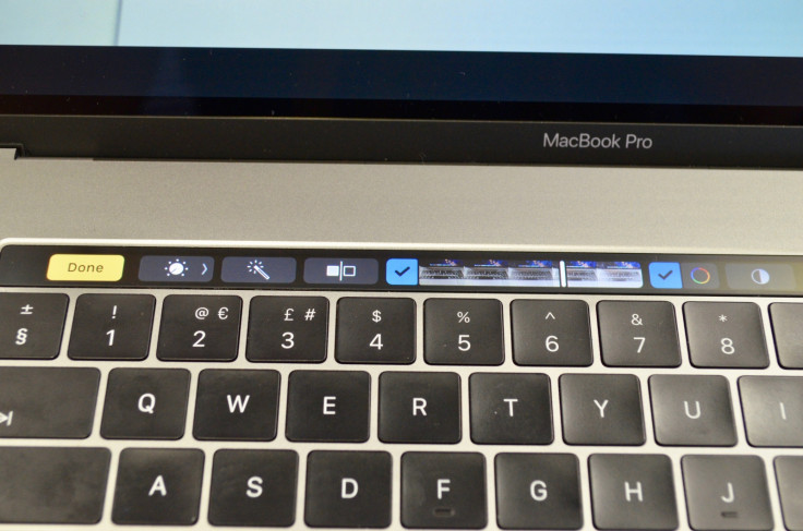
The same is true in Apple's own Photos app, where images can be found, cropped and adjusted using just the Touch Bar, but doing so can become confusing. For adjusting the colour levels of an image in Photos there are 14 sliders, but the Touch Bar only gives access to three. There is nothing stopping the developers of professional applications like Photoshop from giving the Touch Bar more control, however in Photos it looks impressive, but soon feels lacking.
Another place where the Touch Bar feels half-finished is with word suggestions, which appear as you type. We are writing this review in Pages and three suggestions appear in the middle of the bar as we type, just as they do on an iPhone, but here it is far too slow to be of any use. It can be used for correcting mis-spelt words, and seeing an emoji list on there is almost as useful as it is fun, but otherwise assisting typing isn't where the Touch Bar shines.
So when is the Touch Bar any good?
The hardware is beautifully made, as you would expect from Apple. The screen is bright, crisp and easy to see even in direct light; it is also responsive and stable when tapping and scrolling. Recalibrating our muscle memory to adjust the screen brightness and volume without really thinking about it takes time, but after two weeks we are just about there. Logging in with TouchID is really nice, but many years behind the first fingerprint-unlocked Windows laptops.
Mail is where we used the Touch Bar the most. Stretching our left index finger to hit the send icon is quicker than taking control of the track pad and clicking. Moving emails into folders could also be quicker via the Touch Bar once we have become more familiar with it. Nice, sure, but these are not deal-clinchers.
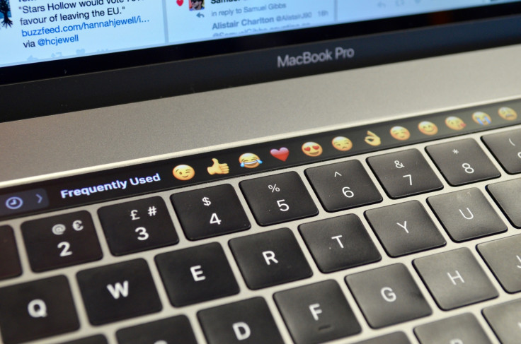
Whether you will find the Touch Bar genuinely useful or not depends on how closely your personal workflow matches that of Apple's slick presentations. After seeing Touch Bar being used by an Apple employee to its maximum potential we felt we had seen the future of computing, but on getting home and remembering we are writers, not video or audio editors, the illusion of the Touch Bar being useful began to fade.
For starters, it does not work at all in Chrome (save for the right-hand buttons for brightness, volume, Siri etc), so in our working day the Touch Bar is mostly blank. This could change as third-party developers update their apps to work with the second screen, but that won't happen for a little while yet.
To sum up, the Touch Bar is a feature which looks great and is a hugely convincing addition to the MacBook Pro when demonstrated in the right hands. These demonstrations show the feature has real potential (and of course it makes a better alternative to the decades-old function keys), but for now it is unfinished.
© Copyright IBTimes 2025. All rights reserved.


