Best Budget Tablet Guide - Part I
Design, screens and hardware
Introduction
The tablet landscape has changed a lot in 2012. Before this year we saw many take on the dominant iPad, and just as many fall by the wayside, skewered on their own swords as they failed to make even a dent in Apple's dominance.
HP tried with the Touchpad and HTC had its Flyer, but neither captured consumers' imagination; what was needed was a rethink, and a different size.
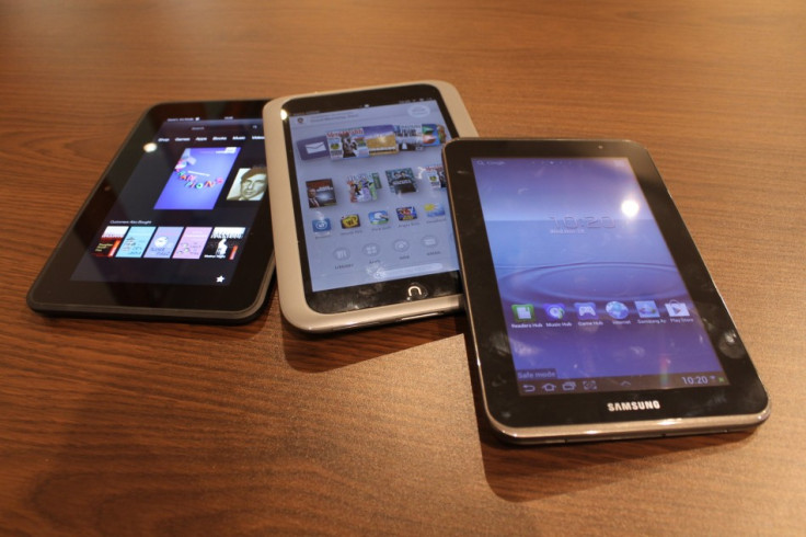
Step forward the seven inch tablet. Undercutting the 9.7in iPad's price by more than 50 percent and closer in size and weight to ebook readers, smaller tablets have gone down a storm in 2012. We look at four of the best 7in models under £200, and in the first half of this two-part feature we give an overview of each tablet, and look at the design, screens and hardware.
In Part II, we address each tablet's software, content, and sum up what we've found.
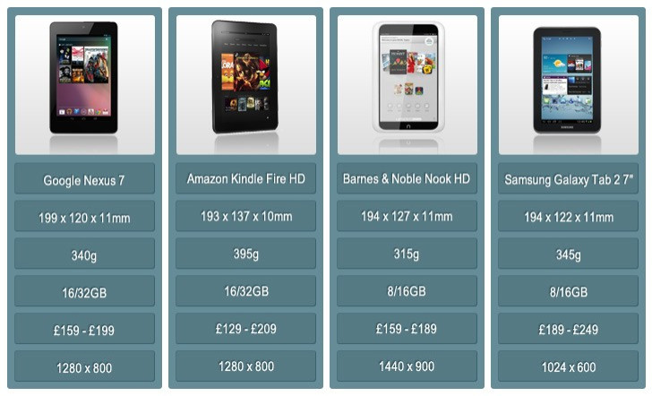
Google Nexus 7

Aside from the Nexus smartphones, Google has left its Android operating system in the hands of other hardware manufacturers, but after partnering with Asus the Google Nexus 7 was born - a 7in tablet with the latest Android software (Jelly Bean) and a high definition screen.
Although Samsung's first generation 7in Galaxy Tab was already on sale when the Nexus 7 arrived in July, it was the Asus-manufactured Google tablet that showed the world that instead of competing with the iPad, going smaller and lighter is better.
Measuring 199 x 120 x 11mm, the Nexus 7 is slightly larger than the Kindle Fire in every direction, and narrower bur taller than the Nook HD and Galaxy Tab. At 340g it is lighter than all but the Nook, which helps to distract from the extra bulk.
The front of the Nexus is very similar to the Kindle Fire, with a 1280 x 800 resolution, glass-covered 7in screen, a front-facing camera and no physical buttons or branding, although there is a silver band around the edge to liven things up a bit.
Asus has given the back of the Nexus a rubberised finish that feels good in the hand and doesn't attract fingerprints.
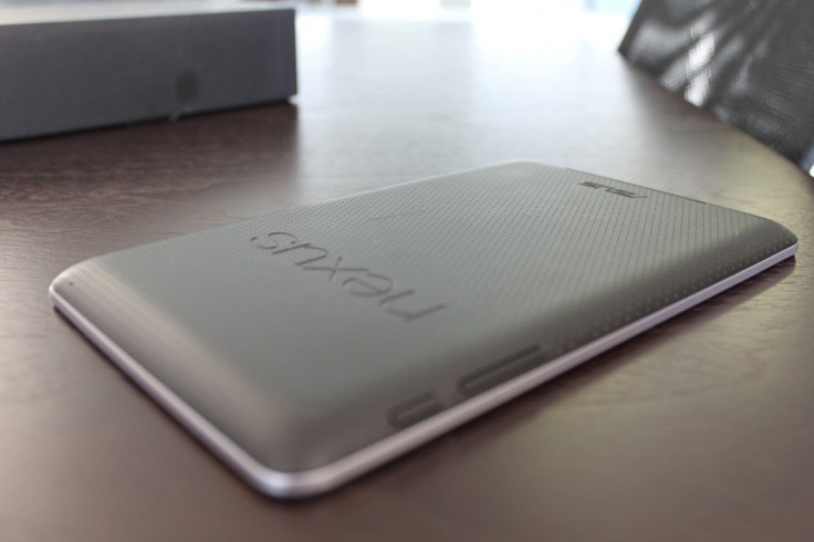
As with the Kindle, there is a power/screen lock button on the right edge, along with a volume rocker, and the bottom edge is home to a microUSB port and headphone jack.
The screen is sharp, with good colours and there is very little colour shift when viewed from an angle, but we did notice the Nexus 7 suffer from some contrast shift.
As with most glass-fronted tablets, outdoor use is best to be avoided, such is the amount of glare and reflections - the screen just isn't bright enough to overcome sunlight.
Inside, there is an Nvidia Tegra 3 system-on-a-chip with a 1.3GHz quad-core processor and 1GB of RAM, making it the most powerful tablet here, although spotting major differences between how each of them perform is more difficult than comparing stats.
The lack of microSD card slot means that you are stuck with the 16GB or 32GB of storage the Nexus 7 comes with, and these are priced to closely match its rivals at £159 and £199 respectively.
Finally, Google sells a 3G version of the 32GB model for £239.
Amazon Kindle Fire HD
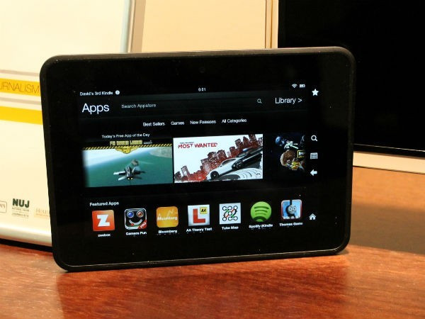
After dipping its toe in the hardware waters with the original Kindle ereader back in 2007, Amazon has enjoyed huge success with its Kindle range. Updated every year with slimmer designs, more features and a lower price, Amazon hit the ebook nail on the head.
Broadening its Kindle range, Amazon now offers the Fire and Fire HD, 7in tablets running a heavily-customised version of Android. The regular (and one-year-old) Kindle Fire is just £129 with 8GB of storage, but the screen only has a resolution of 1024 x 600 and a pixel density of 169 pixels per inch (ppi), so we've focused this feature on the newer Fire HD, which costs £30 more.
The whole point of the Kindle Fire HD is to consume. Read books and magazines, listen to music, watch films and TV, play games - that's what the Kindle HD is primarily for.
Measuring 193 x 137 x 10mm and weighing 395g, the Fire HD has a sizable bezel around the edge of the glass-covered screen, while the back is finished in soft-touch plastic.
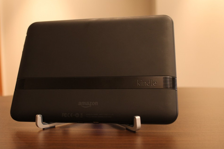
There is a power/screen lock button on the right edge along with a volume rocker, but they are small and set quite deeply into the chassis, making them difficult to locate and press when you first use the device.
With no buttons or branding on the front, we sometimes got a little disorientated, forgetting which way up we were holding the tablet and on which side the buttons were.
The 7in display of the Fire HD has a resolution of 1200 x 800 with a pixel density of 216ppi, equalling the Nexus 7 and beating the iPad mini, which is £110 more expensive.
We were very impressed with the Fire HD's display. Everything looks pin-sharp, especially text, and Amazon has used a clever manufacturing technique similar to Apple's in-cell technology, removing an airgap between the display itself and a touch sensitive layer above it - this helps to reduce glare and improve touch feedback.
Overall, the Kindle Fire HD is a good-looking tablet with high build quality and good design, although the size of that screen bezel lets it down.
We understand why it's there - you need something to hold without accidentally touching the screen - but here it makes the display look much smaller than it is.
Inside, the Fire HD has a 1.2GHz dual-core processor running a heavily customised version of Android and it can be had with either 16GB or 32GB of storage, priced at £159 and £199 respectively.
There's no microSD card slot, so the storage cannot be increased.
In Part II, we address each tablet's software, content, and sum up what we've found.
Barnes & Noble Nook HD
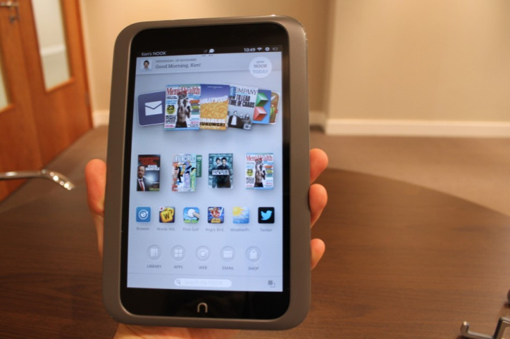
With its friendly, rounded corners, soft plastic finish and user accounts for all the family, it's obvious to see that the Barnes & Noble Nook HD is the most family-friendly tablet on the market
Despite having a design and features that separate it from the crowd, the Nook HD may have an uphill struggle as the UK is less familiar with Barnes & Noble than Amazon, Samsung and others.
It too has a 7in screen, measures 194 x 127 x 11mm and weighs 315g, making it the lightest of the bunch and therefore the most comfortable to hold in one hand for long periods of time - and the rubberised back helps with this, too.
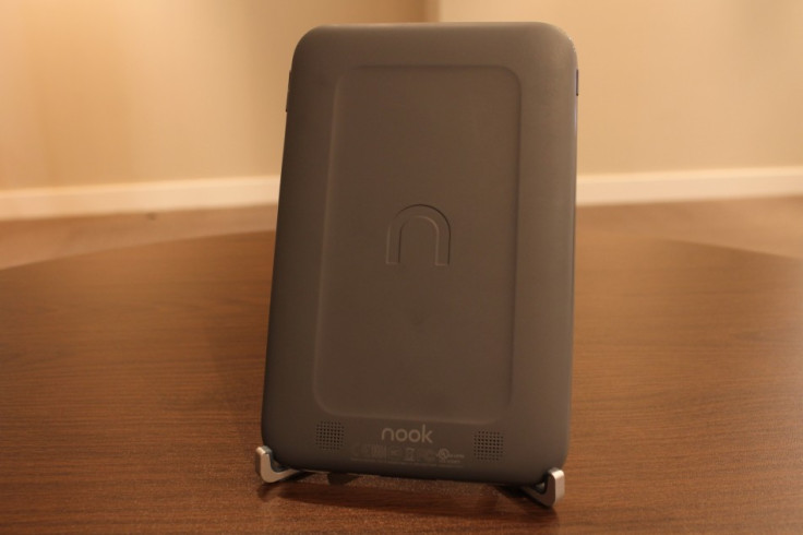
The Nook HD has the highest resolution screen of any 7in tablet on the market, measuring in at 1440 x 900 it's better even than the 7.9in iPad mini.
What this means, is that text is sharper and more rounded, HD films look great and the whole interface has a smoothness to it that the rivals struggle to replicate.
For us, the Nook HD has the best screen of any 7in tablet - iPad mini included - and everything from HD video and photos, to books, magazines and the web look brilliant.
The Nook HD's two-tone design helps to make the screen bezel appear smaller than that of the Kindle, which in turn makes the screen seem larger.
While we like the two-tone design, we wish B&N had used the same rubberised finish on the front as the back, as the screen bezel feels quite cheap in comparison.
The Nook HD is powered by a dual-core 1.3GHz processor with 1GB of RAM, but has just 8GB of internal storage, and a pitiful 5GB of that is assigned to user storage, so you'll want to make use of the microSD card slot.
The device retails for £159, but you'll probably want to add around £15-£20 for a 32GB microSD card.
Samsung Galaxy Tab 2 7.0
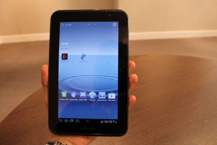
First of this group to go on sale, the (deep breath) Samsung Galaxy Tab 2 7.0 arrived back in May with a 7in screen, Android 4.0 (Ice Cream Sandwich) and is available in either black or white.
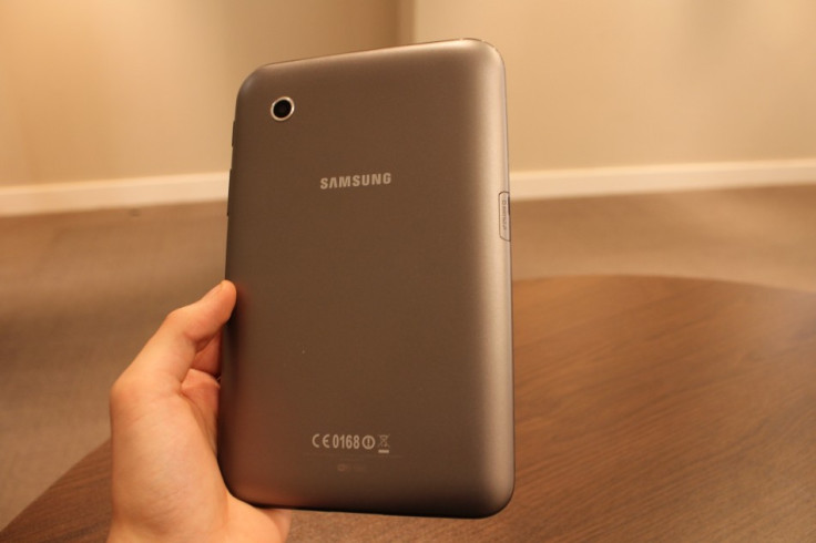
Measuring 194 x 122 x 11mm and weighing 345g, the Galaxy Tab is almost exactly the same size as the Nook, but is 30g heavier - in part due to sporting front and rear cameras, which the Nook doesn't have.
We've never understood why manufacturers feel the need to include cameras with their tablets, and the terrible 3-megapixel back and VGA quality front-facing cameras on the Galaxy Tab 2 7.0 make Samsung's argument for including them even more invalid; in short, you really won't want to use them, the quality just isn't good enough.
Moving on, the Tab has a grey plastic back with a microSD card slot on the left, a power/screen lock button and volume rocker on the right, and a headphone jack on top.
Like Barnes & Noble, Samsung has opted to use its own proprietary connection for charging and syncing with your computer and, as we've said before, we would prefer Samsung to have used the almost industry-standard microUSB port instead.
The Galaxy Tab's screen bezel is slightly smaller than that of the Nook and much smaller than the Kindle Fire's, helping to make the screen look bigger than it really is, although the 1024 x 600 resolution is disappointing, given the superior (albeit slightly newer) competition here.
At this resolution - and with a pixel density of just 170ppi compared with the Nook's 243ppi - text and icons don't look as sharp as we'd like, with jagged edges visible.
Despite the low resolution, colours are good and HD content looks almost as good as it does on the other tablets on test here, but the Galaxy Tab seems to suffer from more glare and reflections than the competition.
The Galaxy Tab 2 7.0 is powered by a dual-core 1GHz processor with 1GB of RAM, making it the least powerful of the four tablets - although you shouldn't make a purchase based entirely on how fast a processor claims to be.
Overall, the Galaxy Tab 2 7.0 feels well made - more so than the Galaxy S3 smartphone, in our opinion - but the extra weight and low camera quality give away the Samsung's age, even if it's only slightly older than its rivals here.
In Part II, we will be looking at the four tablets again to decide which has the best software and available content, helping you decide which one you show buy this Christmas.
© Copyright IBTimes 2025. All rights reserved.


