Facebook Rolls Out Timeline Update With Simpler Design
Facebook has announced yet more updates to its layout, this time to users' Timelines, which will be simplified over the coming weeks to more closely resemble the major update to News Feed announced last week.

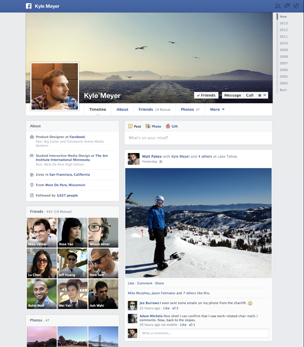
The goal is to reduce clutter on your Timeline and give more options for how you want content to be displayed on your page; the main change is that the smaller left column of your Timeline is for likes, interactions, friends and other such information, while the larger right side is reserved for wall posts, photos and status updates.
The billion-member social network said in a blog post: "We heard from you that the current timeline layout is sometimes hard to read. Starting today, all posts are on the right side of your timeline, with photos, music and other recent activity on the left."
Facebook has made the left-hand column completely customisable, so if you want your Instagram posts in the top left, you can put them there, or your Words With Friends interactions, About section, or whatever you want.

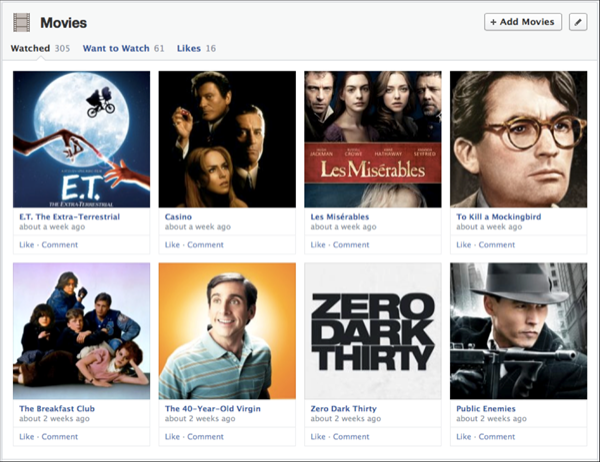
Fitting neatly with the recent News Feed update, which lets you view stories relating specifically to films and TV programmes liked by friends, the new Timeline has a heavy emphasis on media.
Users can now share more information regarding which books, TV shows and films they like, and going beyond that they can also specify which content they have watched, enjoyed, or what to watch in the future.
Say there is a book you want to read; you can add that to the 'Want to read' collection on your Timeline, and of course this information is shared with your friends - who can also add it to their Timeline - and the official Facebook page of the book in question.
The updates have already been trialled with some New Zealand users and will begin rolling out worldwide from today, 13 March. iOS users will see the update soon, while the Android app will be updated in the coming weeks.
© Copyright IBTimes 2025. All rights reserved.


