Flickr Update Sparks User Backlash as Thousands Complain
A major design update to the photo-sharing service Flickr has prompted a widespread user backlash, with thousands descending on the site's help forums to voice their anger at Yahoo about the changes.

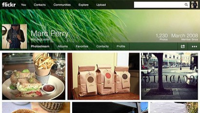
Claimed to be a "better, brighter Flickr" with an all-new design and Facebook-inspired profile page layout complete with cover photo, the update has received thousands of complaints, with one forum thread receiving more than 8,000 mostly negative comments from users overnight.
Flickr is owned by Yahoo, who has been attempting to revamp it products over the last 10 months since Marissa Mayer took the helm. In December it launched a revamped iPhone app for Flickr as it seeks to challenge the likes of Instagram and Facebook.
One commenter with the username [Carter], said: "I'm on a computer, not a phone. I want a usable site in which I can interact with a community, not a hideous 'internet 3.0' facelift that makes the site unusable but pretty on a tablet.
"You're killing your own efforts to create a viable internet community, Yahoo. Fire whatever executive is telling you that you need to throw features at the site every 8-12 months."
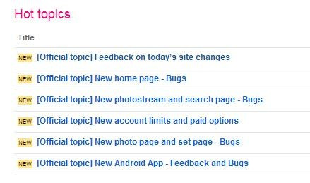
One thread, a poll asking users to vote for the freedom to choose between old and new layouts, gained more than 700 comments with the vast majority demanding Flickr revert to the old design, or allow users to choose which they want to use.
Another petition asking Flickr to revert to the old design amassed more than 500 comments overnight, while one thread is simply titled "RIP Flickr" and another asks for alternative photo hosting sites.

In a company blog post, Flickr's head of product Markus Spiering said: "We want Flickr to be the most amazing community and place for you to share your photos. So, we're also revealing a beautiful new design that puts photos at the heart of your Flickr experience, where they should always be."
Doublr
As part of the update, Flickr is also increasing its free storage to 1TB for each user which, it claims, is enough to store one photo taken every hour for forty years, or more than half a million 6.5-megapixel photos.
Many users are angry because they have paid for Flickr's premium service up to two years in advance, and are now claiming the website is no longer the service they originally paid for.
The changes see Flickr quietly remove its paid-for Pro service. Previously, free accounts had a 100MB per week upload limit and images were not stored at full resolution, while the $25 (£16.50) per year Pro accounts had no such cap. Now, with 1TB of space, free users can upload as much as they want, so long as each photo is no more than 200MB and each video is no more than 1GB or three minutes in length.
For $49.99 (£33) per year, the Ad Free service removes adverts from the user interface, and for $499.99 per year the Doublr service offers 2TB of space for photos and video, as well as removing all ads.
One user, with the screen name penlea1954, said: "How do I return to the original web layout, if not how do I get my money back as I have just paid this year's subscription and the new site layout is impossible to use...If the site does not improve I will delete my account and cancel my subscription. Who in the right mind came up with this new layout?"
User backlash to design changes of websites is nothing new, as almost every update to Facebook gains widespread criticism before users eventually get used to it, although Facebook users aren't asked to pay for a premium service.
Flickr has also updated its Android app to incorporate the new design, and although some Play Store reviews of the update complain about a buggy interface, we have seen no such problems during a brief test.
IBTimes UK has emailed Flickr to ask if it has a comment on the complaints, and if the ability to choose between layouts will be available in the future; we will update this story when we get a reply.
© Copyright IBTimes 2025. All rights reserved.


