Google's 'Project Athena' Brings Android-L like 'Material Design' User-Interface to Chrome OS

Internet major Google is working on designing a new User Interface (UI) for its Chrome OS. The new UI is part of a larger initiative by the company called 'Project Athena' that promises to bring a completely redesigned and new user experience to Chrome users.
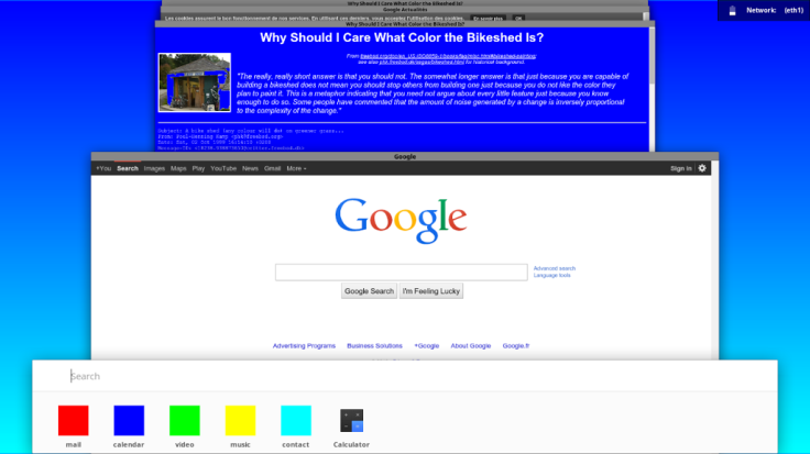
Project Athena is currently under development by the Chromium OS research team. However, various images of the new look UI have surfaced, and hint at better 'windows reorganisation'.
Check out the Project Athena image below:

The leaked image is suggestive of Google's latest Android L OS which has already started seeding via a developer preview version to Google's Nexus 5 and Nexus 7 devices.
Another aspect that is evident from the above image is the 'stacked card view' of multiple Windows (arrangement of all constituting Chrome Windows).
This view is similar to the multi-tasking view that Chrome for Android currently incorporates.
Google's Project Athena also seems to have brought out various changes such as pushing off of the app launcher and search to the bottom of the screen.
The new look UI for Chrome OS also seems to have laid emphasis on easy user navigation, a fact evident from the stack-like arrangement of Windows, and the neat pile-up of important/frequently used apps at the bottom of the screen.
However, with Athena still to exit the 'developmental phase', the official launch of the new look Chrome OS would take a comparatively longer time.
"Athena is a brand new project the Chromium OS team is experimenting with in order to bring a new kind of user experience", states Google's Francois Beaufort, in a Google+post.
Those interested in checking out the source code and compilations of Athena can navigate to the official Chromium web page.
Last month, Google introduced the 'Material Design' , which promises a refreshed look and design for Android L.
© Copyright IBTimes 2025. All rights reserved.


