HTC One Review - The New Android Standard Bearer [VIDEO]
Key Features:
- 4.7in screen (1920 x 1080; 468ppi)
- 32GB storage
- Android 4.1.2
- UltraPixel Camera
- HTC Sense 5 with BlinkFeed
- Price: From £41-a-month (£70 upfront) from EE
HTC One Review
HTC is struggling. It is reporting record sales slumps, and its One series smartphone in 2012 failed to spark the public's imagination.
2013 is set to be a make-or-break year for the Taiwanese company and that means there is an awful lot of pressure on the shoulders of the HTC One, the company's latest flagship phone. With no other products announced for 2013 so far, the fate of the company is - for better or worse - tied to the success of the One.
Luckily for HTC, the One is just about the best smartphone on the market today.
Design
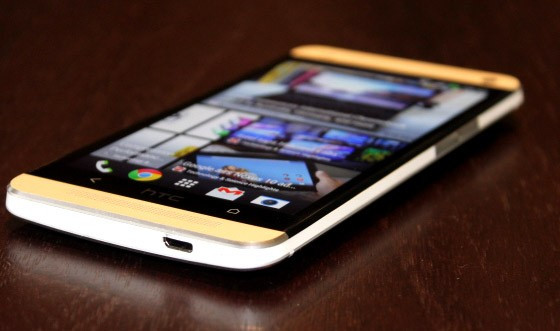
The HTC One is a beautiful phone. More comfortable than the Xperia Z, more premium than the Samsung Galaxy S4 and bigger than the iPhone 5, it is not an outrageous claim to say the HTC One is the best designed and best built smartphone on the market.
At 9.3mm thin and weighing 143g the HTC One is neither the thinnest nor the lightest smartphone around, but it doesn't matter. What matters is how it feels in your hand, and it feels great. The curved rear means it is a lot easier to hold in one hand than the fully-flat Xperia Z.
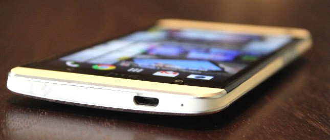
The phone is a combination of aluminium and plastic, but the latter doesn't detract from the look or feel of the phone, in the same way as the plastic construction of the Galaxy S3 and S4 do.
Everything here is precise and measured. The volume rocker on the right-hand side is flush with the phone's edge, but it remains responsive and solid. The power button on the top edge is an integrated IR blaster.
HTC has clearly put a lot of thought into each and every aspect of the design.
Layout
While the design and build quality are virtually flawless, the decision making process behind the positioning of some of the buttons is now so clear cut.
Firstly the power button is now in the top left hand corner, rather than the top right as was the case with the HTC One X and many other popular smartphones. As well as taking time to get used to the position, for a left handed user like me it make locking/unlocking the phone a lot more awkward (though for right-handers I guess it's a positive).
The bigger gripe I have is one which afflicts the wider Android eco-system and has to do with the buttons which sit below the screens of all devices.
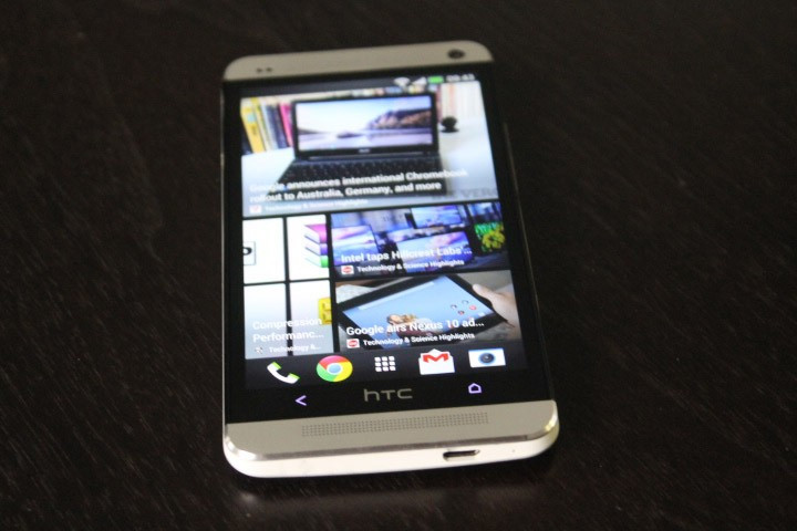
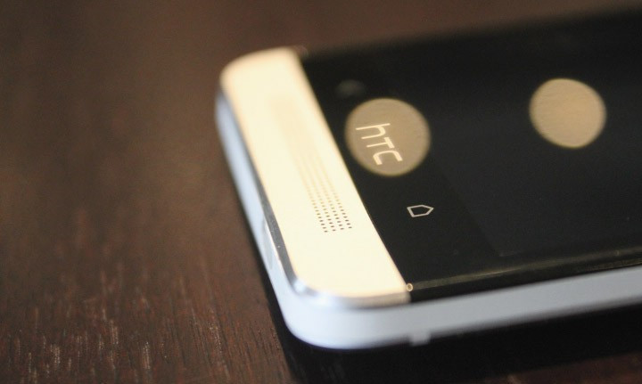
With the One, HTC has decided to put two rather than three buttons below the screen - Home and Back buttons flanking the HTC logo which I initially confused for another button.
This replaces the three-button layout on the One X, while Samsung also has a three-button layout on the Galaxy S3 and S4, though the order of the buttons is different.
It took some getting used to in order to use the One's two-button layout effectively. The lack of a third Menu button meant more on-screen buttons in some apps, leading to a confused look in some cases.
The problem here is not necessarily with HTC but with Google. Refusing to mandate a specific button layout means manufacturers can do what they like - leading to an inconsistent experience.
Screen
The screen on the HTC One is exceptional. With a Full HD resolution of 1920 x 1080 pixels, the 4.7in screen has a pixel density of 468 pixels per inch (ppi). This is far superior to the 326ppi of the iPhone 5's 4in screen, though how much good it does you is questionable, as identifying individual pixels on the iPhone's screen is impossible anyway.
Pixel density in and of itself doesn't necessarily make for an excellent display, but HTC's use of Super LCD3 technology has produced a screen with superb contrast, great colour reproduction and good viewing angles.
At 4.7in, the screen is at the top end of what I consider comfortable. The 5in+ screens seen on the Xperia Z, Galaxy S4 and Galaxy Note series are just too big for me, though with the trend for ever-bigger screens growing, it seems as if I am in the minority.
Hardware and Performance
Like the design, build and screen, HTC has not scrimped on the internals either. Powered by one of Qualcomm's Snapdragon 600 series chips, paired with 2GB of RAM, the phone's performance is impeccable.
Streaming HD video, intense 3D gaming and multitasking are all carried out without a pause for thought. The phone can at time become a little heated but nothing to worry about.

Google has also improved Android's stability meaning in the week I was testing the phone, only once and for a brief few seconds did the One revert to the bad old days of Android and seize up.
Storage is currently limited to the 32GB of built-in memory, with no way of increasing this via microSD. A 64GB version is said to be coming to certain territories.
In terms of battery power, I tweeted last week that I was getting a full day plus more from the One and it was the best battery life I had got from any high-end smartphone. I got a number of responses which disagreed with me, but over the course of a week, the phone never once ran out of battery by the end of the day - despite some intense use.
HTC also has a Power Saver mode which easily gave me a day-and-a-half use with the screen's brightness turned down and Wi-Fi turned off when asleep.
Connectivity is also well-covered with Wi-Fi, Bluetooth 4.0, DLNA and Wi-Fi Direct. The phone is compatible with the UK's only 4G network from EE, but will also support the up-coming 4G networks from O2, Vodafone and Three.
In terms of audio ability, the HTC One's terribly named BoomSound speakers produce rich and full sound which is completely unexpected from a smartphone. It was good to find that the neatly drilled speaker holes above and below the screen are there for something more than aesthetics.
Audio during calls was also excellent, with HTC including two microphones to aid noise cancellation and transmit only your voice and not the background din.
Ultrapixel and Zoe
Any high end smartphone these days needs to have a decent camera and while most other top Android smartphones in 2013 feature the same 13 megapixel sensor, HTC has tried something different with its 4 megapixel sensor.
While it may sound puny in comparison, the camera on the One has been dubbed Ultrapixel as a result of the use of a physically larger sensor combined with big pixels which are supposed to be able to soak up more light and therefore improve low light performance.
The physically bigger sensors are aided by a 28mm f/2.0 AF lens, optical image stabilisation, an LED flash and a new image signal processor.
You also get pre and post shutter image capture, allowing you to pick the best from a series of images, similar to the Time Shift feature we saw on BlackBerry's Z10.
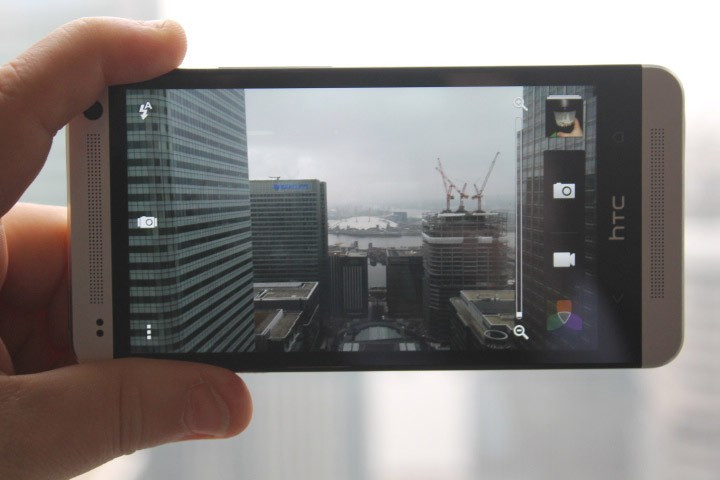
The camera app is excellent, offering so many settings it would take you days to go through them all, but everything from manual control of settings such as white balance and ISO are there, as well as the usual plethora of filters.
The app also allows for some impressive post-capture editing, aided by that Qualcomm chip.
In terms of performance, the One's low-light performance was superb, picking up light our own eyes could not discern. I felt the results were just a notch below those from the Nokia Lumia 920.
General performance was also good, though the lower resolution did mean that detail in images when zoomed in was lacking.

HTC has also developed a new feature called Zoe. Essentially it allows you to capture four or five full resolution still images per second while recording three seconds of 1080p video. The result is a short video file which is reminiscent of the moving images seen hanging in Hogwarths.
While it seemed like a bit of a gimmick initially, the ability to share these, put them together effortlessly with unique filters and music is superb and HTC should be congratulated for trying something a bit different.
Android, Sense and BlinkFeed
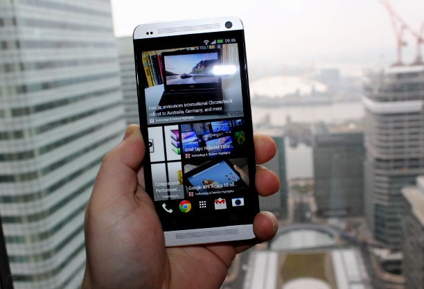
HTC's Peter Chou focused on two features during the launch of the new phone in January. One was the Ultrapixel camera, the other BlinkFeed, the company's attempt to replace your homescreen with a constantly updated visual news feed.
At first the implementation is jarring and confusing. The system works by pulling in disparate new feeds from sources like the Guardian, Reuters, TechCrunch and others. It will also draw in updates from Twitter, Facebook and Zoe - HTC's new photo and video sharing service.
The result is a Flipboard-like feed of stories and social network updates that can seem overwhelming. That is until you refine the feed somewhat. Removing Twitter and Facebook helps, but even at that, if you include everything you are interested in, the feed just becomes cluttered and confused.
BlinkFeed is best used for just one or two subjects (football, movies, science etc) rather than as a general news feed.
In its current format BlinkFeed feels unfinished. The fact you can't import your own feeds means the system is fairly limited, but I assume HTC will work on improving this, and when it does, BlinkFeed could actually become something useful rather than a tacked-on addition to Android as it feels now.
In addition to BlinkFeed, HTC has tweaked a lot of the stock Android interface. While that in the past has meant a confused and slightly ugly look, Sense 5 has been refined and is now a slick and easy-to-use custom skin.
HTC has pre-loaded a couple of its own apps including the movie rental service Watch, a funky and interactive Gallery app and the TV app, which works in conjunction with the infra-red blaster on the top of the phone to turn the One into an all-in-one remote.
Using the TV app you can tell the phone which country you are in, which TV service you subscribe to (Sky, Virgin, Freesat) and which channels are included in your package. It will then bring up listings for the channels and highlights will even show up in your BlinkFeed timeline.
Setting up the phone to work as a remote control was straight forward and worked effortlessly for my TV and set-top box, and while it is a bit of a gimmick, should you be unable to locate the remote and have your phone in your hand, it could save you having to get off the couch.
Verdict
The HTC One is the best built, best designed smartphone I have ever used. Its combination of aluminium and plastic together with a large, bright and sharp screen puts it right at the top of the smartphone pecking order.
There are a couple of niggles with the button layout and BlinkFeed feels unfinished, but with a superb camera, powerful processor and excellent smartphone speakers it is hard to fault the HTC One.
In terms of cost, the HTC One is likely to be on a par with the iPhone 5, Samsung Galaxy S4 and Sony Xperia Z, meaning it will rely on its features in order to stand out.
HTC has built a superb smartphone, I only hope it puts as much effort into marketing the phone as it obviously did in building it.
Scores
- Overall 9/10
- Design 10/10
- Performance 9/10
- Screen 9/10
- Battery 9/10
- Value 8/10
The Good
- Superb build-quality and design
- Excellent screen
- Great camera
The Bad
- Confusing button layout
- BlinkFeed feels unfinished
© Copyright IBTimes 2025. All rights reserved.


