Sony Xperia Z vs HTC One – The Battle for Third Place
With Samsung and Apple likely to continue to dominate in 2012, we assess the prospects of the two smartphones vying for third spot in 2013.
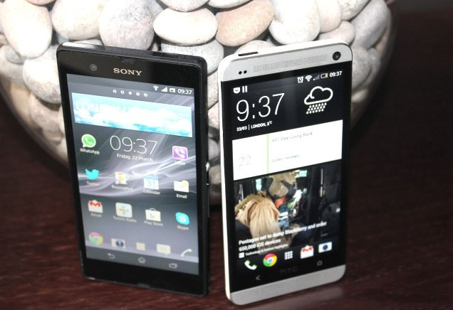
The two smartphone sitting on my desk are so superbly designed and so powerful that had I shown them to someone just five years ago, they very well could have accused me of being from another, altogether more advanced civilization in a faraway galaxy.
Today, the smartphone market is such that the HTC One and the Sony Xperia Z are also-rans behind the behemoths that are Apple and Samsung's flagship smartphones.
It matters not a jot that both these phones are in many ways superior to the Galaxy S4 and the iPhone 5, they will be regulated to third spot at best battling for the scraps from the gilded tables of Apple and Samsung.
So should you want take the road less travelled, which smartphone offers the best alternative. I look at the design, screen, interface and price to help you decide:
Design
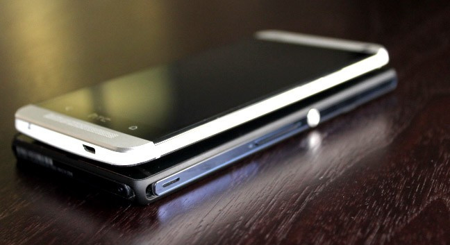
Design and build-quality are probably the two areas where these phones stand out the most from the crowd. I have already said the HTC One is the best designed and best built smartphone on the market, but the Xperia Z is not far behind it.
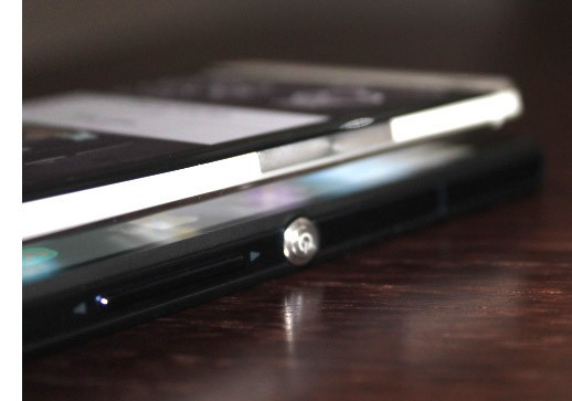
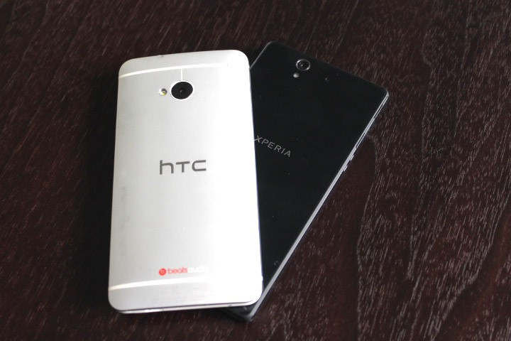
The One combines aluminium and plastic in a way which doesn't feel in the least bit cheap or second rate. It is slim, weighs just the right amount to feel comfortable without feeling unsubstantial and looks beautiful.
The Xperia Z is slimmer (7.9mm versus 9.3mm) and weighs almost exactly the same (146g versus 143g) as the HTC One yet it has a larger screen (5 in versus 4.7in). It uses what Sony calls its OmniBalance design language which has been replicated on the equally stunning Xperia Tablet Z.
The fully-flat design, squared edges and large silver power button give the phone an aesthetically pleasing aspect, but in the hand the Xperia Z just doesn't feel as comfortable as the One, which has a curved rear to better fit your hands.
In my opinion the HTC One is the better designed phone, but only by a short margin - and both beat the Galaxy S4 and the iPhone 5.
Screen
As I mentioned above, the Sony Xperia Z has the larger screen. At 5in with a resolution of 1920 x 1080 pixels the screen has a searingly sharp pixel density of 441 pixels per inch. The HTC One has the same resolution and because of the smaller 4.7in screen has a slightly higher pixel density of 469ppi.
But what does that all mean?
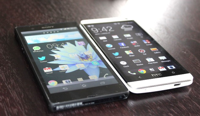
It means both screens are incredibly sharp, to the point where you cannot identify individual pixels with your naked eye no matter how close you get to the screen. It makes reading text and browsing the web a great experience.
For me 5in is slightly too big but for those of you without small hands, the Xperia Z screen is probably as easy to use as the One's 4.7in screen.
The difference comes in the type of technology used in the displays. HTC uses an LCD3 screen which has been laminated to bring what's displayed as close to the surface as possible. Contrast is create, the screen is bright and rich (though not as much as the Super AMOLED screens on Samsung's Galaxy line) and there is little to no contrast shift when viewing from an angle.
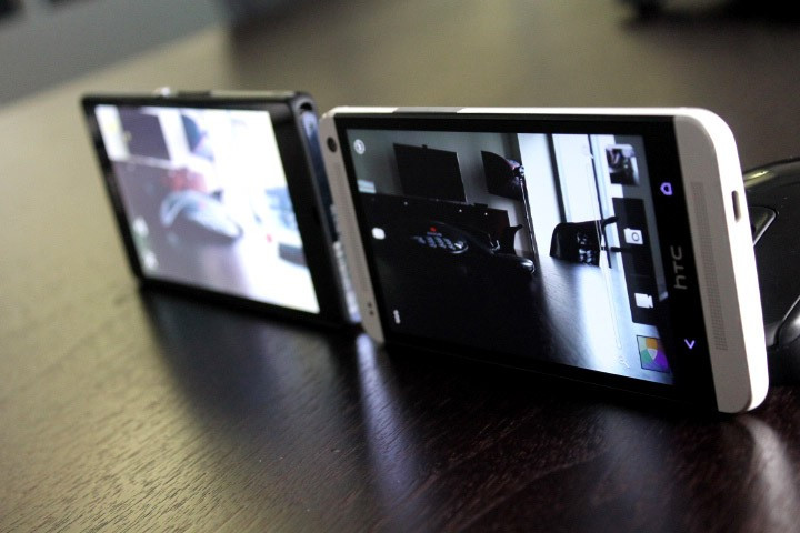
Sony on the other hands uses a TFT panel powered by its Mobile Bravia technology, the same technology found in its televisions. I found this screen to be superb, until that is I held it side by side with the HTC screen (both on full brightness) when the Xperia screen looked washed out and dull.
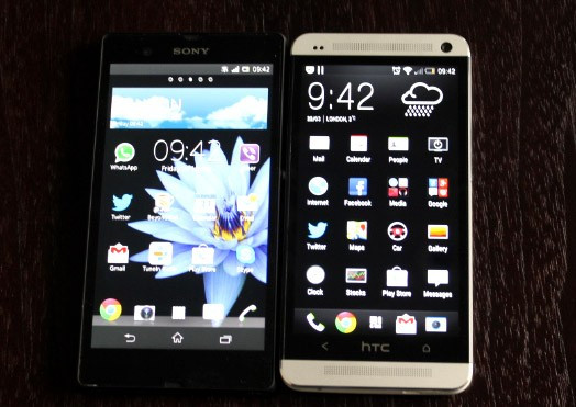
The difference is most noticeable when displaying the app drawer on a black background, but any movement away from a straight-on viewing angle and the Xperia Z's display suffers.
While it's hard to call the Xperia Z's display poor (and it's not), the HTC One is certainly a step up.
Interface
Both phones come with Android 4.1.2 with both companies saying they will upgrade this to Android 4.2 in the future.
Android phones have been plagues by poor implementation of manufacturers' own UI skins but in the past 12 months we have seen the likes of Samsung and HTC changing their ways and getting out of Android's way to a greater extent.
HTC's Sense version 5 which ships with the One is a case in point. It has reduced lot of the clutter which beset previous versions and with a bit of tweaking you can create a interface which is simple and effective.
The big change with Sense 5 of course comes with BlinkFeed, which is HTC's attempt at re-imagining the homescreen as a FlipBorad-style pictorial newsfeed. It's an interesting idea and it may work, it's just slightly unfinished at the moment.
Sony's take on Android is similarly sleek. While it has pre-installed a number of Sony widgets and apps these can all be removed giving you a blank canvas to work with. The use of three rather than two navigation buttons is also more to my liking.
Sony, more than any other smartphone manufacturer - at least until Amazon enter the fray - should be able to offer its users a complete eco-system of music and film from its in-house stable of artists.
While it does offer access to its own stores through its own apps, the whole thing feels a bit disjointed and probably won't feel complete until Sony force people to only buy content from its stores - like Apple and Amazon does.
But of course this will lead to its own problems and Sony as yet doesn't have the power to take this bold step.
Price and Value
Unfortunately neither Sony or HTC has managed to offer their 2013 flagship phones at a price which would make people sit up and take notice. Both phones cost in or around £500 SIM-free or on expensive 24-month contracts.
Had either Sony or HTC been able to undercut Samsung and Apple by at least £100 then it would have given people a lot to think about when changing their phones.
Considering the build-quality, the excellent screens and top notch hardware it is not a surprise these phones cost as much as they do, but if either want a chance at challenging Apple or Samsung then I think price may be there best bet.
© Copyright IBTimes 2025. All rights reserved.


