iOS 7 Review: The iPhone's Biggest Update Yet
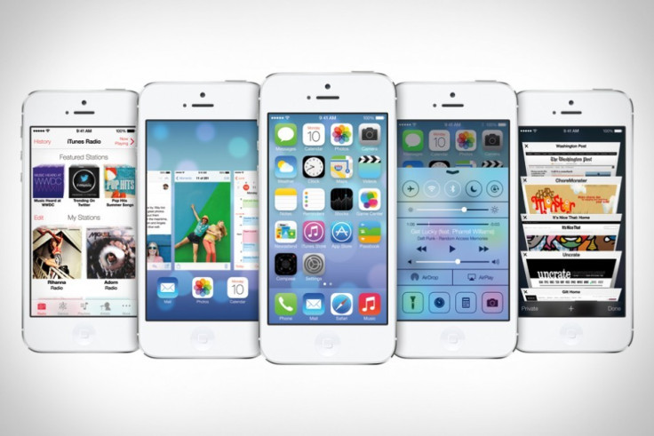
In six years the iPhone's user interface has changed very little. New and much-needed features like cut-and-paste, the App Store and multitasking arrived with each major annual update, but visually not much has changed - until now, with the launch of iOS 7.
Key Features:
- All-new user interface design
- Updated Notification Center
- New Control Center
- More intelligent multitasking
- Available: 18 September; free for iPhone, iPad and iPod touch - check device compatibility guide for full details.
Available for the general public to download from 18 September for the iPhone, iPad and iPod touch, iOS 7 is the biggest visual change in the devices' history, and marks Apple design chief Sir Jony Ive's first attempt at creating software to match his hardware.
We look at some of the biggest changes, and reassure iPhone users everywhere that change is a good thing.
iOS 7: Lock screen, Home screen, keyboard, search and folders
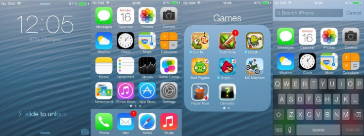
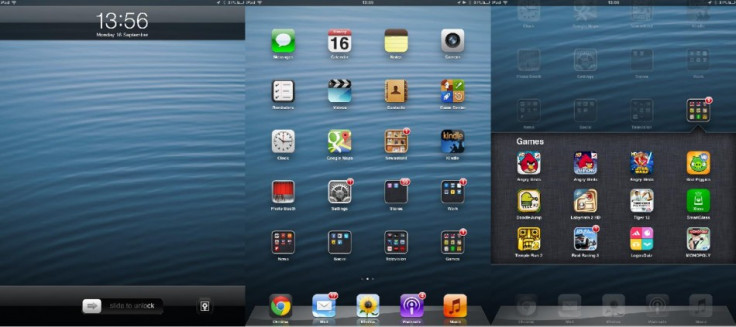
It's a small thing, but press the Lock or Home button and the lock screen illuminates gradually with iOS 7; like rows of lights turning on in sequence down a corridor, the backlight, time, date, signal strength, wallpaper and 'slide to unlock' message populate the screen in around a second. Small, as I said, but a sign of the attention to detail Apple has gone to with this update.
From the lock screen you can either slide right to unlock, down from the top edge to open the updated Notification Center, or upwards from the lower edge to open the new Control Center.
Using the iPhone's accelerometer, Apple has created the illusion of icons sitting above the wallpaper, and tilting the phone lets you peek around them. The animation serves no real purpose, but is distinctly Apple in its ability to draw attention to the simplest of things.
Apple has relocated Spotlight search for iOS 7. Where before a swipe from left to right opened the search box, it's now found by dragging a finger down from the middle of the screen, pulling a search box down with it. This now leaves an empty space to the left of your Home screen, which I expect to see Apple make use of in the future.
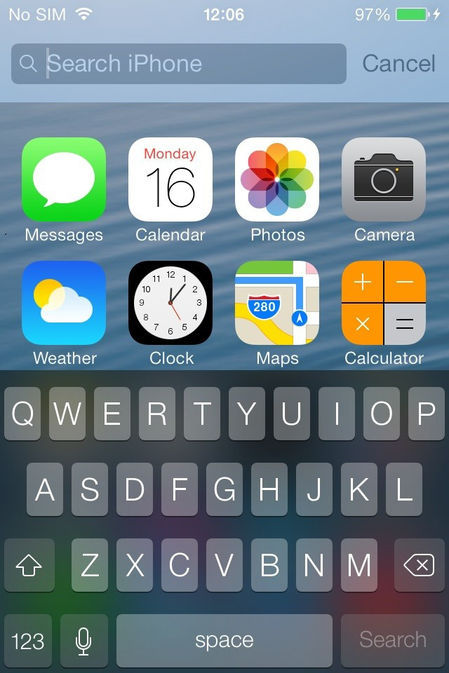
Opening search gives us our first look at the new keyboard. The background is semi-transparent and mirrors the colour of whatever is behind it, while the keys are now light grey instead of white, and the characters written on them are white instead of black. The keyboard uses the new Helvetica Neue font, as is commonplace across the entirity of iOS 7.
Of course the elephant in the room here are the new app icons. At first the home screen seems a mess; nothing is familiar and you may wonder why Apple has bothered changing so much for purely aesthetic reasons.
But give it a day and you'll be over it. If you leave your apps in the default positions then they are still broadly recognisable; the green of Messages in the top left, blue of Weather below it, grey of Camera in the top right and the green and blue of Phone and Mail in the lower left - the changes aren't as profound as they first appear.
Finally, there's now no limit as to how many apps you can store inside a folder, making it possible for most users to have everything on a single Home screen.
Notification and Control Center
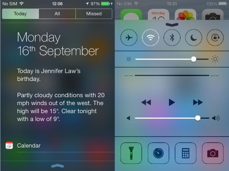
Although still revealed with a swipe down, Notification Center for iOS 7 is all-new, split into three sections marked Today, All and Missed.
The Today tab gives the current day and date, a summary of your next calendar event for the day - or friends' birthdays pulled from Facebook - and a written description of the current local weather.
Below this is a timeline of all calendar events for the day followed by share prices pulled from iOS's Stocks app; after that there's a brief summary of your schedule for tomorrow.
Next is the All tab, which displays all recent notifications from apps like Facebook, Twitter, Calendar, Mail and many others. Finally, Missed is where notifications will go if they weren't seen the last time you looked at Notification Center.
With iOS 7, notifications know when they have been responded to elsewhere. Say a Facebook contact starts a chat with you and your iPhone beeps accordingly, leaving the message on the lock screen. If you then take up that conversation on your laptop or tablet, the iOS notification disappears, knowing you have read it elsewhere.
Completely new in iOS 7 is Control Center. A swipe up from the bottom edge of the screen reveals a semi-transparent panel broken up into four sections. There are on/off toggle switches for Airplane mode, Wi-Fi, Bluetooth, Do Not Disturb, and Rotation Lock, but unfortunately these cannot be removed or changed; the ability to swap Rotation Lock for Wi-Fi Tethering would have been useful, for example.
Next is a screen brightness slider, followed by media playback and volume controls, and then finally there is a toggle switch to use the camera flash as a torch, along with shortcuts to set a timer, open the calculator and launch the camera app. Again, these cannot be changed.
Multitasking
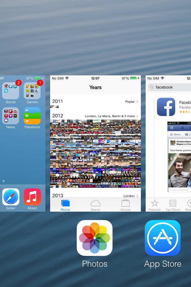
A double-press of the Home button opens the iOS multitasking drawer, showing a horizontal list of the icons of open apps and a small preview of each. Apps are closed by flicking the preview up and away, and up to three apps can be swiped away and closed at a time.
Underneath the shiny new interface iOS 7 brings some clever changes to how iPhones and iPads deal with applications running in the background.
Apps will check for updates at power efficient times - such as when the device is connected to Wi-Fi or has a strong 3G/4G signal. iOS 7 can also refresh apps when it thinks you will need up-to-date information. Say you check news apps at 7am every day, the system will learn this behavior and start to update those apps shortly before that time, so the latest headlines are waiting for you.
Safari
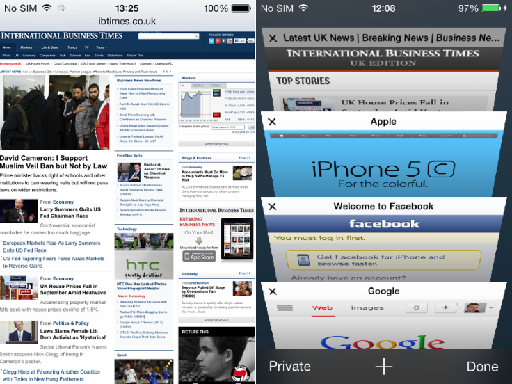
iOS 7 has replaced Safari's interface with a unified address/search box which minimises when you scroll down, giving more screen space to the page you're viewing.
Appearing as a vertical list of all pages you have open, the new tabs layout scrolls past like an old rolodex and sits in front of a background which is slightly transparent, revealing your wallpaper behind.
Finally, Safari for iOS 7 has a section where links tweeted by anyone you follow on Twitter appear in a dedicated feed.
Siri
After two years Siri is finally out of the beta development stage, and in iOS 7 it can deliver content from Bing, Wikipedia and Twitter. The personal assistant can now also return missed calls, play voicemail messages, adjust screen brightness and launch apps.
Camera and Photos
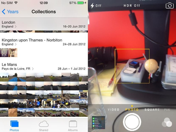
Apple's iOS camera app has always been quite basic compared to some Android and Windows Phone alternatives, but for iOS 7 a few extra features have been added, along with a design change.
Switching between shooting regular, square, panoramic photos and video (and slo-mo on the iPhone 5S) is done by swiping left or right. There are also eight Instagram-style filters to choose from, and can be applied before or after a photo is taken - although this depends on the device you're using, check our compatability guide for full details.
Photos can still be viewed as albums (including your device's camera roll) but now there are a number of smart albums to help catalogue photos based on when and where they were taken.
First photos are grouped by year; tap to reveal 'collections' within that year which are grouped together based on date and location, then tap once more to see larger thumbnails of photos iOS thinks were taken at the same time.
iOS 7: Conclusion
This is just an overview of some of the biggest changes introduced by iOS 7. Every single Apple app has been updated to feature the new design direction Apple is taking, and of course third party app developers will now be working to update their work accordingly.
At first, iOS 7 is shocking. We iPhone owners have had the same operating system - visually, at least - for six years now and to change absolutely everything was a brave move by Apple. But once you get used to the new features and familiarise yourself with the new icons, iOS 7 makes perfect sense.
It's simpler, but more than that it's change, and after those six years change is what was needed. Installing iOS 7 makes your phone feel brand new again.
Must Read:
© Copyright IBTimes 2025. All rights reserved.


