iOS 7: Top 10 Updated iPhone Apps
With iOS 7, Apple has introduced some major visual changes to the iPhone and iPad operating system, and developers have been working hard to make sure their apps have the same look and feel as Apple's new software.

To promote applications already updated to use iOS 7's new design and features, Apple has added a Designed For iOS 7 section to the App Store, where you'll find every app that has been updated so far. Here we have 10 of the biggest apps to get the iOS 7 treatment from day one.
Facebook (Free)
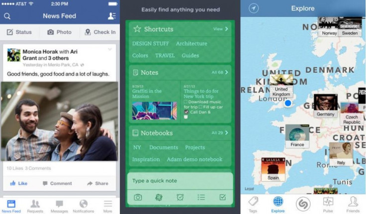
Facebook has updated its iOS app to include the same white menu bar at the foot of the screen as used by many pre-installed iOS 7 apps. The bar offers links to your news feed, friendship requests, chat conversations and notifications, and a link to see a submenu including your profile, events, friends list, groups, settings and more.
Copying the semi-transparent elements of iOS 7 - like the Notification and Control Center - the blue bar at the top of the Facebook app is slightly transparent, blurring but not completely covering your news feed as it scrolls underneath.
Twitter (Free)
Twitter has taken iOS 7's new 'flat' design and used it to update the top bar of its app and most buttons, removing all shadows and colour gradient. The paler shade of blue used also reflects iOS 7's softer colour pallette.
Twitter has not followed Facebook in swapping the lower menu bar from back to white, but as most other updated apps are taking this design route, we expect to see Twitter do the same with a future update.

Evernote (Free - £3.99 for Premium)
If Twitter has done the bare minimum to make itself iOS 7-friendly, then Evernote has done the maximum, changing just about the entire user interface to reveal an app that follows iOS's shift away from real-world metaphors and towards a clean and crisp design theme.
Thanks to a permanent button appearing on every screen of Evernote, adding a new note is never more than one tap away - previously users had to navigate to a specific screen to create a new note.
Images and PDFs can now be annotated, although you'll need to be a paying member to edit the latter - and all notes are automatically synced in the background to your account and across devices, using iOS 7's new multitasking tools.
Shazam (Free)
As with most other updated apps, Shazam has removed the black theme of its lower menu bar, replacing it with crisp white icons set on a bar that is transparent, mirroring the blue background colour present throughout the application.
Shazam has also updated its fonts to closely resemble Helvetica Neue used by iOS 7; the app's new typeface is thinner than before and slightly smaller.
As for new features, the iOS 7 update of Shazam includes the ability to mention friends and places when they share a tagged song to Facebook, and there is extra language support for Czech, Polish and Russian.
New York Times (Free - plus subscription)
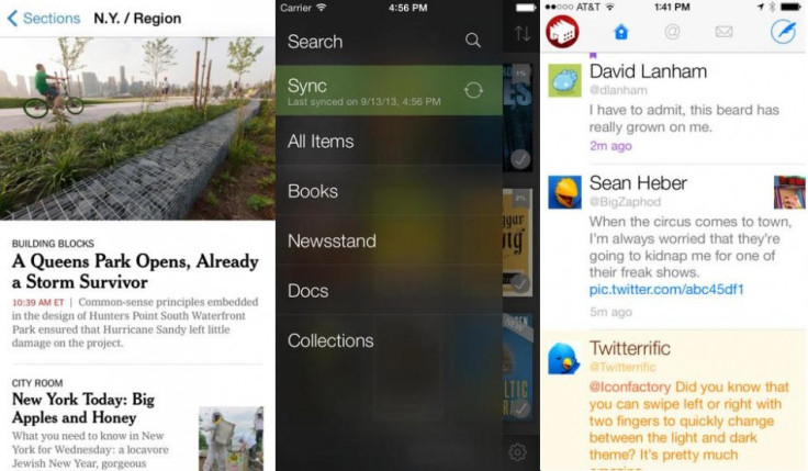
The New York Times app has also been given the iOS 7 treatment, which here includes a semi-transparent menu bar at the top to indicate which section you're viewing.
But with this app the black bar menu at the foot of the screen has been removed altogether, and instead navigating from one section to another is now done with a swipe to the left or right - similar to the new gesture used by Safari to flick back and forth through open pages.
Finally, using AirDrop (only available on the iPhone 5 and newer hardware) readers can more easily share stories from the app with each other.

Kindle (Free)
Amazon has always used a dark theme for its Kindle applications - and indeed the Kindle Fire tablets - so it's no surprise to see the bookseller reluctant to embrace Apple's white theme for its iOS 7 update.
The library page remains two shades of grey and includes Apple's new simplistic icon set, but once reading a book the slide-out navigation menu is as white, grey and flat as the rest of the operating system.
Clean, crisp and with a satisfying lack of wooden bookshelves and folding page animations, the updated Kindle app fits Apple's new design brief while maintaining its own identity.
Twitterrific 5 (£1.99)
An alternative to Twitter's own application, Twitterrific 5 gets the full iOS 7 treatment, from the thin Helvetica Neue font and transparent panels, to simpler icons and a top menu bar that blends into iOS's own status bar for signal strength and battery life.
Capitalising on iOS 7's new background multitasking, Twitterrific can now download tweets and update your timeline in the background, so it's always up to date when you launch the app.
Finally, Twitterrific can now use Safari Reading List as a bookmarking service to save tweeted links to read in the browser app later.
Digg (Free)
Yet again it's a white, grey and flat update - Digg has added the seamless top menu bar adopted by most applications, as well as the same monochrome colour palette shared with much of iOS 7's menu system.
As with other apps which rely on being up-to-date as soon as they are launched, Digg makes use of the new background multitasking in iOS 7; if you regularly open Digg at 7am, for example, iOS will learn this and update the app's content shortly beforehand.

AroundMe (Free)
Another app to embrace Apple's white-and-flat design brief with iOS 7, AroundMe has implemented exactly the same menu design and icons as the operating system it's running on, along with a range of pastel colours for each topic the app is designed to help you find.
There is the slightest degree of transparency to the top menu bar, which blends seamlessly into the operating system's own status bar, making the app seem more integrated with the OS and helping to make the iPhone's screen appear larger, having reduced the number of sections splitting it up.
Finally, AroundMe has implemented iOS 7's new swipe back gesture, so a swipe from left to right will see you return from the page of a specific pub or cafe back to the search results page.
OmniFocus 2 (£13.99)
Like Evernote and AroundMe, the developers of OmniFocus have treated the move to iOS 7 as a chance to completely update their interface. Visually, the update closely mirrors Apple's Calendar app in iOS 7; there is a clean white background, contrasted by the use of bright colours to indicate different types of event and reminder.
As with the NY Times app, there is no white menu bar at the foot of the page in OmniFocus 2, but the rest of the app is very similar to iOS 7; from the semi-transparent top menu bar and pastel colours, to thinner fonts and simplified icons, this app could pass for one of Apple's own.
© Copyright IBTimes 2025. All rights reserved.


