Samsung Galaxy S3 Review of Reviews


Samsung made a huge deal of the launch of its flagship 2012 smartphone, the Galaxy S3, and with the phone going on sale this week, the first round of reviews have gone online, and we have brought together some of them to give you an idea of whether or not this phone is worth paying a lot of money for or committing to a new 24 month contract.
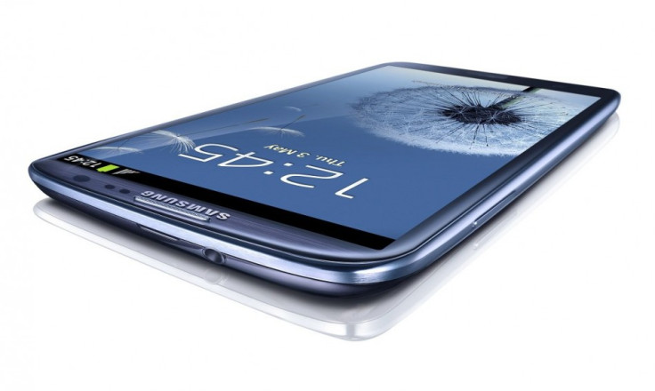
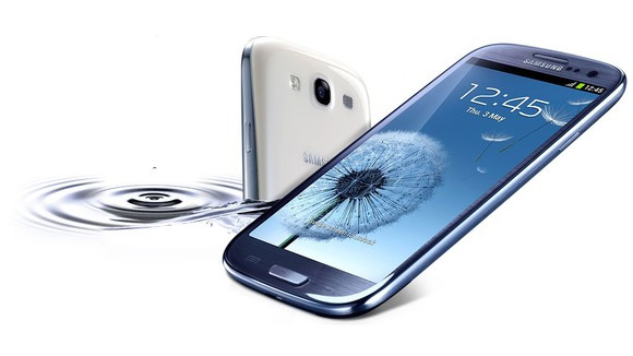
The Galaxy S3 features a 4.8in Super AMOLED screen, with a resolution of 720 x 1,280; a quad-core CPU running at 1.5GHz, will come with Android 4.0, has an 8 megapixel camera, and has a Siri-like feature called S Voice.
Samsung is hoping that the Galaxy S3 will be at least as successful as its predecessor, the Galaxy S2, which has sold over 20 million units since launching last year.
Samsung is currently the largest vendor of smartphones, as well as phones in general, in the world and the South Korean company will be hoping the launch of this phone will help it remain in this position.
However, the success or otherwise of the Galaxy S3 will depend to a large extent on the critical reception it receives and the first raft of reviews have appeared online with a generally positive reaction, though with some concerns about the design of the phone as well as the TouchWiz UI.
Samsung Galaxy S3: Review of Reviews

Chris Davies from SlashGear
Davies calls the design of the Galaxy S3 "contentious" adding:
Does it feel cheap? That probably depends on what you're coming from: if it's an iPhone 4S or an HTC One X, then yes, there's a strong possibility that the glossy plastic of the Samsung will prove a tactile disappointment. Those stepping up from the Galaxy S II, however, will find a more cohesive design in the hand, with fewer contrasting textures.
What first seems a simplistic design - reminiscent of a bar of soap, particularly with our white review unit - makes more sense as you live with it. There's no ridge on the lower back section, unlike the Galaxy S II and Galaxy Nexus, which means it feels slimmer than its 8.6mm thickness (just 0.3mm thinner than the Nexus, but a fair difference from the Galaxy S II which is 9.89mm at its fattest point). The curve of the corners has a shallower radius than on the Nexus, too, which helps the new phone feel softer and more comfortable when you grip it.
Vlad Savov from The Verge
The Galaxy S II set a high bar for smartphone camera performance, but the Galaxy S III has beaten it. Image quality on this phone is simply excellent. Full-resolution pictures look sharp and detailed, allowing you to crop in on areas of interest, unlike the HTC One X, which can furnish you with some neat results, but never at the full 8-megapixel resolution. The fact the Galaxy S III can achieve that feat means it has a higher usable resolution than the One X - and pretty much any other smartphone on the market.
That having been said, the Galaxy S III is a technological triumph. Not at first sight, perhaps, but Samsung has done the overwhelming majority of things right. The camera is easily the best I've used on an Android device, the processor claims the title of benchmarking champion, and the customizations layered on top of Ice Cream Sandwich are mostly unobtrusive and sometimes even helpful. They never really gel into one coherent user experience, meaning you'll have to learn what each new feature does individually rather than intuiting it from the phone's general behavior, however that's a trifling complaint when compared to our usual disappointments with Android OEM skins. TouchWiz may still have its illogicalities, but it's been cleaned up and streamlined sufficiently to make it an adequate alternative to Google's stock experience. While neither the display nor the construction materials on the Galaxy S III are the best possible, both represent acceptable compromises that help Samsung balance out the rest of its class-leading spec sheet.
Sharif Sakr from Engadget
The GS III's display is a 4.8-inch window onto wondrousness and certainly a major selling point. It has all the contrast and deep blacks that we've come to love from AMOLED displays, but it's also bigger than average, with a healthy pixel density and -- most importantly -- much better color rendition than some older AMOLED screens.
Six months of progress has led to real visual improvements since the Galaxy Nexus, even though the underlying screen technology is the same: colors aren't over-saturated and they don't have that unnatural blue-ish tint. In fact, the color temperature is very similar to that of the HTC One X, which uses more conventional LCD technology, and that's a huge accomplishment for Samsung.
Although it doesn't sound like much, the extra screen size is noticeable and great to have. It's 0.1 inches bigger across the diagonal than the HTC One X, and 0.15 inches bigger than the Galaxy Nexus - which equates to a seven or eight percent difference in surface area. When it comes to watching videos, reading e-books or surfing websites, every fraction helps. In fact, if you almost made the leap to the jumbo Galaxy Note but couldn't quite convince yourself it was sensible, then the GS III could be the compromise you've been waiting for.
Gareth Beavis from TechRadar
Samsung has unsurprisingly re-tooled the Touchwiz overlay for the Galaxy S3, and has really gone to town with the whole 'inspired by nature' business.
For instance, the lock screen now becomes more interactive than ever. You don't get a visual clue when you're unlocking (which may be a nod to the litigation brought forth by Apple on the subject) but touch the screen and you'll see a little water ripple under the finger.
Added to that is a little water drop sound, and the whole effect is surprisingly pleasing. We can see it irritating a few people after a while though, so turning it off will probably be a decent option.
Samsung has taken a leaf out of HTC's book as well with the new overlay to the Galaxy S3 by allowing users to open up specific applications from the lock screen. Simply swipe the application upwards and you'll be taken directly to it without having to navigate within the phone itself.
We still prefer the HTC Sense method of dragging the icon into the styled ring, but it's a real time-saver when you want to open the camera to get a quick snap for instance.
Luke Westaway from CNET UK
The S3 is not a phone for folk with modest mobile needs or small amounts of cash to spend on a blower. Happily, those guys are spoilt for choice -- with so many great mid-range Android phones to choose from which will serve their mobile masters as faithfully as Old Yeller.
The S3 is a phone for people with serious power needs and a healthy bank balance. If you want a device for 3D gaming, HD video streaming and browsing the web -- I don't mean faffing around with mobile versions of websites or lightweight apps -- the S3 has the super-powered engine and massive display you're looking for.
Indeed, this phone sits at the very top of the smart phone spectrum -- rival high-end Androids at this lofty price are hard to find. The main alternative is HTC's quad-core brute -- the One X -- which is actually more affordable than the S3 but not such a powerhouse, judging by our benchmark tests.
The monthly toll for the S3 could buy you Apple's top-of-the-range blower, the iPhone 4S. Its iOS software is generally slicker and easier to use than Android but won't appeal to people who really like to drill down, tweak, tinker and customise their kit. So it's horses for courses.
It goes without saying that S3 buyers aren't likely to need hand-holding where technology is concerned -- instead they'll relish the fine-grained opportunities Android opens up for customising and controlling your digital environs.
© Copyright IBTimes 2025. All rights reserved.


