Sony SmartWatch 2 Review - Timely Update or Waste of Time?
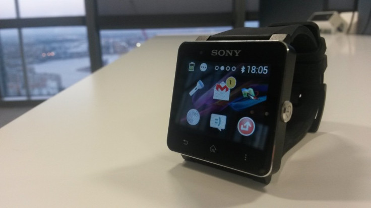
Key Features:
- 1.6in display, resolution 220 x 176
- Bluetooth 3.0
- NFC for quick phone pairing
- Three-day battery
- Water resistant
- Price: £149
Sony Smartwatch 2
Joining the Pebble and Samsung Galaxy Gear, the SmartWatch 2 is Sony's attempt at convincing consumers their smartphone needs a second screen, bringing call, text and email notifications to your wrist in a device that looks more watch-like that it's South Korean rival.
The Smartwatch, Pebble, Galaxy Gear and much anticipated iWatch are all part of an expected revolution in wearable technology and the "quantified self" which low power chips like Apple's M7 along with flexible displays are meant to herald in 2014.
While Sony and Samsung will be boasting about being the first to market, these devices are very much previews of what is to come.
But this is Sony's second attempt at a smartwatch, so has it learnt anything from the first time round and made a device that is actually useful?
Your smartphone's second screen
I'm always missing text messages. Facebook notifications, emails, tweets and phone calls too. At work my phone's on silent (which I forget to turn off when I leave); when outside I very rarely hear my phone ring, and I never feel its vibration in my pocket when walking.
But the SmartWatch 2 vibrating on my wrist has never failed to catch my attention, and a week with it has proved to me that the smartwatch concept isn't as daft as it first seems.
There are more anecdotes - like when you get a text message or email while on the phone. It beeps in your ear, but navigating to the message while keeping up the conversation is a pain. Not so with a smartwatch, which displays the message on your wrist a moment later
After just a couple of days the smartwatch was making sense to me, but would it last?
Setup
The SmartWatch 2 works with any Android phone running version 4.0 Ice Cream Sandwich or newer, and set up can be initiated by NFC if your phone supports it.
Turn both devices on, touch the phone and watch back-to-back, and you'll be asked to download Sony's free Smart Connect app from the Play store. Open the app, accept the watch's pairing request, download the SmartWatch 2 app as prompted, and you're good to go.
For non-NFC phones, connect to the watch like any other Bluetooth device, by scanning and then pairing to it.
There's no need to pair the watch more than once, as it automatically reconnects when it sense your phone is within range.
Once the watch's app is installed, a permanent shortcut is added to your phone's notification bar. Swipe down from the Android home screen, tap the watch, and you can then edit how each of the watch's apps behaves; you can also search the Play store for SmartWatch apps from this page.
Sony SmartWatch 2: Look and Feel
It might seem daft to point this out, but the Smartwatch 2 looks like a watch - it's not a wrist-worn computer from a 1980's sci-fi film, nor is it the cumbersome Samsung Galaxy Gear.
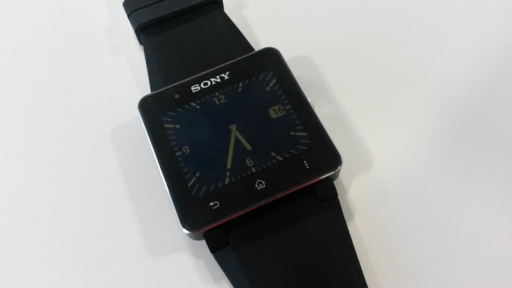
There's a 24mm strap which can be easily replaced with any other strap sold in a watch repair shop; the square, 41mm case doesn't feel any bigger or heavier than my regular watch; the time and date is displayed clearly and accurately - it's a watch.
Sony makes the rubber strap in black, yellow, pink, purple and turquoise, and there's a leather model available in black or brown.
The 21mm-thick case is made from glass and aluminium, with every side coloured matt black, save for a chamfered chrome lip around the upper edge. At 122.5g, the Sony is noticeably lighter than conventional watches of a similar size.
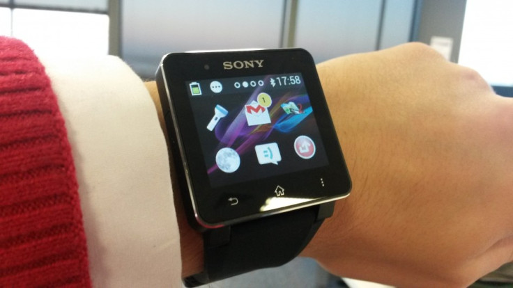
There's just one button on the SmartWatch 2, located where you'd normally find the crown; one press illuminates the time, a second press launches the home screen, full of apps and notifications.
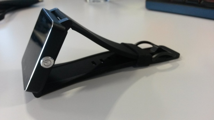
On the left of the case there's a microUSB port for charging with the included cable, but because the watch is 'water resistant' - you can do the dishes with it, but don't go swimming - the port is covered by a door that's almost impossible to open. I simply couldn't open it with my fingernails, and found only my driving license thin enough to prise it open. Sony really needs to provide a tool to do this, or make the door from rubber to aide opening it with fingers.
Finally, the 1.6in LCD screen has a resolution of 220 x 176. It's a world away from HD, and everything looks a little rough around the edges where you can see individual pixels, but it's bright, can show the time clearly without using the backlight (unless it's dark, of course, in which case you press the button) and viewing angles are good.
Sony SmartWatch 2: Software
Two presses of the watch's button takes you to the home screen, where pages of application icons sit above a wallpaper and menu bar familiar to any Sony Xperia smartphone user.
It's not Android, but the limited functions available perform in a similar way. Swipe down to reveal your notifications, and left or right to flick between home screens.
Notifications are a big reason to invest in a smartwatch, but Sony's work to perfect this headline feature feels half-finished at best.
There's a slight pause between notifications hitting your phone and arriving on the watch over Bluetooth - you'll be fishing your phone out of your pocket before the watch alerts you to the same message.
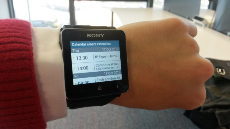
This isn't the only example of watch and phone failing to work in harmony: Facebook messages read on the watch will remain as 'unread' on Facebook itself until you view them on your phone or computer - and the Android app used to control the watch's Facebook interaction somehow manages to be both basic and confusing.
By default, the watch will alert you every time a friend updates their status and it's not immediately obvious how to turn this off, or limit to just a handful of friends and family. For me, notifications rarely came through and chat messages wouldn't appear unless I turned status update notifications on too - and even then they were often late.
The watch will say a friend has uploaded a photo, but the photo won't be shown; it'll tell you a friend has shared a link in their status, but the link can't be opened.
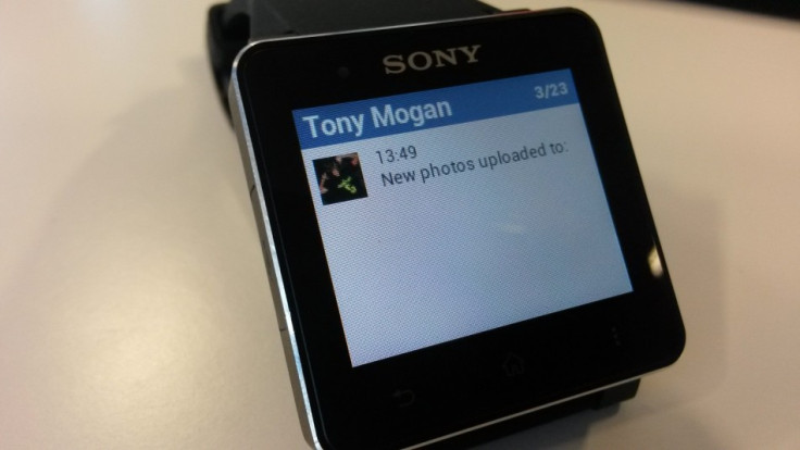
It's the same story with emails, where links aren't clickable and attachments aren't shown, and the font used for these - and text messages - is very small. My Gmail messages seemed to be no more than previews, cutting off after the first couple of sentences, and text messages are not grouped by conversation, instead appearing in order, one by one.
All this starts to get frustrating, and the only way to improve the situation is to tap the lower-right Menu button to open the notification you're looking at on your smartphone when you next unlock it.
Unless it's out of range.
Using Bluetooth, the watch must be within 10 metres of its phone companion to use most of its apps (they're greyed out when the phone can't be reached). But in practice I found the watch to disconnect - with a vibration to notify - when I'd only walked into the next room.
I started to wonder why I didn't just pick my phone up and take it to the kitchen with me, rather than rely on the watch to keep me updated.
Sony SmartWatch 2: Performance and Battery Life
Although it can't do much, SmartWatch 2 performs well and with minimal fuss. The screen responds quickly to taps and swipes, and apps open just about instantly. Installing new apps via your smartphone is simple enough, but finding SmartWatch-specific once in the Play store can be taxing.
Sony offers a number of its own apps for Facebook and Twitter integration, Gmail, music playback (from tracks stored on your phone), missed call notifications and more, but the majority of third party apps aren't free.
I paid £1.60 for a web browser which is more a gimmick than actually useful. Yes, it works, but addresses are entered using a number keypad as if typing on an old mobile phone and there's no space bar. Closing and reopening the app took me back to Google, forgetting the page I last opened.
If nothing else, this app taught me that smartwatches and internet browsers should never be seen together. Browsing the web is not what a smartwatch is for.
Sony claims battery life is three to four days of "normal" use and up to seven days of "light" use. While my Smartwatch 2 stormed through its first two days without breaking sweat, the third day was more difficult, and even after the novelty had worn off and I was using it less, seeing three full days remained a struggle.
Sony SmartWatch 2: Verdict
The first two days of smartwatch ownership lived up to my high expectations. I was checking texts while making calls, discreetly dismissing unimportant emails without committing the crime of leaving my phone on the pub table, and no one laughed, because the computer on my wrist looked like a watch.
Sony has got a lot right with the SmartWatch 2. It's a well-made, good looking device that lasts all weekend, performs perfectly as a watch, and has the added benefit of flagging up texts, calls, emails and more in a discreet way.
But it feels unfinished. Not displaying emails and Facebook notifications properly is a crime, there aren't really any third party apps you'd want to download - let alone pay for - the USB cover is impossible to open, and the screen resolution is too low.
At £150, it's half the price of a Galaxy Gear; where the Samsung tries so desperately hard to impress with its big screen and camera, the Sony sticks to the basics, which is fine, but its execution is poor. It's a shame, because once the SmartWatch has evolved another generation to iron out the creases, Samsung and no doubt Apple will have moved the game on so far that a polished and refined version of this watch will feel desperately out of date.
When the smartwatch race starter gun went off earlier this year, Sony found itself already a lap ahead, but now it's tripping over its shoelaces and in a year's time will be stumbling home a disappointing and undeserving third, thinking what could have been.
Scores:
- Design: 9/10 - Handsome and discreet, it looks like a watch, just as it should. USB cover is a pain.
- Build Quality: 9/10 - That aluminium will eventually scratch, but otherwise excellent.
- Screen: 7/10 - Clockface easily readable in direct sunlight, but resolution is poor.
- Software: 5/10 - Quick, with some good ideas, but let down by poor email and notifications.
- Value: 7/10 - Much cheaper than Galaxy Gear, but offers little above minor added convenience.
- Overall: 6/10 - Harsh given the 9s, perhaps, but excellent hardware is massively let down by unfinished and underperforming software.
The Good:
- Attractive and sturdy design
- Looks like a watch, not a computer
- Vibrations means you'll never miss a message or call again...
The Bad:
- ...unless your phone's in the next room
- And you want to read more than half an email
- And you want to see that picture your Facebook friend commented on
- And...you get the idea.
© Copyright IBTimes 2025. All rights reserved.


