Sony Xperia T Review

Key Features
- 4.55in screen, 720 x 1,280 resolution, 323 pixels per inch
- 1.5GHz dual-core processor
- 16GB storage, 1GB RAM
- 13-megapixel camera
- Used by James Bond in Skyfall
- Price: £400 SIM-free, or free from £33 per month on Vodafone
Sony Xperia T: Introduction
The Sony Xperia T was first announced at IFA back in August and is now on sale, with its Android 4.0 (Ice Cream Sandwich), a 1.5GHz dual-core processor and the claim-to-fame of being used by none other than James Bond in the latest 007 film, Skyfall.
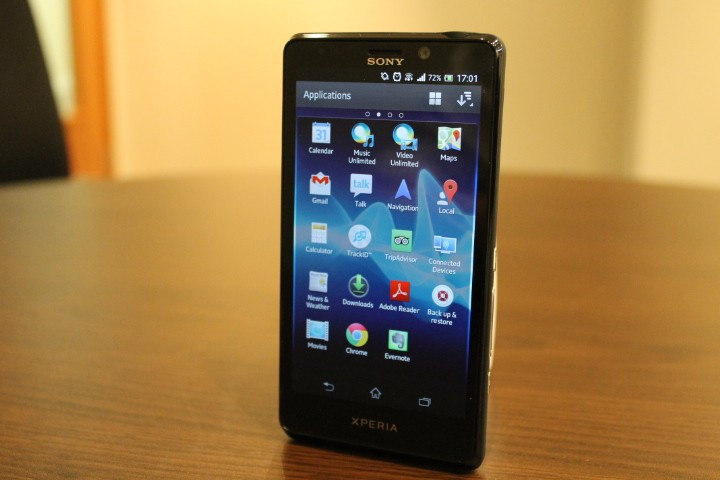
Smartphone screen size is a hotly contested topic at the moment, where some say the Galaxy S3 and Note 2 are too big, but that the iPhone 5 isn't quite large enough, so Sony has put the Xperia T somewhere in between, with a screen measuring 4.55in.
Sony Xperia T: Design and Feel
Sitting somewhere between the largest and smallest smartphones on the market, the Sony Xperia T is a good size. It's screen is nice and spacious but the phone can still (just about) be operated in one hand.
The device measures 129 x 67mm and is 9.4mm thick, and weighing in at 138g means it's heavier than the featherweight 112g iPhone 5 and the larger 133g Galaxy S3.
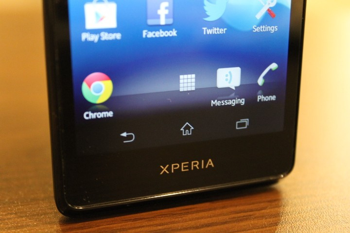
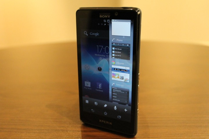
On the front Sony has protected the screen with glass and below it are no actual button at all - instead, the screen displays the usual three Android navigation buttons at the bottom and almost constantly.
We prefer to see seperate buttons below the screen - as Samsung does - just because Sony's design feels like part of the screen has been robbed, as it is always taken up by the three icons.

This black bar, added to the sizable space below the screen and black bar at the top of it makes the phone feel too big for its display.
We guess Sony has designed the Xperia T this way to make the screen appear more integrated into the design of the phone - personally, we like to be able to see when the display stops, but maybe that's just us.
Above the screen is a 1.3-megapixel camera capable of shooting 720p HD video and to the left of that is the speaker and a proximity sensor.
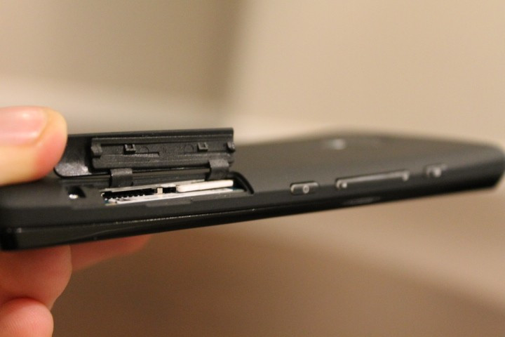
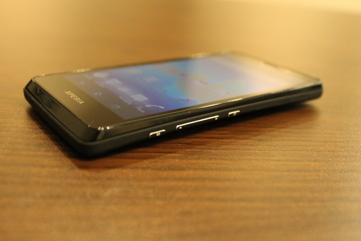
On the right edge there is a plastic flap that opens to reveal microSD and micro SIM card slots, a power / screen lock button, volume rocker and finally a two-stage camera shutter button.
We would have prefered to have seen the lock and volume buttons either higher up, or up on the other side, as placing them so low down makes them hard to reach - not only physically, but remembering they are there takes some time.
The left edge has nothing more than a micro USB port for charging and syncing the phone, while there is nothing at all on the bottom edge and just a 3.5mm headphone jack at the time.
Around the back, Sony has given the Xperia T a 13-megapixel camera, which is a much higher pixel count than the 8-mp shooters found on the Galaxy S3 and iPhone 5. Finally, there is an LED flash below the camera and a loudspeaker lower down.
A design quirk of the Xperia T is that the back is arched slightly, making the phone slightly thinner in the middle and fatter at the top and bottom; it's an interesting design choice and helps to make the device look and feel thinner than it is - and that back panel is a sort of rubberised plastic.
Overall, we like the look of the Xperia T, but noticed during our week with it that it picks up dust and fingerprints very easily. Just a couple of hours in the pocket of our jeans and the panel gaps around the screen were filled with dust and pocket lint which isn't easily removed
The screen also developed a long but very faint scratch and, as we never pocket phone along with keys and coins, we've no idea where it has come from. It's handy, then, that the Xperia T comes with a plastic screen protector included in the box.
Sony Xperia T: Hardware and Connectivity
On the outside there is nothing more than a microUSB port, and on the inside the Xperia T gets Wi-Fi 802.11 a/b/g/n, Wi-Fi Direct, the ability to act as a wireless hotspot, Bluetooth 3.1 with A2DP for streaming music to wireless speakers, and NFC for making contactless payments.
All of this represents what we have come to expect from any smartphone priced £400 and above, and to that extent the Sony delivers.
As for sensors, the Xperia T gets the usual selection of proximity and ambient light, accelerometer, gyroscope, compass and GPS - and there's an FM radio in there too for good measure.
The Xperia T has 16GB of internal storage, and there's also a micro SD card slot, so you can increase that by up to as further 32GB.

Sony Xperia T: Operating System and Performance
Unfortunately, the Xperia T doesn't get Android 4.1 Jelly Bean, and instead has to settle for 4.0.4 Ice Cream Sandwich, which - as with all Xperia devices - is smothering in Sony's custom skin.
Sony has said that the Xperia T and V will both get the Jelly Bean updated "following launch" although no specific date has yet been given.
In the meantime, the Xperia T's interface is very similar to all recent Android-running Sony smartphones, with the emphasis being on dark colours, black backgrounds and a contrasting neon wallpaper.
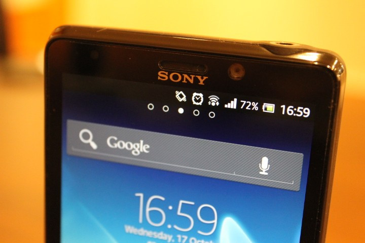
The stylus has certainly become Sony's own over the years, and comparing this to, for example, Samsung's TouchWiz shows how very different each build of Android can be, and yet how familiar the operating system remains across most handsets.
A feature of the Xperia T's software we didn't like was that a pinch out from the home screen displays our widgets floating around the screen, rather than thumbnails of all our home screens, as we have come to expect from most other builds of Android.
We'd much rather use the pinch out command to quickly navigate to a different home page, rather than see our (mostly unused) widgets floating around somewhat aimlessly - although this is a small issue, we admit.
Elsewhere, it's business as usual and the 1.5GHz dual-core processor is more than capable of handling a wide range of apps and games with ease.
It may not have the clout of a quad-core Samsung Galaxy, but for general use you would be hard-pressed to notice that the Sony is a little down on outright performance figures.
HD video plays flawlessly - more about the display below, spoiler: it's excellent - and the phone multitasks without any problems or lag, although we did notice that the slightly rubberised back heats up with extended use, especially when downloading over 3G.
The Xperia T has a 1,850mAh battery that it claims is good for up to seven hours of 3G talk time and 410 hours of 3G standby time.
In the real world, this means a day-and-a-half of average use, with a combination of 3G and Wi-Fi, phone calls, texts, social networking and a push email account is about what you can expect.
As an example, we unplugged our T at 6am on the day of writing this review, and by 3pm it will had 70 percent remaining, so two days of light (ish) use should be possible.
Sony Xperia T: Display
Most of Sony's recent Xperia smartphones have had truly excellent displays, and the T is no different. With a resolution of 720 x 1280 and a pixel density of a huge 323 per inch - that's only three less per inch than the Retina screen of the iPhone 5.
The screen of the Xperia T really is one of the very best on the market today; it's crisp, sharp, the colours really stand out and the blacks are very dark.
To our eyes the screen doesn't go quite as bright as some other smartphones, and the very dark blacks mean glare in direct sunlight can make the screen difficult to use.
Screen glare is very noticeable, even indoors and out of direct sunlight. It's a shame, because, as we said, the quality is great, but the glare is a real problem a lot of the time.
Sony Xperia T: Camera
Sony has got to work with Android's default camera app and given it something of a makeover, removing some of the many settings the app ships with as standard and giving it the same dark UI as the rest of the phone.
The sensor is 13-megapixels, but by default the Xperia T shoots at 10mp, because that's 16:9 widescreen, whereas 13mp is the squarer 4:3 ratio. You can also pick to shoot at 2-megapixel at either 4:3 or 16:9 if you need to save some space on the 16GB of internal storage.
Other settings include turning the flash on or off, setting a self timer, smile detection, geotagging, and there's a range of scenes to choose from, such as landscape, night, sports and party.
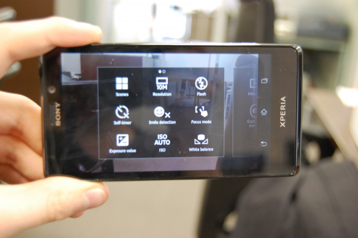
Sony has got rid of some of Android's more complex adjustments, such as ISO and exposure - we like that some phones have these options, but they are confusing to all but the most keen photographers, so it's probably no great loss that they are missing here.
Zooming is done by either pinching the screen (although we found this to be fairly unresponsive) or press the volume rocker. To capture a photo, either tap the onscreen icon, or press the dedicated shutter button on the edge of the phone.
It's a two-stage button, so pressing halfway focuses the lens, and pressing it down fully takes the photo - just like on a proper camera.
Verdict
As with Samsung, Sony's Xperia interface is one that takes Android and gives it a good shaking up. Both companies go about it in two very different ways, and where Samsung has opted for the bright colours and tedious links with nature, Sony has stuck with the darker themes shared across many of its product ranges.
For the sake of a unified ecosystem of products, it works well; every Xperia looks pretty much the same, so if you've used one before then this T will be very familiar to you right from the off.
An update to Jelly Bean soon will keep the T right up to date for the foreseeable future, and the hardware is decent - we liked the camera and the screen (minus glare issues) is excellent.
The Xperia T might not be a quad-core beast like the S3 or HTC One X+, but it's around £100 cheaper than those.
Its rubberised back makes the phone comfortable to hold and the screen size is just about perfect - although still a bit of a stretch for those with small hands - while the weight is a little on the high side.
These are obviously very small complaints, and for the screen alone we suggest that those looking for a high-end smartphone that is more affordable than the iPhone should seriously consider the Sony Xperia T. And besides, if it's good enough for Bond, then it's good enough for us.
Scores
- Screen: 9/10
- Design: 8/10
- Camera: 9/10
- Operating System: 7/10
- Build Quality: 8/10
- Overall: 8/10
The Good:
- Great screen
- Good camera
- Sturdy build quality
The Bad:
- Magnet for dust and fingerprints
- Glass very reflective
- No Jelly Bean yet
© Copyright IBTimes 2025. All rights reserved.


