Sony Xperia Tablet Z Review
A world class tablet in search of an operating system.

Key Features
- 10.1in Full HD screen (1,200 x 1,920)
- Dust and water proof
- 6.9mm thick; 495g
- Android 4.1 (Ice Cream Sandwich)
- Price as Reviewed: £399
Sony Xperia Tablet Z Review
Android tablets have on the whole been pretty terrible as they attempt to catch up to the huge success the iPad enjoyed from the moment it launched in 2010. While initial attempts were a pale imitation of Apple's tablet, the last 12 months has seen things shift away from Apple and towards Android.
Companies like Google and Amazon have had success in the 7in market, but it is at the 10in market where Android tablets have remained on the periphery. Samsung has enjoyed some success with its Galaxy Note 10.1 and now Sony is looking to move things on again with the Xperia Tablet Z.
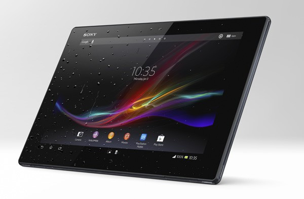
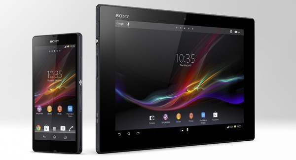
The Xperia Tablet Z, as you can probably tell from the name, is in the same family of products as the company's flagship Xperia Z smartphone which launched earlier this year. As well as having a similar name, the tablet also uses the company's fully flat design language to full effect, creating what is an amazing feat of engineering and making - to my mind at least - the best designed tablet on the market.
Fully flat design
Pick one up and you will immediately see what I mean. The Xperia Tablet Z is lightweight (495g), incredibly thin (just 6.9mm thick all over) and feels supremely well built. Thinness doesn't always necessarily equate to sturdiness, but in this case it does.
Again like its smartphone cousin, the tablet is water and dust proof with all the ports around the edges covered with small plastic flaps. While they are obviously necessary, the plastic flaps are annoying and not the easiest to locate or open.

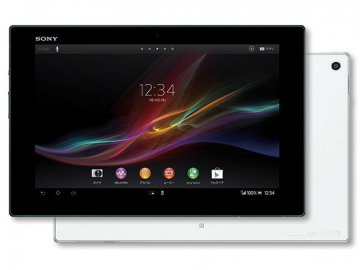
The tablet is covered on the front by a single pane of scratch-resistant glass while the rear and edges are finished in matte black plastic which makes it comfortable to hold. The only design flourishes on the black monolith are the now recognisable oversized metallic power button along the left-hand edge, a Sony logo above the screen and an Xperia logo on the rear.
At 495g it is significantly lighter than the latest iPad (652g) and holding it in one hand for extended periods is much more comfortable than most 10in tablets. Indeed on commutes I found myself just holding onto the tablet while changing trains and buses rather than putting it into my bag.
Water proof gimmick
Obviously the water and dust proof certification is a bit of a gimmick. Most people wouldn't use a tablet in the bath and while it might help if you spill a glass of water for most people this will simply be an added bonus rather than a make-or-break feature.
Inside the tablet is equally well equipped with a quad-core 1.5GHz Snapdragon chip paired with 2GB of RAM. The model I was reviewing had 16GB of storage (around 12GB which was usable) but it also comes in a 32GB version and both can be expanded using the microSD card slot (up to an extra 64GB).
The performance of the tablet was impeccable in the couple of weeks I was using it, which is in part thanks to improvements in Android's stability. HD video playback, intensive gaming like Grand Theft Auto 3 and multi-tasking were all done with any fuss.
IR blaster
The tablet also come equipped with an IR blaster allowing you to control your TV, set-top box or sound system from your tablet. The set-up is fairly straight forward but again, like the waterproof feature, this is a bonus rather than anything else.
Battery life is close to Sony's claims, with nine hours of video playback possible and slightly less than that of general use - all of which is par for the course for 10in tablets but considering the thinness and lightness of the tablet, is another boon for Sony.

The Xperia Tablet Z has a 10.1in screen with a resolution of 1,200 x 1,980 meaning it is pin sharp with a pixel density of 224 pixels per inch (ppi) which is great for reading text on the tablet. The pixel density is not as high as the iPad (264ppi) but is close enough that it would be difficult to tell the difference.
Sony also employs its Bravia Mobile technology which has filtered down from its TV division to help improve the screen's performance. The screen tends to ever-so-slightly over-saturate colours but nothing which is a major problem, though viewing angles are not flawless with a distinct colour drain taking place when viewing the tablet from an acute angle.
So far, so great from Sony.
But, and it's a big but, the tablet is running Android and therein lies its greatest problem. Android developers have decided that optimising their apps for tablets is not a priority, which means the experience of Android on tablets is a pale comparison to Android on smartphones, or iOS on the iPad, where developers have fully embraced the potential of a larger device.
At Google I/O last month, the company were strongly encouraging app developers to create bespoke tablet versions of their apps, as even Larry Page & Co. can see there is a major shortfall in quality tablet apps on the platform. And while there is now a tablet section in the Google Play store, it is like a supermarket shelf after nuclear war has been declared - decidely bare.
The problems are two-fold. One is that there is no standard Android tablet size as there is for the iPad, meaning developers have to create apps which look good on devices from 7in to 10.1in and everything inbetween. The second - and probably more important point - is there is simply not the critical mass of Android tablet users out there yet to make it worth the developers time.
All this of course does not help Sony and the other manufacturers in the meantime.
Sony has added its own lick of paint to Android 4.1 though it's not very intrusive and most of the touches are well implemented. A nice screen unlock animation and some custom Sony apps for music and video (which are of course optimised for tablets) are the main additions and thankfully Sony's skin doesn't slow down the interface at all.
Conclusion
A world class tablet in search of an operating system.
Sony has done all it can from a design perspective in my view and while the screen is not the best out there it is still excellent by any standard. To make a tablet that is as thin and light as the Xperia Tablet Z and not compromise on build quality or miss out on any major features is a remarkable achievement.
Sony has set a new standard not just for Android tablets, but for all tablets. Now it needs Google and their developers to get on board.
Scores:
- Screen: 9/10
- Design: 10/10
- Operating System: 7/10
- Build Quality: 10/10
- Value: 9/10
- Overall: 9/10
The Good
- Sensational design
- Great build quality
- Great performance and battery life
The Bad
- Lack of tablet-specific Android apps
- Fiddly ports
© Copyright IBTimes 2025. All rights reserved.


