Sony Xperia Z Review
Key Features:
- 5in screen (1080 x 1920; 441ppi)
- 16GB storage
- Android 4.1.2
- 13 Megapixel Camera
- Waterproof
- Price as Reviewed: £500
Sony Xperia Z
At this stage, it is unlikely that anyone in the UK who reads a newspaper, watches TV or has even glanced at a billboard lately doesn't know that Sony has a new phone on the market.
The Xperia Z is being heavily marketed by Sony with ads prominently displaying quotes claiming it has "reinvented the smartphone."
It hasn't, but what it has done is put itself back at the top table of smartphone manufacturers, challenging the likes of Apple, Samsung and HTC.
Sony is banking on the striking design, powerful hardware and the fact the phone is waterproof to be enough to woo customers.
But is it enough?
Look and Feel
The Xperia Z is certainly a striking phone. It is all 90-degree angles and flat surfaces. I was given the black version to test out (white and purple also availabe) and the first thing I was reminded of was the black monolith from the opening scene of Stanley Kubrick's seminal 2001: A Space Odyssey.
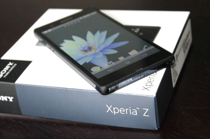
Sony calls the design language OmniBalance, one which it has used to even more striking effect on the Xperia Tablet Z, which was announced last month.
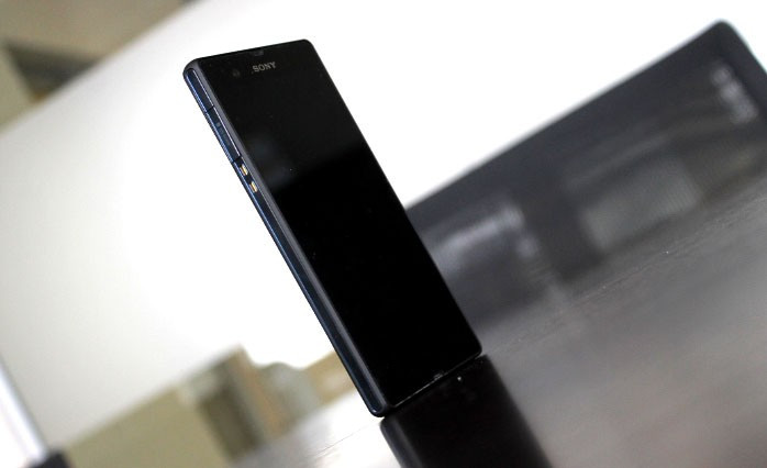
From a purely aesthetic point of view, the Xperia Z is beautiful. Its combination of glass panels front and back, with soft-touch plastic construction around the edges make for a stunning-looking phone.
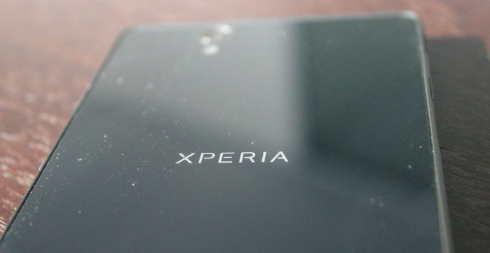
The front and back glass panels may look good, the surfaces are a magnet for finger-prints and the phone quickly looks grubby after only a few minutes handling.
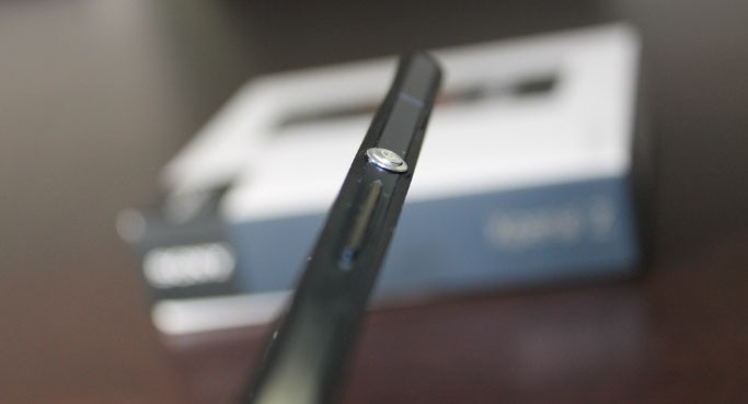
The only thing breaking the black monotony is an over-sized power/screen lock button on the right-hand side, which works well with the overall look of the phone.
At just 7.9mm thin, the phone is slightly thicker than the iPhone 5 (all of 0.3mm) but considering the Xperia Z's screen is a full inch bigger, I am willing to forgive the Sony engineers.
The phone weighs 146g which is only a few grams heavier than the HTC One but 34g heavier than the iPhone 5. However holding it, the phone feels light, again due to the fact that it is so big you simply expect it to weigh more.
Conversely the HTC One feels heavy, despite weighing less, which is in part thanks to the use of aluminium rather than plastic in its construction.
The biggest issue I have with the design is that looks were put before comfort and the phone is simply not enjoyable to hold. While I constantly felt like picking up the HTC One, the same can't be said for the Xperia Z.
It feels too perfect. There is no give, no less-than-right-angled surfaced. Where the curved back of the HTC One felt made for your hand, the flat, square back of the Xperia Z feels wrong.The iPhone 5 can get away with it because it is so small (comparatively), but the large 5in screen makes Sony's phone rather awkward to use.
Waterproof
The phone has been designed to IP55 and IP57 standards. What this means is that it can "withstand low pressure jets of water from all practicable directions" and can be kept under one metre of fresh water for up to 30 minutes.
To achieve this Sony has had to put little plastic flaps on all ports (headphone, microUSB, SIM, microSD) around the phone's edges. With all these secured you can make and take calls in the shower; drop your phone down the toilet without worrying it will be damaged; or impress your friends by dropping the phone in a pint of beer down the pub and watching the it vibrate when you call it.
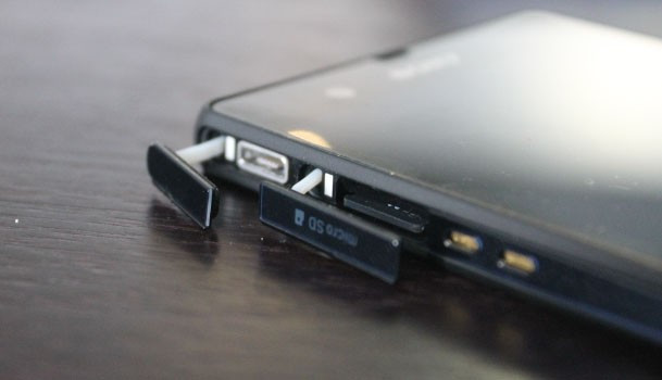
All very novel ways to use a phone I'm sure, but none that are of much interest on a day-to-day basis. Yes it may save your phone if you are a perennial drop-the-phone-down-the-toilet person but making calls in the shower is not something I ever want to do.
The biggest impact of the waterproof feature for me was the fact I had to open and close the ports all the time. While the port covers themselves are well built and never felt like they might break off, they are fiddly to open and having to do so four, five, six times a day is a pain I can do without.
Try opening the headphone port with a pair of gloves while on the way to work, or open the microUSB port in the dark when you need to charge your phone at night. Not easy.
I would gladly give up the waterproof-ness for a life without port covers.
Screen
The Xperia Z's 5in screen has a full HD resolution of 1080 x 1920 pixels, giving it a pixel density of 441ppi and it is powered by the company's Bravia technology, the same tech that goes into the company's television set.
All this sounds like it should add up to a pretty impressive display. And it does - to an extent.
The screen is really sharp making it great for the likes of web-browsing, viewing photos and reading ebooks. Indeed thanks to that 441ppi you can read a lot more of webpages at once, without having to zoom in all the time.

The screen is also very bright, making it useable in direct sunlight, though light leakage was an issue.
However, when we put the screen side-by-side with the HTC One, it was clear that the TFT panel used on Sony's screen looks dull and washed-out in comparison. Blacks were nowhere near as deep and contrast was also well below HTC's standard.
Playing games and watching films on this 5in Full HD display is good, but tilt the phone in any direction and contrast shift becomes a major problem.
For all its claims about Bravia technology, the Xperia Z screen is a disappointment.
Hardware
Like all high-end phones these days, the Xperia Z is fast and powerful. It features a quad-core processor from Qualcomm backed up with 2GB of RAM. This is more than enough for most uses and streaming HD video, playing intensive games like Real Racing 3 and GTA 3 were a breeze for the Xperia Z.
The phone uses Android version 4.1 and while it's not the very latest update of Google's software, it is still excellent. We had no problems with stability and the few tweaks Sony has made to the interface (basically adding its own apps and widgets and customising the app drawer) were unobtrusive.
One issue I did have was with the lock screen. While it gives fast access to the camera by default, if you implement any security other than swipe-to-unlock (such as a PIN, pattern or face unlock) you lose this feature - making picture-taking in a hurry impossible as there is no dedicated shutter button.
The phone comes with 16GB of storage which can be expanded by up to 64GB using a microSD card, unlike the iPhone and HTC One. This combination of decent internal storage with microSD expansion should be the standard for smartphones, but sadly isn't.
Connectivity
In terms of connectivity, the Xperia Z has the usual combination of Wi-Fi N and Bluetooth 4.0 as well as the usual sensors (gyro, accelerometer, proximity and compass). It also includes NFC which is used with a range of Sony products to share content between your smartphone and TV, speaker, headphones etc.
It's a neat use of NFC and does work well, but only if you've bought into the Sony eco-system lock, stock and barrel.
Battery life is typical of smartphones these days, with a full day of use just about being manageable from the 2,330mAh battery. Sony does include a Stamina mode which shuts down battery-draining features when the phone is asleep, with Wi-Fi being the biggest offender.
While Stamina Mode is a good idea, and something we are seeing in more and more smartphones these days, I would much rather see some improvement in battery technology which lets you use the full features of a smartphone for more than a single day.
Camera
Given than Sony develops the 13 megapixel Exmor sensor used in the Xperia Z - as well as a host of other smartphones in 2013 - I expected a lot from the camera on this phone.
With the Ultrapixel camera from HTC and the PureView technology from Nokia pushing expectations higher in the past 12 months, Sony did have a challenge on its hands.
The results are mixed.
There is no doubt the images produced by the camera on the whole are excellent, and with the superb Superior Auto mode, even non-photo enthusiasts like myself can take some amazing pictures. With this mode enabled the camera app will try to guess what kind of scene you are trying to capture and adjusts all image parameters accordingly including colour saturation, contrast, metering mode etc.
And it works. It got it right almost every time, but for those of you who like tinkering with such things, there is also a manual mode available.
The one issue I had with the Superior Auto mode was that images tended to look a little processed, with colours over-saturated. If you want the more natural look, manual mode is the way to go.
The camera app is as fully-featured as it gets with everything from face detection mode to smile shutter and panorama mode on offer.
Overall the camera is excellent, though low-light performance can't match the Ultrapixel or PureView technology.
The camera also offers 1080p video capture, which is excellent and even offers a HDR mode when you are moving between bright and dark situations.
Verdict
The Xperia Z is the best smartphone Sony has ever produced. It is sleek and beautiful and extremely well-built.
But it seems to me that the Xperia Z has been designed to be a phone to admire from afar rather than one you use all the time.
Camera quality, processing power and software are all top of the range, but a less than stellar screen is a disappointment and one less reason to purchase the phone.
Costing £500 without a contract, pricing is on a par with the iPhone and HTC One but I'm not sure being able to call the phone while it sits in a pint of warm beer is enough to convince me to buy one.
Scores
- Overall 8/10
- Design 8/10
- Performance 9/10
- Screen 8/10
- Battery 8/10
- Value 8/10
The Good
- Eye-catching design
- Waterproof-ness might save your phone one day
- Powerful processor and good camera
The Bad
- Expensive
- Not comfortable to use
- Screen below standards set by others
© Copyright IBTimes 2025. All rights reserved.


