Vector Luna smartwatch review: Smart on the outside, simple on the inside
Key Features
- 30-day battery life
- Bespoke software
- Compatible with Android, iOS and Windows Phone
- Sleep and activity tracking
- Price: From £219 to £349
Vector Luna smartwatch review
All smartwatches to date suffer from three key problems. The first is looking more like a miniature phone than a desirable timepiece, the second is a tendency to overload the wearer with notifications and the third is poor battery life of less than two days. The Vector Luna hopes to overcome all of these by marrying traditional watch design with a simplified user experience that results in an entire month of battery life.
With prices sitting either side of £300 and a range of different styles, Vector is aiming its smartwatches squarely at the (relatively) affordable end of the Apple Watch line-up. Brave or misguided? Let us find out.
Vector Luna: Look and feel
The glitz and glamour of Vector's launch party, held in a central London hotel bar overlooking the city and with champagne flowing, should give every clue you need as to how Vector is marketing the Luna. The usual bunch of technology press mingled awkwardly with tabloid showbiz reporters, fashionistas and people seemingly there for no other reason than to have their picture taken. It felt like the kind of event Apple would have wanted for its Watch and that should go some way towards explaining the design of the Luna.
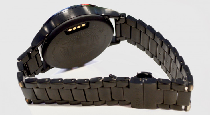
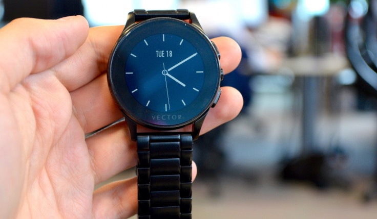
Available in black, silver and both champagne and rose gold (albeit not real), the colour palette would not look out of place in the window of any jewellers. My review sample is the black model with a matching stainless steel strap; leather bands are also available. The 44mm face is quite large compared to traditional watches but is perfectly acceptable when lined up against the huge LG G Watch Urbane and Huawei Watch. This black model treads a fine line between subtle and dull, but the silver and gold versions are genuinely attractive without being too flash.
The Vector's build quality is excellent – just what you'd expect from a regular £400 watch. It feels chunky, weighty and as if it could survive being worn every day in almost any environment. There's no sapphire to protect the screen but the glass on mine is yet to scratch. Three buttons sit on the right of the watch, as they would on a conventional timepiece, and these are what you use to control it. The screen is not touch sensitive, as I will explain in the next section.
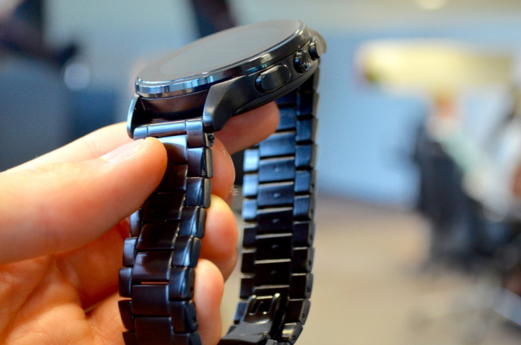
These three buttons are difficult to press; they are spongy and do not always register the first time they are pressed. Apparently this is a trait of the pre-production watches the press has been given to review and by the time the Vector goes on sale in September, this will have been addressed.
Vector Luna: Screen
Here is where the Vector Luna starts to differentiate itself from other smartwatches. The digital screen is monochrome, has a low resolution that gives everything jagged lines and is not touch sensitive. These shortcomings are of course for a reason and that is the Luna's 30-day battery life. Similar to the e-ink screen of a Kindle, the Vector's screen only uses power when whatever it is showing changes; this is mostly just the position of the hands every second/minute/hour.
The screen is easy to see inside but suffers in bright sunlight – an issue with most smartwatches – but at least there is a backlight, which comes on when you press any of the three buttons. I can forgive the Vector for having such a low resolution and no colour because it is not meant to be competing with the Apple Watch. But a sticking point I do have is how large the face of the watch is compared to its screen, which is significantly smaller.
Vector Luna: Software, notifications and performance
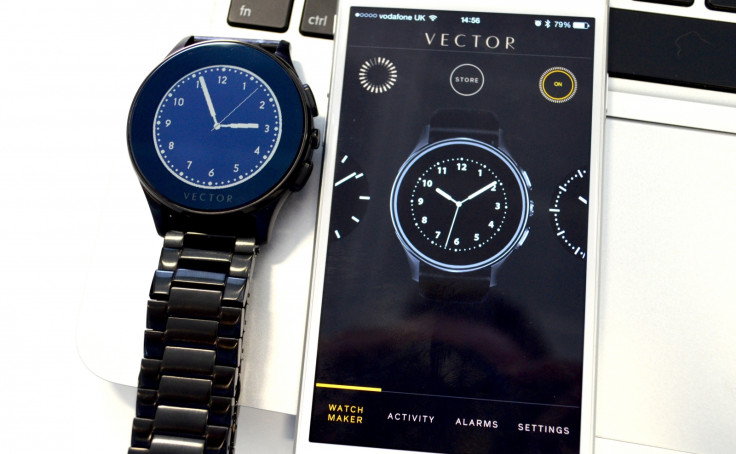
The Vector Luna connects to iOS, Android and Windows Phone handsets over Bluetooth, and a free app is used to set up the watch, personalise a collection of different faces, set alarms and manage which notifications come through. Changes made in the app are faithfully replicated instantly on the watch itself; switch faces and the new one immediately appears on its screen. Alternatively, the up and down buttons can be used to cycle through watch faces.
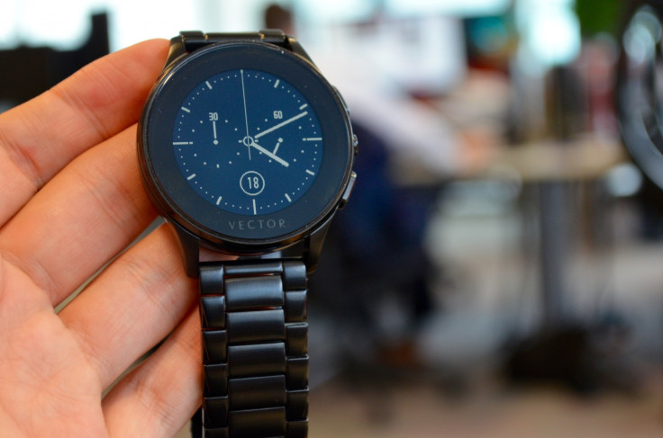
There are around nine to choose from, including some available to download within the app for free. Some already have their own extra pieces of information (complications, if you prefer), but the simpler faces can be modified to display more, such as the day and date, the name of your next meeting (pulled from your phone calendar), distanced walked, calories burned, a different time zone, or the weather forecast.
I like the customisation here but the complications are put where they are often blocked by the virtual minute and hour hands. The Apple Watch puts them in the corners, on the outside of the dial, and I feel this is the better approach to take. Just because they would be obscured on traditional watch does not mean they need to be on a smart one too.
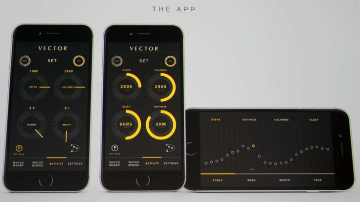
Notifications cause the watch to vibrate but the message is not displayed until you turn your wrist towards you or press the middle button; instead, a ring appears around the outside of the watch face to let you know you have unread notifications waiting for you. It is a similar system to the Apple Watch and it works well, preventing people nearby from seeing the message and stopping the watch from lighting up every few seconds during a particularly vocal WhatsApp group chat.
Only a snippet of each notification is viewable but it is usually enough for you to act on - either come back to it later or reach for your phone now. Also useful is how the Luna taps into your calendar and places markers around the watch face to show when you are busy; if you have a two-hour meeting at 2pm, a mark will appear between two and four (once midday has passed, to show the meeting is in the afternoon and not over a late-night kebab).
Notifications can be dismissed by turning the watch away from you but this also removes the notifications from the screen of your smartphone and can be done by accident far too easily. Another downside is the sleep tracking, which simply tells you how long the watch has been stationary at night – put it on your night stand or sleep wearing it and you will get pretty much the same results.
Vector Luna: Battery life
One of the Luna's killer features is battery life. At 30 days, it blows every other smartwatch (except the Withings Activite and Pop, which do not have screens) out of the water; by comparison, the Apple Watch really struggles to go two full days between charges.
The monochrome screen has a lot to do with this, but so too does Vector's custom software, which is as stripped back as it needs to be and carries no unnecessary fat. Battery life is not shown on the watch itself but inside the smartphone app; charging takes a couple of hours with the included USB cable, which attaches magnetically.
Vector Luna: The Verdict
Vector's vision of creating a simple smartwatch with a month-long battery life and a feature set, which is unlikely to distract or overwhelm is a sound one. The design on most models is something I could get along with every day and this is the first smartwatch (Withings Activite excluded) that I would wear without complaint – Apple's name gives its watch a certain lust-factor but it still looks like a sci-fi prop.
However, the Vector almost does too little. In hitting the 30-day battery life goal, the screen resolution is too low to be of any real use. The top line of a notification is sometimes all that is needed to know how to act on it but often I would have to reach for my phone to make sure. That, and it really looks like a piece of tech from a bygone age; I see this resolution and the sounds of dial-up modems, Nokia 3310s and fax machines fill my mind.
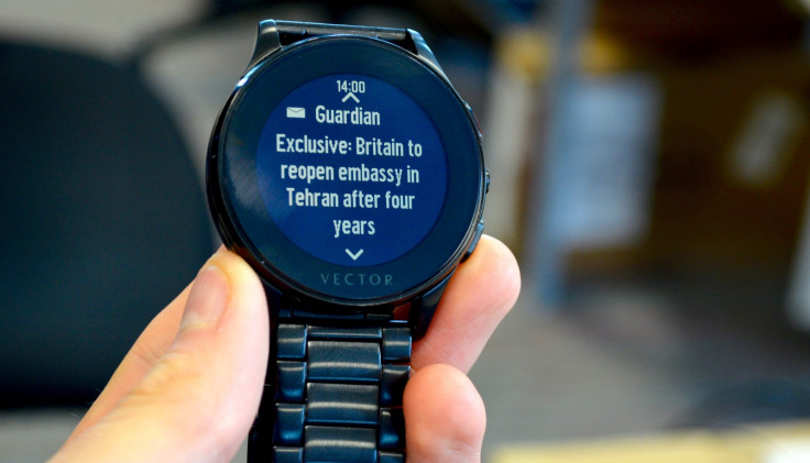
Vector also needs to work on its software before the Luna goes on sale in September (exact date and retailers to be confirmed). The watch occasionally crashes or shows the wrong time, requiring its Bluetooth connection to be unpaired and re-paired. In one case, the iPhone app needed to be reinstalled. I also wonder, being a bespoke operating system, how many developers will bother creating apps for the platform; so far only the BBC, CNN the Guardian and the Economist have done so, and these merely buzz the watch with headlines, seemingly at random.
The smartwatch market gets richer every time a new option arrives but in the case of the Vector, I wonder if superior battery life and a watch-like design have eaten too much of the pie, because what is left behind does not feel quite smart enough.
The smartwatch market gets richer every time a new option arrives but in the case of the Vector, I wonder if superior battery life and a watch-like design have eaten too much of the pie, because what is left behind does not feel quite smart enough.
Vector Luna Scores:
- Design: 7/10 - Far more subtle than most smartwatches, it doesn't look like a sci-fi prop
- Build quality: 9/10 - All-metal body and strap feels very solid and well-made. Squidgy buttons are a letdown
- Screen: 5/10 - Always being on is nice, but resolution is very low and can be hindered by sunlight
- Software: 6/10 - Being on iOS, Android and Windows Phone is great, but software feels far too basic and has some bugs
- Battery life: 9/10 - For a smartwatch 30 days is an insane battery life which puts it a long way ahead of almost all rivals. Lack of battery icon on watch face is annoying
- Overall: 6/10 - Looks smart and lasts for weeks, but the Vector's software leaves it feeling half-finished for now
The Good:
- Watch-like design
- Range of colours, styles and prices
- Month-long battery life
The Bad:
- Low resolution display
- Poor software
- Can get expensive
© Copyright IBTimes 2024. All rights reserved.


