Why is design so important in getting your CV noticed?
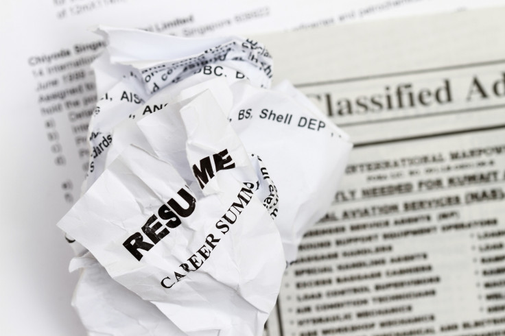
Your dream job doesn't just rely on your skill, experience and education – it relies on the presentation of your CV. This week, Bloomberg published a lowdown of the best typeface to use on your curriculum vitae and according to one design expert, using Times New Roman is akin to turning up to an interview wearing sweatpants.
The winner, on the other hand, is Helvetica. "Helvetica is so no-fuss, it doesn't really lean in one direction or another. It feels professional, lighthearted, honest," Brian Hoff, creative director of Brian Hoff Design, told Bloomberg. "Helvetica is safe. Maybe that's why it's more business-y."
But why is typeface – and design – so important on a CV, even if you are the right person for the job?
"Design has become more important with the current job market," James Innes, founder and chair of CVCentre.co.uk, tells IBTimes UK. "In fact, it becomes continually more important as competition for jobs increases year on year."
Presentation is key because it is the first thing potential employers see. "Most jobseekers don't realise that the way their CV is presented can often be of more value in getting to the next stage of the application process than the information itself," Innes writes in The CV Book.
"You will make an impression on the reader even before they read a single word. Presentation can make all the difference between success and failure. If the presentation of the CV is thoroughly professional then the applicant immediately gives the impression of being thoroughly professional themselves."
"Enhancing the presentation of a CV is very much the cosmetic surgery of the CV writing world," Innes writes. "Content is clearly more important, but aesthetics are also critical in making the right impact on the reader."
This is all common sense, as Innes points out. But does he agree that Times New Roman is a no-go?
"I do agree in many ways, now that it's increasingly rare to see an actual printed CV," he says. "But, for a printed CV, I think it remains perfectly acceptable – depending on the circumstances. For example, it probably wouldn't look good coming from a designer!"
Some of the most common faux pas on CVs including spelling mistakes, splitting sections over two pages and an overuse of bold or italics, but aesthetics are also crucial – as up to a quarter of CVs are binned immediately by recruiters because of poor presentation. So what is the key to a good-looking CV?
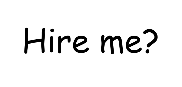
"I would strongly recommend that you remain conservative with your choice of typeface," Innes writes. "Presentation is, of course, a personal issue and some people will prefer certain typefaces to others – for example, teachers tend to like Comic Sans. However, it is important to realise that the easiest-to-read typefaces will get you the positive presentation points! We generally use mainstream typefaces such as Times New Roman and Arial, as they are professional, easy to read and get results."
He advises to avoid unusual typefaces, as they are harder to read for humans and for automated scanning software.
"It is critical not to go over the top with fancy layouts, typefaces, etc," Innes says. "They can detract and confuse. A clear, conservative impression is always preferable, except in specific cases such as architecture, graphic design, etc., where you are entitled to demonstrate a little more creative licence. But, in general, don't stray too far from the standards such as Times New Roman or Arial."
As for size, Innes advises generally to keep to 11 or 12 point, with larger text for main headings. The key is consistency throughout your CV, so it is easy to read. "A recruiter receiving your CV by email may ultimately decide to print it but your first impression will normally be made on screen," Innes says.
© Copyright IBTimes 2025. All rights reserved.


