Apple is listening: WatchOS 3 features bring the performance and simplicity we demanded

With watchOS 3 Apple has told us all something important: It is listening. It has simplified the Apple Watch and turned it into something which is genuinely useful and not just a feature-filled luxury.
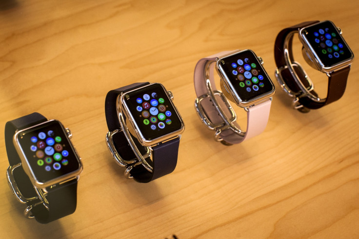
The change has two prongs. The first is the removal of the home screen, a place where tiny app icons made the Watch feel far too much like a smartphone for your wrist, and far too complex. Instead, it now looks like the watch face itself is the home screen, from where you swipe around to skip through live apps in a dock, change the watch face, and access notifications and settings.
It's a much simpler approach and one which puts time back to the front-and-centre. This all means Watch users will need to relearn an almost entirely new operating system (and, let's be honest, the Watch's first OS wasn't the most intuitive), but it will be worth it.
Faces are quicker to change and customise (there are new ones, too, but developers still can't make their own). Apps are a claimed seven times faster to open, and now provide new information (such as sports scores) instantly. This, a massive speed boost, is far and away what the Watch needed more than anything else, and it has appeared for free, without the need for expensive new hardware.
By giving the Watch a dock and Control Centre, Apple has created a unity between watchOS, iOS and the newly-named macOS which was otherwise missing; it has brought our attention back to the time and away from needless applications which were always better on the iPhone anyway.
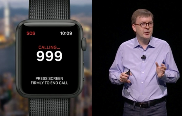
As great as these updates are, they pale in comparison to the Watch's newest feature: SOS. Pressing and holding the side button (which previously let you turn the watch off or put it into low power mode) starts a countdown then automatically calls the local emergency phone number (such as 999 in the UK or 911 in the US). The Watch knows which number to dial.

The Watch will then alert your pre-defined emergency contact (or contacts) with a map of your location, and all the while your (also pre-defined) personal and health information will appear on the screen, to be read by paramedics and hospital staff.
This is one of those features which sounds so patently obvious the moment it's explained, and one which makes us ask ourselves why it has taken so long to arrive.
None of this has given us the Apple Watch 2, but we can't realistically expect that until 2017. But from this autumn (around September or October) we will get a fresh new look for the existing Watch, with much improved performance, a simpler and more unified interface, and a great, potentially life-saving, new feature. Isn't that just what we wanted? Apple is listening.
© Copyright IBTimes 2025. All rights reserved.


