Apple Watch review: A glimpse into the future we didn't know we needed
Key Features:
- Available in 38 and 42mm cases
- Retina touch screen
- Interchangeable straps
- All-day battery life
- Heart rate monitor
- Price as reviewed: £599
Apple Watch Review
There is so much to say about the Apple Watch that it's difficult to know where to begin. It is Apple's first wearable; its first new product for five years and the first since the death of Steve Jobs. Its price range starts at a respectable £299 and runs through the stratosphere to a scarcely believable £13,500 without gaining a single feature.
It's available in two sizes, three ranges and with a wide selection of straps; there are dozens to choose from, and at launch you can only buy them online. The Watch has turned Apple's iconic shops into showrooms where glove-wearing staff help you try on every model until you find the one for you.
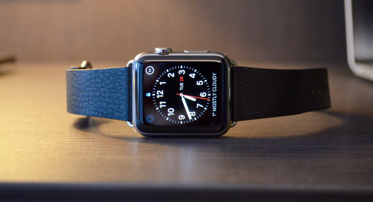
Each of these unique aspects could be the subject of a 1,000-word feature, and now I've to somehow condense it all into a single, coherent review with an outcome which will help you make your mind up about buying one.
What the Apple Watch cannot do is sell the smartwatch concept to its many critics. If Android Wear smartwatches haven't convinced you that notifications and phone calls on your wrist make sense, then neither will the Watch. So rather than ask if smartwatches are a good idea, let us decide if the Apple Watch is a good smartwatch and worthy of your considerable investment.
Apple Watch: Design and Hardware
If you were to describe the original LG G Watch or Samsung Galaxy Gear over the phone to a technophobe, your spoken description of them would differ little to that of the Apple Watch. It's shinier and slightly move curved, but the general blueprint is the same; a small square touch screen which sits on your wrist; it beeps and vibrates, it alerts you to texts and phone calls, and you can live your life without it.

But Apple is a world leader in industrial design, and where Samsung and HTC are nipping at the curved, aluminium heels of the iPhone 6, Apple's first wearable is in a league of its own. My Watch is the mid-range model called, confusingly, Watch. The cheapest model is called Watch Sport, while the gold version is Watch Edition. They all have exactly the same software and range of features, but Watch Sport is aluminium, Watch is stainless steel and Watch Edition is yellow or rose gold.
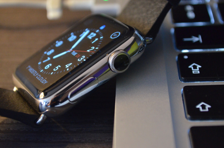
The Watch's stainless steel is beautifully shiny and matches the buckle of my black leather strap, known as the Classic Buckle. There are two buttons on the watch; one is similar to the iPhone's screen lock button, but here it acts as a way of quickly accessing up to 12 your favourite contacts. Holding the button brings up a menu for switching the watch off, locking it and switching to the battery-sipping Power Reserve mode, where nothing but the time is shown.
Apple Watch: Digital Crown
This is joined by the Digital Crown, a small wheel which spins and clicks. Press the crown to access the watch's application launcher, or double press to either return to the time or open the app you used last. A long press of the crown opens Siri, which you can speak to just as you would on your iPhone. Finally, turn the crown to scroll through lists or zoom in on images, maps and app icons on the home screen.
In this last instance the Watch's user interface performs a beautifully seamless transition, where zooming into an app makes it burst open and fill the screen one element at a time. Needless, sure, but very smart. Pressing both the crown and button takes a screenshot, which is sent instantly to the camera roll of your iPhone.
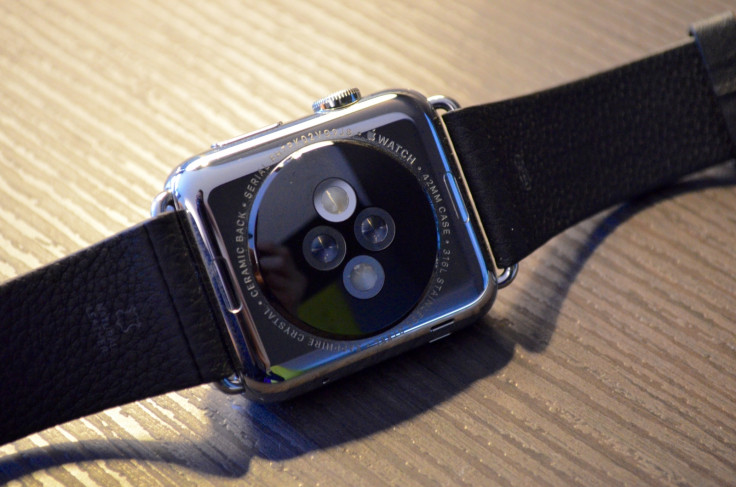
Turn the Watch over and you'll find the heart rate monitor beneath a ceramic and sapphire cover. Infrared and visible light LEDs, plus photodiodes, detect your heart rate during exercise and when you ask it to through the Glances menu, which are more like widgets than full apps. Above and below the sensor are buttons to release the strap.
Unique to Apple, but open for third parties to use in their own bands, the mechanism is as simple as pressing the release with your nail and sliding the strap out; replacements slide and click into place.
Put the Watch on and its lack of size is the first thing you'll notice. It's much smaller than you would think and the curved edges help to make it look and feel less like a computer strapped to your wrist. The weight is about the same as my regular 42mm Tissot watch.
Apple Watch: Software
Beyond the side button and Digital Crown, there are several other ways to interact with the Watch. You can tap and swipe at the touch screen, use your voice, move your wrist (to wake it up, the time is not permanently displayed), and use Force Touch, which is a firm press of the screen used to reach features and settings hidden from view.
Sometimes this makes sense - use Force Touch on the watch face to bring up alternative faces and ways of customising them - and sometimes it doesn't - use Force Touch on your text inbox to write a new message, or on your Twitter timeline to write a new tweet.
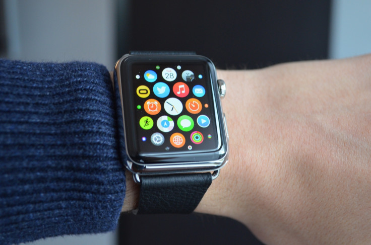
It isn't always obvious when a Force Touch command is available, causing you to prod at the screen on the off chance that something pops up. Confusion is commonplace when first learning your way around the Watch. There is no difference in swiping the screen or turning the Digital Crown to scroll, and developers will have to be creative with their app icons, because their names are not displayed on the home screen.
It's no wonder that Apple has given us seven months to view demonstrations and tutorials online before putting the Watch on sale, as there's a fair amount to learn.
A long press of the home screen lets you delete and rearrange apps, although you can't make folders and the central clock app cannot be moved.
Something Apple needs to work on is Watch's sensitivity to movement. The screen is meant to come on and show the time when you move your wrist, but I found this needed a larger movement than would be natural with a regular watch. Hopefully a tweak of the software can fix this, because I'm sure the battery could handle the screen lighting up more often.
Apple Watch: Notifications...a lot of notifications
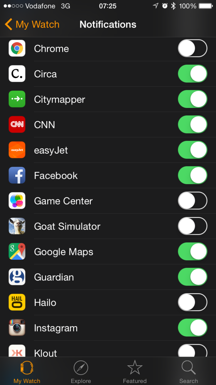
A key feature of the Apple Watch and smartwatches generally is notifications, a way of subtly alerting you to incoming calls, texts, emails and tweets without the need to check your phone. By default, the Watch will alert you to absolutely everything, from calls and alarms, to calendar event, Instagram likes, retweets, distanced walked (twice per day) and an hourly reminder for you to stand up if you've been watching too much Netflix.
It's a nightmare, but thankfully the iPhone app lets you switch each of these on or off. The Watch's haptic feedback is more powerful and precise than the vague vibration of other smartwatches, closer to someone firmly tapping your wrist than a phone buzzing in your pocket.
The speaker is fine in a quiet office, but for everywhere else your phone is likely to be louder; of course, where a vibrating - even ringing loudly - phone might be missed while walking along a noisy street, a watch tapping firmly at your wrist is hard to ignore.
Apple Watch: Fitness tracking
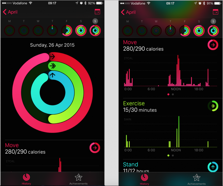
Like most fitness trackers and smartwatches, the Watch uses sensors to record your movement. The included Activity app, which also appears on your iPhone when you sync the Watch for the first time, breaks down your day into movement, exercising and standing, which are displayed as circular graphics to show how much of each user-defined goal you have completed.
Goals can be adjusted and the Watch reminds you every hour to stand up and walk around; it also delivers twice-daily updates on your progress, although these can all be switched off.
The Watch can be taken for a run without your iPhone, but relies on the phone's GPS for plotting the routes of runs you go on; it has 4GB to store music, which can be streamed to Bluetooth headphones. Apple Watch also estimates your active and resting calories burnt, which is something not all fitness trackers do, and can identify walking, running, rowing and cycling, as well as general exercise like circuit training by combining the accelerometer and heart rate monitor.
Apple Watch: Battery Life
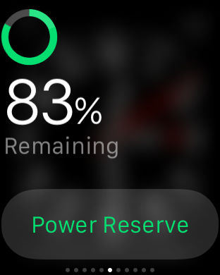
The downfall of every smartwatch so far, battery life is a major concern for every player in this industry - and that includes Apple. Battery life is why the screen doesn't light up when you get a notification - the Watch taps you and pings, but doesn't illuminate until you raise your wrist; battery life is also why the Watch doesn't track your sleep, because 24 hours of use simply isn't possible.
Apple says 18 hours is though, and to me that sounds about right. I cut down on many notifications - retweets, Instagram likes etc - and chose not to make phone calls or use the Watch for any task where my iPhone would be more efficient. Doing that, the Watch became my way of telling the time and checking the importance of incoming messages and alerts, before replying on my phone.
Doing this saw the battery fall to around 50% each day; on a lazy Sunday I still had 65% left when I went to bed, and having been off the charger for 10 hours as I write this, at 4pm, the battery is at 68%. Put simply, it'll always do a full day and I worry about it less than I thought I would. It charges quickly too - a 10% top-up takes around 12 minutes.
Apple Watch: The Verdict
More than a year of rumours, seven months of pre-launch hype, and a shaky start from rival Android Wear put a huge amount of pressure on the Watch. Apple has entered a new market, blurred the boundary between technology and fashion, charged £13,500 for a product which performs identically to one at £299, and released something with the unenviable task of being as popular as the iPhone.
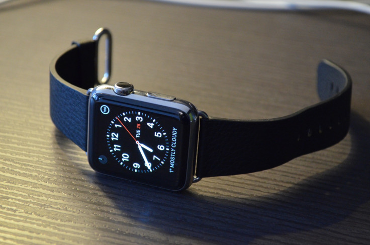
The Apple Watch isn't a home run. Its software is initially confusing; the apps are often slow; the price for anything but the Sport model is high, and it doesn't do any one thing significantly better than its cheaper rivals. The hardware is excellent and, after some trial and error, using it is as ergonomic as you can expect a complex operating system on such a tiny device to be.
It won't convince the naysayers to buy a smartwatch (I suppose fashionistas may well pick one up as a status symbol), and it won't answer the numerous and important questions asked about the fundamental need for smartwatches. But it will ensure those questions keep getting asked.
Like the first iPod, iPhone, iPad and MacBook Air, the Apple Watch is a premature glimpse of the future. It isn't finished yet, just as the first iPhone didn't have an App Store, but one day the creases will be ironed out, the price will be lower and the battery will last longer. That day isn't today or tomorrow, but it's coming soon.
Apple Watch Scores
- Design: 9/10 - Superb in almost every way, this is the best-looking smartwatch by miles
- Build quality: 9/10 - Excellent, although some concerns over strength of Sport Watch's glass screen
- Software: 6/10 - Confusing at first, but full of features without being too complex. Many notifications need filtering out
- Performance: 6/10 - Watch itself performs very well, but apps drawing data from iPhone are too slow
- Battery life: 8/10 - A full day is always possible, more so than on any other smartwatch I've used. Charges quickly, too
- Overall: 7/10 - A admirable first effort only let down by slow software
The Good:
- Design and build quality - it's smaller than you think
- Screen is bright and sharp, easy to see the time outdoors
- Huge range of designs, straps and sizes...
The Bad:
- ...but many of those options are painfully expensive
- Software is slow when pulling data from iPhone
- Screen doesn't always come on when you move to look at it
© Copyright IBTimes 2025. All rights reserved.


