Ebola: Now You Can Track Worldwide Outbreak Cases on Silk's Interactive Map Infographic

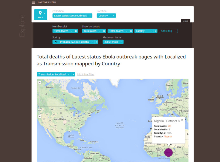
Data publishing platform Silk has created an interactive infographic database that can instantly show all the information you'd ever want to know about the Ebola outbreaks on the world map, from new deaths to suspected cases, as well as historical data about outbreaks of the virus.
The Ebola Outbreaks database is constantly being updated using latest information from the World Health Organisation (WHO) and the US Centers for Disease Control and Prevention (CDC) and is free for anyone to access, search for information, and share or embed the graphic.
Filters can be added onto the world map infographic in categories like "confirmed deaths", "confirmed cases", "total cases" (this includes suspected cases), look at which countries have a transmission of Ebola and where that transmission came from.
Once the data is generated, users can then click on the highlighted circles on the map to see quick statistics about outbreaks in specific locations and countries, or even to see if cases of the virus are localised to one location or widespread within a certain country.
Of course, you don't have to look at everything on a map – you can also pull up graphs, lists, groups and grids to look at specific data, such as percentage of deaths, and historical fatality rate from different outbreaks dating back to 1976.
Silk says it will be updating the database as soon as there is new information available.
Anyone can actually take any research data they are working on, upload it in a spreadsheet format and instantly create an interactive map or graph database (there are millions of Silk interactive charts and webpages in existence).
You can make it for free if you don't mind the information being freely available to anyone on the internet to find, or pay a membership to make private interactive charts and maps for an internal client presentation, for example.
© Copyright IBTimes 2025. All rights reserved.


