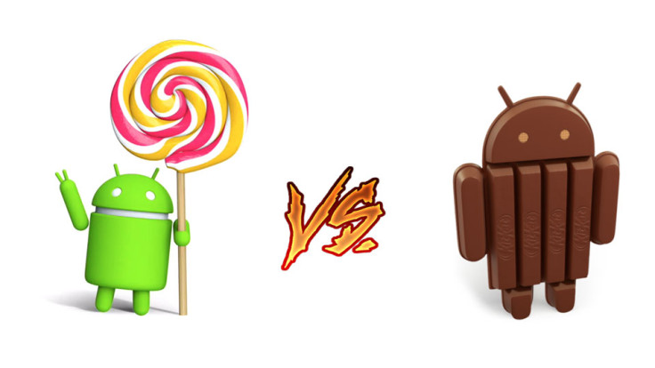
Galaxy Note 4: Android 5.0 Lollipop vs Android 4.4.4 KitKat UI comparison

The famed Galaxy Note 4 has recently been grabbing the spotlight as Samsung has started rolling out the long-awaited Lollipop update for the Exynos (SM-910C) and Snapdragon (SM-910F) variants of the handset in Poland and South Korea, while the rest of the world anxiously awaits the release of the new Android 5.0.2 update on their Note 4.
Meanwhile, folks at Phone Arena have managed to secure some final screenshots depicting the features of Android 5.0 Lollipop and Android 4.4.4 KitKat in a side-by-side UI comparison.
Although the new Lollipop update has overhauled the KitKat UI to a considerable extent, IBTimes UK explores the most noteworthy additions with minor tweaks and enhanced animations that are part of the Lollipop update.
A few of those noticeable changes include enhanced lock screen notifications, improved Dialer and Messenger, as well as the new ART runtime.
Here is an in-depth feature and UI comparison between the new Lollipop update and the ageing KitKat update:
Recent and Active apps

Although, the Lollipop Recents app does not get any noticeable changes to its KitKat styled card-like menu, the Lollipop version enables apps such as Chrome to launch new cards for every tab opened or running in the background.
Settings Menus
There are a few distinct tweaks identified throughout the various sub-menus in Settings, which include the Sound and Power Saving menus.
Application manager tab and sound bar UI have been significantly revamped with a limited facelift to the Settings menu design, wherein it sports a newly-styled header.
S Planner, Clock, and My Files
In line with other apps, the S Planner, Clock, and My Files apps also receive just some minor visual facelift including improved animations in order to precisely sync to the speed of Lollipop's overall interface.
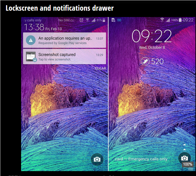
Lockscreen and notifications drawer

The new revamped notifications drawer with TouchWiz-y goodness brings a brighter, yet less-gloomy shade of blue to the default design template on the Note 4.
Unlike the stock Lollipop, the new custom Lollipop update simplifies the UI elements by allowing you to access the complete row of quick toggles without the need to swipe down twice on the Note 4 display.
Meanwhile, the Lockscreen adds a critical tweak to the push notifications, wherein the notifications can be disabled via actionable menus even without unlocking your device.
Gallery, Music and Video
The Gallery, Music and Video apps also get some fresh visual enhancements in the Lollipop release, while their functionality remains unchanged from the KitKat update.
Dialer, Contacts and Messaging
The Dialer, Contacts and Messaging apps now get a major UI refresh with visual enhancements including the ability to render a distinct colour for each app instead of posing a uniform shade of blue across all of them.
The unique colour coded UI for each app should come in handy, while quick-switching between various apps for multitasking.
[Source: Phone Arena]
© Copyright IBTimes 2025. All rights reserved.


