Google Testing Radical Overhaul of Gmail

Google is testing a radical redesign of its Gmail service which would mark the company's most dynamic design change to the service since 2011.
Google has not officially revealed the details of the new look Gmail, but it has begun testing it out on a select group of users, and among them appears to be the people over at Geek.com, who have published screenshots of what Gmail could soon look like for everyone.
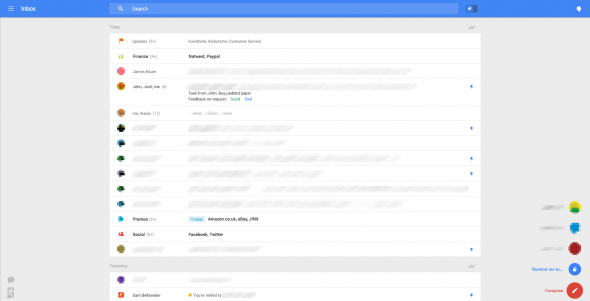
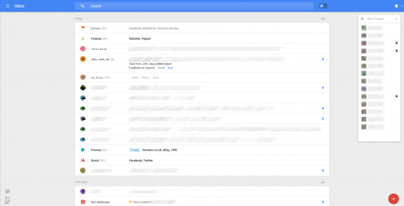
The design mirrors the look of Google+ and is a much stripped-down version of the rather cluttered Gmail interface in use today.
Among the most significant change includes the removal of the sidebar which sits on the left-hand side of the current view with what is called a "fly-in menu" which, like Google+ appears when the users needs it.
Another major change is the removal of the tab system which was only introduced to Gmail in 2013


The new interface will use the entire display for email, apart from allowing users to shrink the window so that they can glance at their inbox whenever required.
Pins, Snooze And New Buttons
The interface adds a few buttons to the lower right corner, which can be clicked to perform actions such as composing an email or setting a reminder. Stars have been renamed as 'pins' and users will also be able to snooze emails for later, a feature that was last seen in the popular Mailbox app.
Google I/O
There is a good chance that Google might unveil the new design at its upcoming Google I/O conference, which is taking place on 25 and 26 June but it as with most Google product updates, the roll out of the new-look Gmail could take some time.
When asked for comment, the search giant told The Next Web: "We don't comment on rumour or speculation."
© Copyright IBTimes 2025. All rights reserved.


