HTC One (M9) vs HTC One (M8) - What's the difference?

New smartphones are often described by predictable technology reporters as 'evolution over revolution', but with the new One (M9) HTC has taken this to new extremes - but that is not necessarily a bad thing.
Announced at Mobile World Congress 2015 in Barcelona, IBTimes UK has been hands-on with the One (M9), and having compared it to the M8 - one of our favourite Android phones of last year - here's what we have found:
HTC One (M9) vs HTC One (M8) - Design
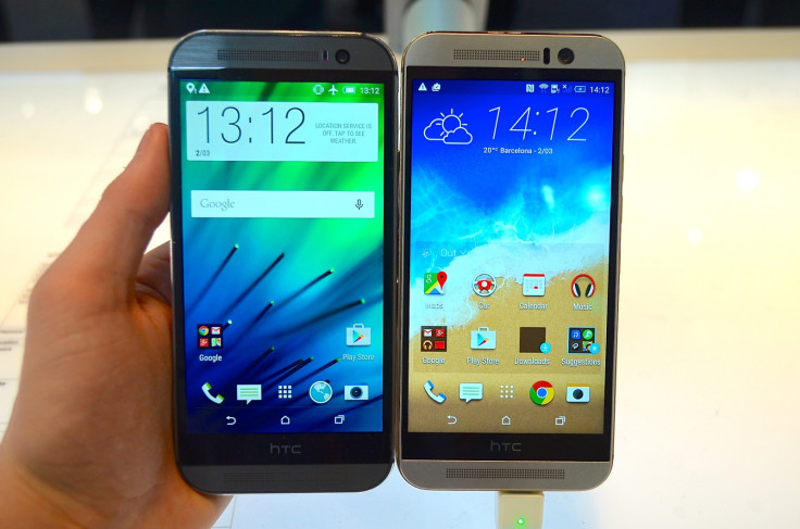
HTC had produced the best-looking Android flagships for the past two years, and the M9 is no exception. It looks great because it is almost identical to the M8. The only obvious aesthetic difference is a gold-coloured band which runs around the outside edge of the handset.
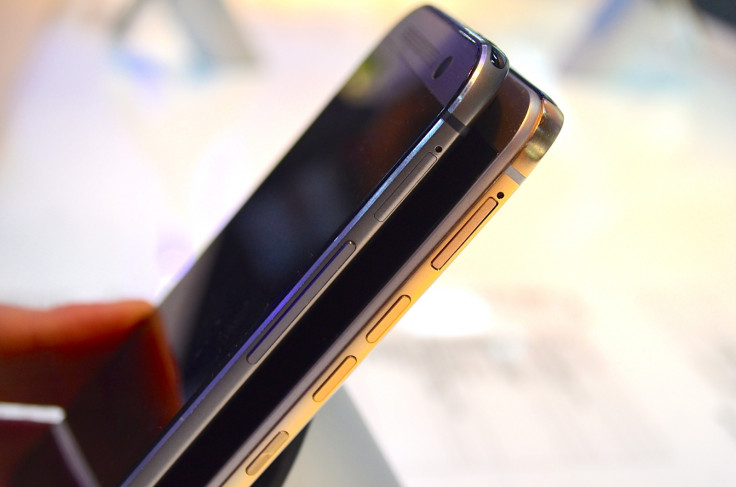
Contained within this band is another, smaller change. The power and screen lock button, formerly at the top, where it was difficult to reach, has been moved to the right edge, just below the volume buttons.

It's in a much better position here, but if I were to nit-pick I would say it's a little too low - I'd rather it was above the volume keys rather than below them, but either way it's a better solution than before.
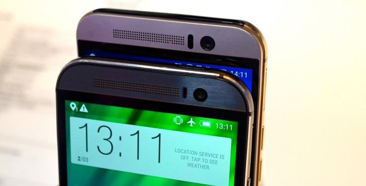
Less obvious until you compare the two phones side-by-side is the M9's slight size reduction. At 144.6 x 69.7mm it is a few scant millimetres smaller than the M8, which was 146.4 x 70.6mm. The new phone is an unnoticeable 0.2mm thicker and 3g heavier.
HTC One (M9) vs HTC One (M8) - Camera
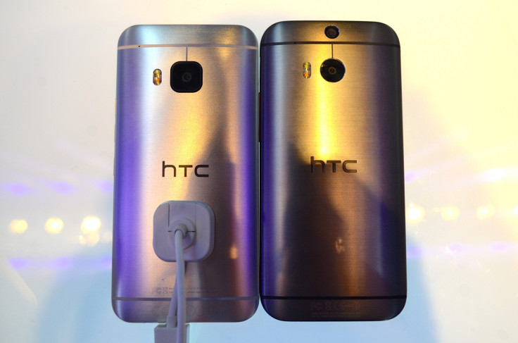
The most noticeable update for the M9 is its photography firepower. Gone is the 4-megapixel Ultra Pixel rear camera and Duo lens from the M8, and in their place is a Sony-sourced 20MP camera. Having only briefly used the phone we can't say for sure if the new sensor is a major improvement, but the huge increase in pixel count should help to keep stat-concious consumers happy.

But HTC hasn't binned the old Ultra Pixel sensor, as it has found a new home as the M9's front-facing camera, letting in much more light than the old M8 and boosting the exposure of your selfies. We took a couple of comparison shots with the M8 and M9 and found the new model to indeed produce a brighter, better lit image.
HTC One (M9) vs HTC One (M8) - Processor, RAM and Storage
Less obvious for now, but crucial if HTC is to keep pace with the competition for another 12 months are the One (M9)'s internals. Replacing the M8's quad-core, 2.3GHz Snapdragon 801 with 2GB of RAM is the new 64-bit, octa-core Snapdragon 810 with 3GB of RAM; the chip comprises two quad-core processors running at 2GHz and 1.5GHz.
Standard storage is up from 16GB to 32GB, while just as before there is a microSD card slot to increase space by up to an extra 128GB.
HTC One (M9) vs HTC One (M8) - Display
Also the same as last year is the M9's screen, which remains the same size - five inches - and has the same resolution - Full HD, 1920 x 1080 - as the year-old M8. This may lose out when compared to the Samsung Galaxy S6's UHD panel and it's 2560 x 1440 resolution, but HTC may be able to claim improved battery life as a result of the processor pushing around fewer pixels.
We'll have to wait until we get both phones into the office for a full review to find out.

HTC One (M9) vs HTC One (M8) - Conclusion
You could argue that HTC didn't need to do much with the One (M8) to make it a better phone, and you'd probably be right. But while the company has undeniably worked hard to refine the phone - and it has created simpler, more beautiful product as a result - it hasn't pushed the boat out as far as Samsung has with the Galaxy S6 and particularly the Galaxy S6 edge.
HTC has undeniably played it safe with the One (M9) - something you could certainly accuse Apple of doing with each S upgrade for the iPhone. But HTC doesn't have the financial position or market share to do that, so it'll be interesting to see if this tactic pays off.
© Copyright IBTimes 2025. All rights reserved.


