Samsung Gear S2 hands-on: Second time around, Samsung cracks the smartwatch
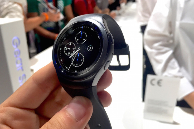
After weeks of teasing and months of speculation and rumour, Samsung has finally shown off the Gear S2 smartwatch. Running the company's own Tizen operating system, the Gear S2 comes in two styles, has a rotating bezel to navigate through menus, and is compatible with almost all recent Android smartphones.
Shown off to journalists for the first time at the IFA technology trade show in Berlin, the Gear S2 ditches its predecessor's curved rectangle screen in favour of a circular one which is brighter and has more pixels than some of its rivals. The Gear S2 is waterproof, has NFC for Samsung Pay contactless payments, Bluetooth for connecting to your smartphone (Android 4.4 and above with at least 1.5GB RAM), wireless charging, apps from Uber, Nike+, CNN, Volkswagen and others, and will go on sale in October.
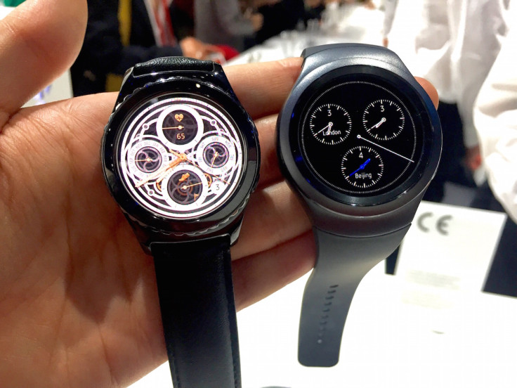
There are two versions of Gear S2
First let us look at the two versions on offer. One is the Gear S2 Sport and the other is the Gear S2 Classic. Both have the same screen and software, both have a heart rate monitor on the back, and both connect to your phone over Bluetooth - but there are some major differences. The Sport model has a brushed metal finish to its case, whereas the Classic has a dark chrome look; I personally prefer the finish of the Sport, but the shape of the Classic, which has traditional 20mm lugs and will accept any regular strap of that size. With the Sport you are stuck with Samsung's own range of interchangeable elastomer bands, which feel very similar to those of the Apple Watch Sport.
Another difference is how the Sport has Wi-Fi and the Classic, inexplicably, does not. The Sport also has a longer battery life, at "up to" two days, compared to the Classic's 1.5 days. Both offer a power reserve mode if your battery is running low while away from a wireless charging. This turns the screen to greyscale and limits notifications to the very basics - like incoming calls and texts.
Spin me right round
Controlling both models is done in three ways. First there's the 360x360 resolution touchscreen which you can swipe and tap just like any other smartwatch. Next are two buttons at the two o'clock and four o'clock positions; the top acts the same as a Back button on any smartphone, taking you back a step in whatever menu you're in. The lower button takes you straight to your apps with a single press, or brings up the off and power reserve options when held for two seconds.
Finally, the most interesting control is the rotating bezel, which clicks as you turn it around the screen and either scrolls sideways through the Gear S2's many customisable watch faces, up and down emails, and in and out of maps. It feels incredible natural and, as Samsung rightly points out, it prevent you from obscuring the screen by touching it. That being said, you can always tap and swipe at the display if you so wish. Scrolling feels nice and click on the Sport model, but felt a little too soft on the Classic. Perhaps these are issues which will be ironed out before they go on sale in October.
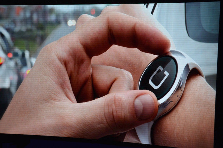
A nice kick of haptic feedback
There's a nice kick from the watch's haptic feedback when you bump into the top of a list or end of an email, and I wish Samsung would use this feature more widely; it feels a lot like the Apple Watch. Another place for improvement is with the speed at which the software moves when you spin the bezel; turning it faster doesn't result in faster scrolling - in fact the opposite is often true. A spring-like mechanic which sees messages scroll quickly with a firm spin of the bezel, then slow to a stop would make a nice improvement.
Elsewhere, it all feels very watch-like. The display switches off by default - flicking off as soon as you turn your wrist away, just like the Apple Watch does - but you can adjust it to be on all of the time, albeit in a simpler form when it thinks you aren't looking. I liked how tapping the smaller chorine dials immediately starts a stopwatch, and how a long press takes you straight into the watch face menu.
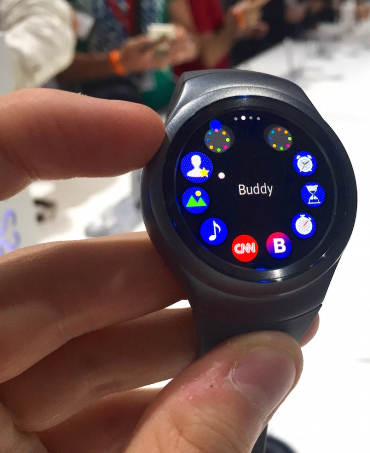
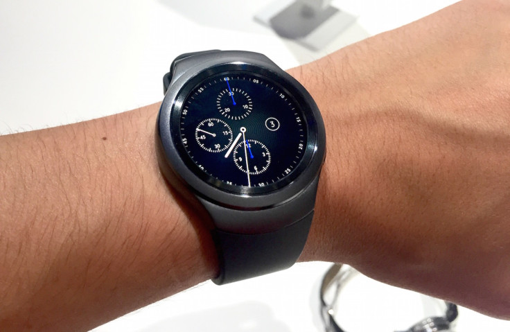
I also found the Gear S2 to be very comfortable. At 11.4mm thick (or 13.4mm for the 3G-equipped Sport), the Gear S2 is thin enough to pass as a regular large watch. The Sport's face has a diameter of 42mm (44mm for the 3G variant), and the Classic is 40mm - smaller than my own watch and precisely splitting the 38 and 42mm Apple Watches. Both models felt comfortable and pretty much identical to my own regular watch, which is a massive compliment considering how awful smartwatches looked just a few months ago.
Betting on the future
The big message from Samsung at IFA 2015 was that the Internet of Things is finally coming, and with it there will be a future where we control our lights, thermostats, cars and media from a smartwatch. That watch is the Gear S2 - of at least it will be, once our homes have all been kitted out with the latest is connected gadgets. Until then, the Gear S2 is a smartwatch which has pretty much the same feature set as the Apple Watch, about the same battery life, a premium design which is attractive without being gaudy, and compatibility with almost all Androids.
I really enjoyed using the Gear S2 and didn't want to give it back. Granted, I'm like that with most new gadgets, but there is so much more depth to Tizen than there is with Android Wear, which is starting to feel a little bit lacklustre and perhaps even dated. Samsung has produced a smartwatch which can absolutely go head-to-head with the Apple Watch. But to do that, it'll need to start at no more than £300. We'll find out the price in a few weeks...
© Copyright IBTimes 2025. All rights reserved.


