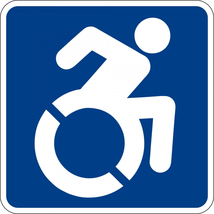
That's how we roll: Redesigned handicap symbol shows some verve

The familiar, static blue symbol for disability access has been redesigned to express some oomph. Now Connecticut Governor Dannel Malloy is proposing that the state's new handicap parking signs, licence plates, stickers and tags use "a logo with a dynamic character leaning forward with a sense of movement".
Malloy's move follows a petition campaign by local residents who want to revamp the stale sign. Their motto? "Change the sign, change the attitude."
The new, more active look grew out of a 2010 guerrilla art project.
Design activists of the Accessible Icon Project created the "active and engaged" alternative symbol, printed them on semi-transparent stickers and (illegally) patched them over street signs in Boston to draw attention to accessibility issues.
Their design has since gained wide attention and has been adopted by several US cities and businesses, reports Quartz.
If Malloy's bill becomes law, the new design will replace the 47-year-old International Symbol of Access, first drawn by Danish graphic designer Susanne Koefoed to indicate spaces with "barrier-free access". Koefoed's original concept did not have a head; the circle was later added to humanize the figure.
In 2014, New York became the first state in the US to adopt the more active access symbol, declaring the update a "major step to prohibit discrimination on the basis of a disability". But it ran into trouble with some stuffy federal laws.
© Copyright IBTimes 2025. All rights reserved.


