Yotaphone 2 review: This dual-screen Android smartphone is not a gimmick
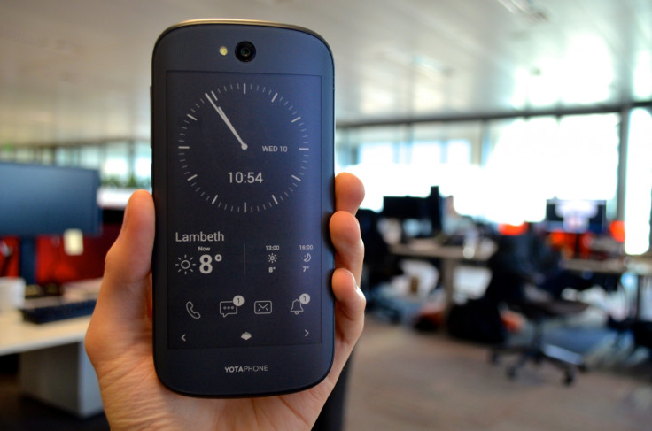
Yotaphone 2 Key Features:
- 5in Full HD screen.
- 4.7in e-ink touchscreen.
- 2.2GHz quad-core processor with 2GB RAM.
- 32GB storage (not expandable).
- Android 4.4 KitKat.
- Price as reviewed: £555.
Yota Yotaphone 2 Review
You'd be forgiven for thinking that the rate of development in the smartphone industry had slowed, with manufacturers producing fewer game-changing features in favour of tweaking their products' design.
But Russian company Yota would disagree. Its dual-screened Yotaphone 2 is on sale now and has an e-ink screen like an Amazon Kindle on its back. Is this yet another gimmick to distract us from the fact all smartphones are starting to look the same, or is the two-screen setup genuinely useful? We spent a week with the Yotaphone 2 to find out.
Yota Yotaphone 2: Look and feel
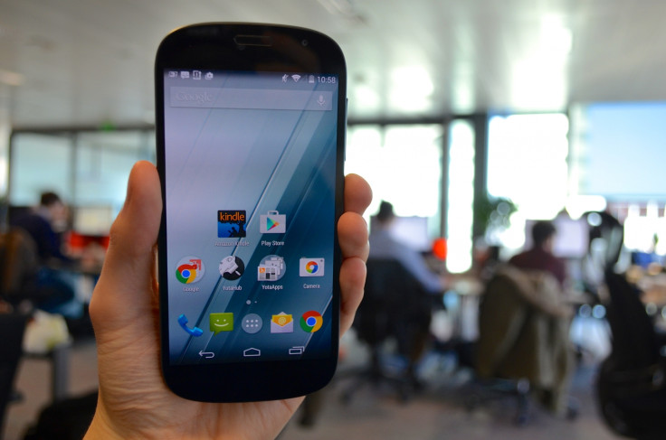
From the front, the Yotaphone 2 looks like any other 5in Android handset, with a particular likeness to the Motorola Moto X. It has a curved top and bottom, Gorilla Glass 3 to protect it from scratches, and slim bezels. There's more wasted space above and below the screen than I'd like - especially given that the Home and Back button eat into the screen, rather than appearing below it.
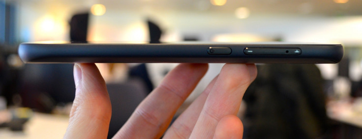
At a fraction under 9mm and 145g, the Yotaphone 2 is surprisingly thin and light given the extra screen. My only complaint is how slippery the e-ink screen is, making the phone occasionally precarious to hold, especially with cold hands. The rear panel is curved slightly to aid ergonomics, and a quirk to simplify the design is how the volume buttons are integrated with the SIM card tray, which sits on the right edge and above the power button.
Yota Yotaphone 2: Front screen
Part of the Yotaphone's genius is how the handset isn't compromised by its second screen. Hold and use the phone normally, and you'd never know that this was anything other than a mid- to high-end handset. The 5in front screen has a Full-HD resolution of 1920 x 1080 and a pixel density of 442 per inch - more than the iPhone 6.
The screen is sharp, bright and looks great when viewed from dead-ahead, and although whites tend to come across too warm and with a yellow tint, there isn't much to complain about. Only when viewed off centre does the Yotaphone's screen start to struggle and colours shift from warm to cool, with whites shifting from yellow to blue.
Yota Yotaphone 2: Rear screen
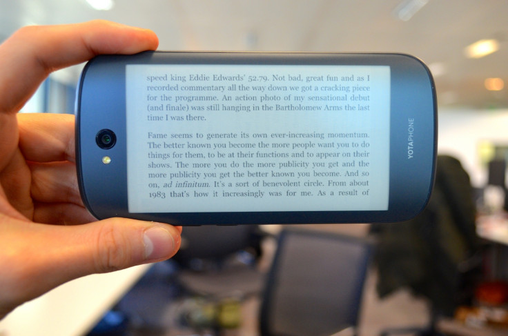
And so, on to the Yotaphone 2's party piece. The rear screen is exactly like what you'd find on an Amazon Kindle or other ereader; it has a resolution of 960 x 540 and can display 16 shades of grey - enough to reproduce Android in its entirety, should you so wish - and is touch sensitive. It is protected by Gorilla Glass 3, and should shrug off scratches, but will therefore be prone to cracks if dropped.
Although it's technically possible to use the rear screen for everything - and enjoy massive battery life as a result - the key to getting the most out of the Yotaphone 2 is to regularly switch between the two. When locked, the rear screen shows a clock, weather forecast and notifications such as missed calls and unread messages, and can be configured to show calendar events, your Twitter feed, and more.
Switching from the front to rear screen is a case of swiping up from the Home button, as you would to access Google Now, then to the left. Although you wouldn't want to watch a YouTube video on the e-ink screen, reading lengthy articles or essays on there is much more comfortable, with no reflections or backlight burning your retina. Everyone we showed the phone to was impressed by the rear screen and immediately understood why it's there - to make reading on the commute comfortable, and for improved battery life.
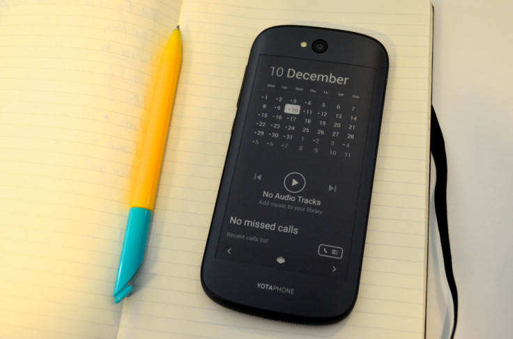
For many consumers I reckon the Yotaphone 2 could easily replace both their smartphone and ereader, but for those who read more often the phone's relatively narrow screen means more page turns and a less comfortable experience.
Another trick performed by the phone is its ability to be useful after the battery has completely died, because anything shown on the rear screen will stay there, as it uses no power at all to do so. An important email, ticket or map could be put onto the back screen, safe in the knowledge that should the phone die it'll still be on show.
Yota Yotaphone 2: Software and performance
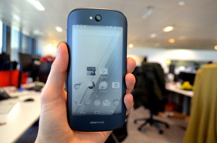
The Yotaphone 2 runs an almost entirely unmodified version of Android 4.4 KitKat on a quad-core Snapdragon processor with 2GB of RAM and 32GB of storage. To the casual observer it looks and feels like one of Google's own Nexus handsets and it'll no doubt appeal to those who don't like the visual changes made by Samsung, Sony, HTC and others.
Making use of the e-ink screen is a folder of games designed exclusively for use on the rear display; there's chess, draughts, 2048 and sudoku, plus an RSS reader provided by Feedly. The bespoke YotaHub app gives you control of what notifications and widgets are shown on the rear screen when it's asleep, but it's not particularly intuitive and takes some time to get everything set up how you want.
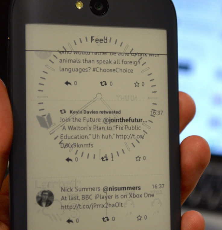
Occasionally, the rear screen wouldn't render properly, resulting in two applications appearing over the top of each other (right). Rebooting the phone fixed this.
Looking beyond the second screen, the Yotaphone 2 is a good mid- to high-end handset. It is fast, responsive, and plays demanding 3D games like Real Racing 3 as smoothly as other £500-plus Androids.
Battery life can be the Yota's trump card - but only if you remember to use the rear screen a lot. Used normally, and you'll see between one and 1.5 days of average use, just like any other Android phone this size - but remember to switch screens when reading long articles and you will see an improvement. Switch permanently and three days should be achievable - but realistically no one is going to do this.
Finally, there's 32GB of internal storage, but unfortunately this cannot be increased as there's no microSD card slot.
Yota Yotaphone 2: Camera
Sadly for Yota, there isn't much to see here. It's an 8-megapixel (MP) sensor with autofocus and LED flash which takes decent photos and has a handful of features like panorama, photo sphere and lens blur.
The app works fine, but isn't all that quick, with the lens blur feature (for mimicking the shallow depth of field photos of an SLR camera) particularly slow. Like many good Android phones before it, the Yotaphone 2 has a fairly average camera, which is a shame given the £555 price tag means it has to compete with the iPhone 6, LG G3 and various Samsungs all offering better photography.
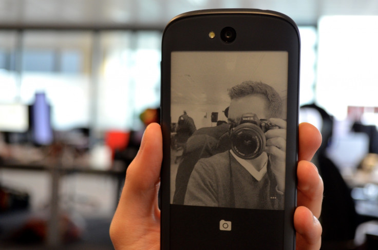
One saving grace is how the rear screen can be used as a viewfinder for taking photos of yourself with the rear camera, as shown above.
Yota Yotaphone 2: Verdict
My overwhelming reaction to using the Yotaphone 2 for a week has been one of relief. That second screen could have so easily ended up as a gimmick - but because of some clever engineering and a set of genuinely useful features, it didn't.
The Yotaphone impressed me more than I ever expected it to, and when I showed it to members of the public (video, below) they almost universally praised it - even after being told about it's iPhone-level price.
Seeing a phone maker do something new is exactly what this slowly stagnating market needed, and although I can't see Apple or Samsung creating rivals in a hurry (Yota has this technology patented to the rafters), I believe this is what the Amazon Fire phone should have been - a smartphone and an ereader in one.
But nevermind not being from Amazon, this isn't from a company anyone has heard of and I fear that will hurt the Yotaphone. Its London launch night looked popular, but a single pop-up shop in Shoreditch (which closes on 28 December) isn't much, and although it can be bought online, a lack of presence in the network's stores will make gaining any meaningful share of the market a real struggle.
I hope that changes and I hope Yota gets the recognition it deserves for having the guts to try something truly different, and succeeding. But I fear even a phone as unique and interesting as this will struggle to tempt the masses away from their iPhones and Samsung Galaxies.
Perhaps this will be little more than a curious footnote in the history of the smartphone, but it's one Yota should be incredibly proud of.
Yota Yotaphone 2: Scores
Design: 8/10 - Surprisingly thin and light considering the extra screen, but rear very slippery.
Build: 9/10 - Feels compact and very well built indeed, although I suspect the glass rear could crack.
Software: 8/10 - Almost entirely stock Android with (sometimes confusing) apps to control rear screen.
Screens: 8/10 - Front is Full HD, crisp and bight. Rear is a comfortable and responsive ereader.
Camera: 6/10 - Average resolution, fairly slow software and not many features.
Overall: 8/10 - Anything but a gimmick, the Yotaphone 2 is a surprising success and not to be ignored.
The Good:
- Comfortable size and weight.
- Rear screen is genuinely useful.
- Great battery life, so long as you make use of rear screen.
The Bad:
- Rear is very slippery and may crack when dropped.
- Poor camera for the price.
- Expensive for an unknown brand.
© Copyright IBTimes 2025. All rights reserved.


