Samsung Gear S2 review: Second time's a charm for smartwatch that goes for the traditional look
The original Samsung Gear smartwatch was difficult to love. It had a large, square, curved screen, it ran Samsung's own Tizen operating system, and it had a SIM card slot. This all made it huge, ugly and destined to only every appear on the wrists of die hard Samsung fans.
For the Gear S2, Samsung has gone back to the drawing board and come up with a smartwatch that has been improved on in every way. It still runs Tizen instead of the popular Android Wear but introduces a familiar watch design and an ingenious rotating bezel to scroll through menus without covering the screen with your fingers.
Samsung Gear S2: Look and feel
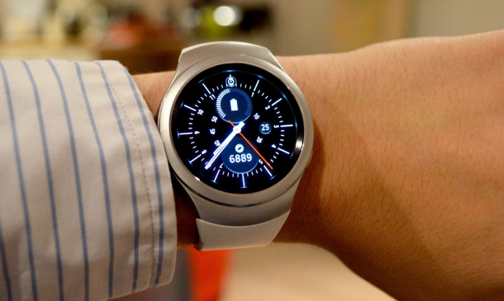
Making the Gear 2 look more like a watch than a wrist computer prop from a sci-fi film was the right move for Samsung to make. The original Gear was not a looker and while the smartwatch market remains a niche, manufacturers should, in my opinion, stick closely to traditional watch design. The Gear S2 and Gear S2 Classic both do this, the latter more than the former, which I'm reviewing here.

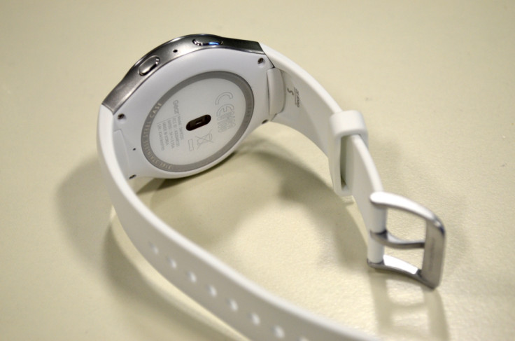
Where the Classic has regular lugs to fit any strap you like, the regular Gear S2 has bespoke fittings that only accept the rubber sports strap provided. The metal case of the watch looks good and feels well made. At 13.4mm thick, it is 3mm thicker than the Apple Watch and 2mm thicker than the Huawei Watch.
Despite this, I did not find the Samsung too large for my fairly small wrists. Nor, at 51g, is it too heavy. It may not quite have the premium looks of the Huawei or the Apple but it should still be considered a worthy rival and a replacement for a regular watch. The silver and white of my review unit perhaps gives the Gear 2 a futuristic look traditional watch fans will be uncomfortable with, but that is my only real aesthetic criticism - and a personal one at that.
Samsung Gear S2: Screen
The Gear 2's screen is circular, measures 1.2in in diameter, and has a resolution of 320 x 320. This makes pixels almost impossible to spot and means text is nice and smooth, with no sharp or jagged edges. The display is also nice and bright; I often had it turned down to setting three of 10, and even switched it down to one when the brightness was distracting me while driving at night.

As well as being bright, the Gear S2 has deep blacks that help make the watch faces look genuine and less like they are being lit up from behind. In short, this is a high-quality screen on par with the (slightly larger and squarer) Apple Watch.
It also stays on all the time, showing a simplified watch face that lights up brighter and adds more detail when you flick your wrist. This small detail makes the Gear S2 as usable as a regular watch - something smartwatches of 2014 could not claim to be.
Samsung Gear S2: Rotating bezel
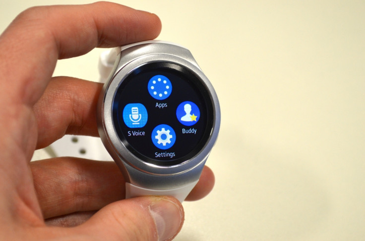
The most unique and ingenious feature of the Gear S2 is its rotating bezel. Similar to Apple and the Watch's Digital Crown, Samsung realised touching the screen of a smartwatch covers what you are trying to look at. The Gear 2's rotating bezel is the answer, offering a way to scroll through menus and messages, flick between watch faces and zoom into maps without touching and obscuring the screen.

You only need to touch the screen when tapping something; rotate the dial to scroll to what you want, then tap the screen to make your selection. It's a very nice system and completely different to what anyone else is doing - even Apple. But it isn't perfect.
The bezel clicks as you move it past where each hour mark would be, but the click isn't tactile enough, so scrolling from one item to the next one is difficult. It's too easy to scroll through two clicks and miss what you were aiming for. Fix this and Samsung is on to an absolute winner.
Samsung Gear S2: Software and performance
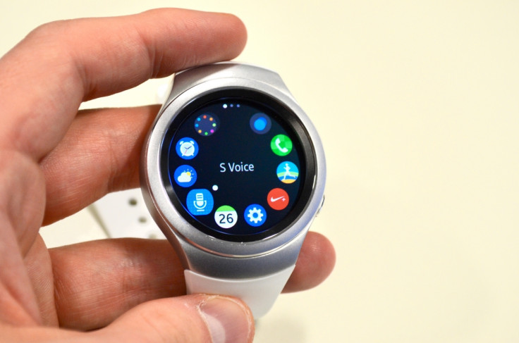
The Gear 2 runs Samsung's own Tizen software instead of Android Wear, as favoured by most other smartwatches. The basics are fundamentally the same - this is a place for reading notifications, tracking your health and recording exercise. But you can also use S Voice as you would on a Samsung phone, track water and caffeine intake, and automatically record walking, running and cycling. The Gear S2 is compatible with most recent Android phones, thanks to the Gear app.
Tizen has more to offer than Android Wear out of the box, but with it only being on Samsung products, I wonder if developers will be as proactive in making apps as they are with Android, iOS and Apple's Watch OS. That being said, there aren't many watch apps I would want, beyond messaging, news alerts, Citymapper for directions, and Uber.

Performance is good. Apps never really feel slow and the Gear S2 generally seems quick and responsive. The watch always automatically knew when I was walking or jogging and provided positive messages accordingly - or told me to move more when I was sat for too long. The vibrate function works well, but isn't quite as strong as the tap of the Apple Watch.
Battery life is about 36 hours, so a full day and night is fine but the second day isn't possible. The same as all other recent smartwatches, basically. Charging is done via the included wireless dock.
Second time around, Samsung has produced an excellent smartwatch. The Gear S2 is attractive and watch-like (especially the Classic model, which I hope to see soon) and the rotating bezel is almost the perfect way to navigate on a small screen. Tizen works well and has (almost) enough applications already for most users.
For me, the Gear S2 doesn't quite have the appeal of the Apple Watch. I can't explain why, and maybe once I've seen the Classic this view will change. But put Apple's 'Reality Distortion Field' to one side and the Samsung is a worthy alternative. Joining the watches of Apple and Huawei, Samsung has made the Smartwatch Class Of 2015 a far more interesting and enticing place than it was in 2014.
Scores:
- Design: 7/10 - Good looking for a smartwatch, but not in the same league as the luxury Apple and Huawei
- Build quality: 8/10 - Great build quality, but rubber strap isn't for everyone. Feels like a sports gadget
- Software: 8/10 - Tizen is very good and simpler to use than Watch OS by Apple, but with any more apps it could feel cluttered
- Performance: 9/10 - Nothing really to fault, but as with any tech there is always room for a speed boost
- Battery life: 8/10 - A day and a half is regularly possible, but forget to charge one night and you won't get through the second day
Pros:
- Rotating bezel is perfect for the small screen
- Watch faces are diverse and attractive
- Wireless charger is simpler and more reliable than others
Cons:
- Cannot use regular watch straps
- Bezel could benefit from clicking more when rotated
- Lack of apps, for now
© Copyright IBTimes 2025. All rights reserved.


