WhatsApp 2.12.87 brings Material Design UI with new calling interface, cleaner search-bar UI and more [APK Download]

Android WhatsApp users are in for some exciting news, as the WhatsApp team has just released a new beta iteration (2.12.87) of the app on its service website, which takes the Material design UI to the next level with a new calling interface, a cleaner search-bar UI and more.
Some of the noteworthy changes include the removal of unwieldy Gingerbread icons that were hidden under the More menu within the chat's overflow options, reports Android Police.

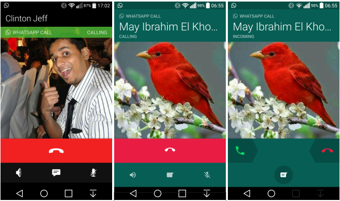
With the advent of the new build (2.12.87), the dark green background takes over the pre-dominant green and red shade for hanging up a call in WhatsApp.
In addition, the caller's name will now get highlighted in bigger fonts with smaller and more minimalistic icons decorating the revamped Material Design UI.

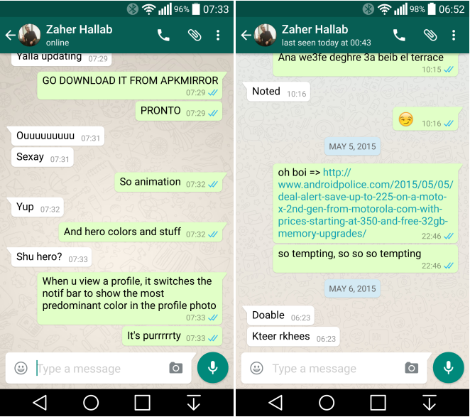
One can also notice a change in icon colour and font size with the new call-reception interface that mimics the call hang-up interface. The default wallpaper also undergoes an overhaul with cooler colour tones and delicate outline drawings that blend quite well into the redesigned app interface.

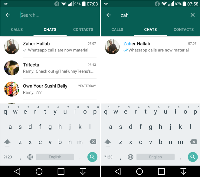
Besides, the oddly misplaced icons are gone for good as you will see a more refined look to the interface with a semi-transparent search option unlike the highlighted text seen in search field from previous builds.
A tiny tweak to the chat interface removes the "Last Seen" status from the line wrap and instead omits the first few characters of a message to make space for denoting the exact date and time the interaction took place.
Interested users could go ahead and download the latest beta version of WhatsApp via the APK mirror (click to download).
© Copyright IBTimes 2025. All rights reserved.


